Alabaster is a versatile paint color that can be used in a variety of ways in home decor since it can be paired with almost any other shade. Use alabaster for a classic and sophisticated appeal or a light and airy atmosphere in any room of the home.
You could also use this color as a paint to upcycle old pieces of furniture, giving new life to items such as a dining table, nightstands, a rocking chair, or a bed frame.
What is Alabaster Color?
The color that goes by the name of alabaster is a creamy shade of off-white. It is named after the mineral or rock, also called alabaster, which has been used for centuries as a material for carvings, statues, and ornaments. Natural alabaster has a snowy white color, hence why this shade was named after the rock.
Alabaster is a neutral color that has very soft yellow and beige undertones, which ensures it has a warm and soft appeal without becoming too creamy.
This color was chosen as the ‘color of the year’ by Sherwin Williams in 2016, which is quite a feat considering it is essentially just a shade of off-white. This title is usually reserved for more interesting, saturated colors, but it shows just how popular and versatile the alabaster color really is for it to have achieved this title.
Meaning of Alabaster Color
Alabaster is a color that is used to convey calm, warmth, and peacefulness. It is ideal in this fast-paced age of technology and business to be used as a color that inspires mindfulness. Alabaster is technically a neutral shade, but since it contains warm undertones, it is not a true neutral because it does not completely lack color.
If you painted a patch of alabaster next to pure white, you would be able to see a clear difference; however, if you paint a whole room in alabaster without any pure white accents, then you would probably be fooled into thinking the room was white with appealing lighting.
Use alabaster as a color when you want to inspire a sense of ease and tranquility in a space while also ensuring it is inviting.
Similar Colors to Alabaster
White
Alabaster is considered to be a soft shade of white, which is created by mixing a tiny amount of yellow and orange with a large amount of white. Considering this color is heavily based on white, one of the colors it is most similar to is, of course, white.
The difference between these two shades is not obviously perceptible to the eye, but the difference comes more in the sense of how they feel rather than how they look.
While a pure white room will feel cool and potentially stark or clinical, an alabaster room will feel comfortable and peaceful. The slight difference in color makes an enormous difference in the atmosphere that is created between alabaster and white.
In a room with poor lighting, the effects will become even more obvious, with white taking on a dull or gloomy feel and alabaster remaining warm and inviting.
Dove white
Dove white is a shade of off-white that is similar to alabaster in the sense that it contains some very subtle warm tones with a dominant white base. The warm tones of dove white are less perceptible than those in alabaster, so the atmosphere created with dove white will be even more subtle than that created by alabaster.
Dove white is closer to pure white than alabaster, so it will contain less warmth than alabaster for a simple and cleaner look.
Cool off-white
Off-white shades can come in cool or warm temperatures, and while alabaster is a warm off-white shade, cool off-white shades have a similar appearance. The difference between cool off-whites and alabaster is that they are achieved using a tiny dash of black in a large amount of white, creating an extremely pale shade of gray.
While cool off-whites and alabaster are both predominantly white and can have a very similar appearance, they will create very different feelings in a room. While alabaster is a warm neutral, cool off-whites will have a cool and fresh vibe that helps to define a room as contemporary.
Cream
Cream could be considered as a darker tone of off-white or a lighter shade of beige. It is a color achieved by mixing a small amount of yellow with white for a very pale shade of yellow-white that resembles the look of dairy cream.
Alabaster itself appears to be a pale shade of cream, and in fact, it could sit exactly halfway between white and cream on a color swatch. While the cream color scheme can look a little dated or old-fashioned, alabaster is neutral enough to feel modern while still offering a warmth that white lacks. Alabaster is the perfect compromise between white and cream, offering the best of both worlds.
How to Use Alabaster in Home Decor
Wall color
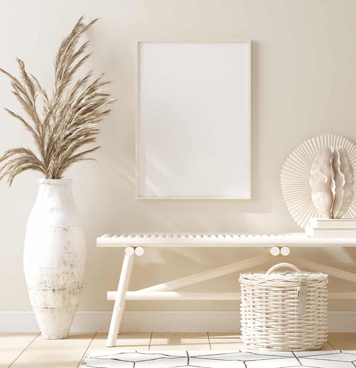
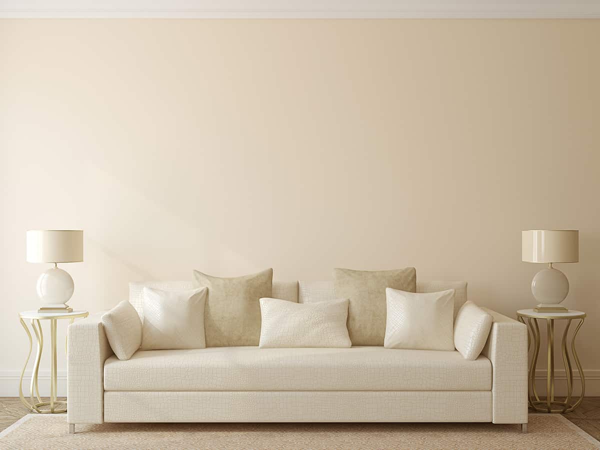
Alabaster is primarily used as a paint color across all walls in a room because it is a soft neutral that is easy to live with and easy to decorate with because it will look great with almost any color. Use this color in any room in the home as a base shade, and the colors you use with it will define the type of style and atmosphere achieved.
Pairing alabaster wall paint with black accessories will make for a sophisticated monochrome style that feels chic and Parisian while pairing it with muted shades of blue will create more of a classic coastal vibe.
Alabaster can even be used with bright and bold colors such as fuchsia pink and carrot orange for a quirky style or earthy browns for a cozy and comfortable atmosphere.
Trim color
Alabaster will work nicely as a trim color if you want to opt for an alternative shade to white without drifting too far from the usual colors. Paint trim and internal doors in alabaster for a softer contrast against the walls and a classic contemporary feel.
Accent wall
Alabaster may not seem like an obvious choice for an accent wall color, but you can use it for an accent wall paired with another shade. Use decorator tape to create stripes on an accent wall and paint these in charcoal and alabaster for an updated monochrome effect, or use blush pink and alabaster to achieve a subtly pretty accent wall in a nursery room.
Color Schemes to Use with Alabaster
Beige retreat
| Shade | Hex Code | CMYK Color Code (%) | RGB Color Code | Color |
| Alabaster | #e6e3d7 | cmyk(0%, 1%, 7%, 10%) | rgb(230, 227, 215) | |
| Beige | #e7bf9e | cmyk(0%, 17%, 32%, 9%) | rgb(231, 191, 158) |
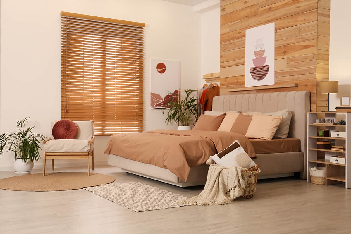
Alabaster is the perfect background shade to create a bedroom that feels like a farmhouse retreat. Opt for earthy tones of beige for soft furnishings, such as oatmeal-colored blankets and biscuit linen cushions, set against wooden framed furniture in rustic styles.
Earthy brown shades can also be incorporated with this look, such as chocolate brown hardwood floors or brown faux fur throws. Use white or off-white accents to punctuate the style, such as white bedsheets and a white rug.
Playful and lively
| Shade | Hex Code | CMYK Color Code (%) | RGB Color Code | Color |
| Alabaster | #e6e3d7 | cmyk(0%, 1%, 7%, 10%) | rgb(230, 227, 215) | |
| Lime Green | #addc37 | cmyk(21%, 0%, 75%, 14%) | rgb(173, 220, 55) | |
| Flamingo Pink | #e6a7ad | cmyk(0%, 27%, 25%, 10%) | rgb(230, 167, 173) |
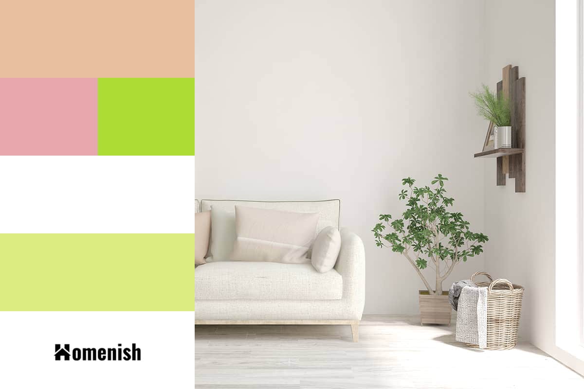
When you want to use bright and playful colors such as lime green and flamingo pink, you need to use a neutral background shade to prevent them from becoming too overwhelming and intense. You might be drawn to white to fulfill this job, but pure white can end up looking stark or clinical, which will result in a room that you don’t enjoy spending time in.
Alabaster works as a great alternative to white in this instance because it is soft enough to seemingly lack color and be used as a neutral, but it will ensure the room feels warm and welcoming.
Pastel nursery
| Shade | Hex Code | CMYK Color Code (%) | RGB Color Code | Color |
| Alabaster | #e6e3d7 | cmyk(0%, 1%, 7%, 10%) | rgb(230, 227, 215) | |
| Pastel Green | #ddec80 | cmyk(6%, 0%, 46%, 7%) | rgb(221, 236, 128) |
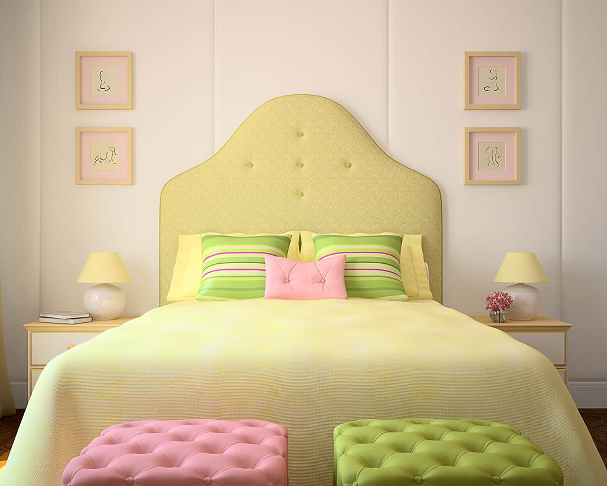
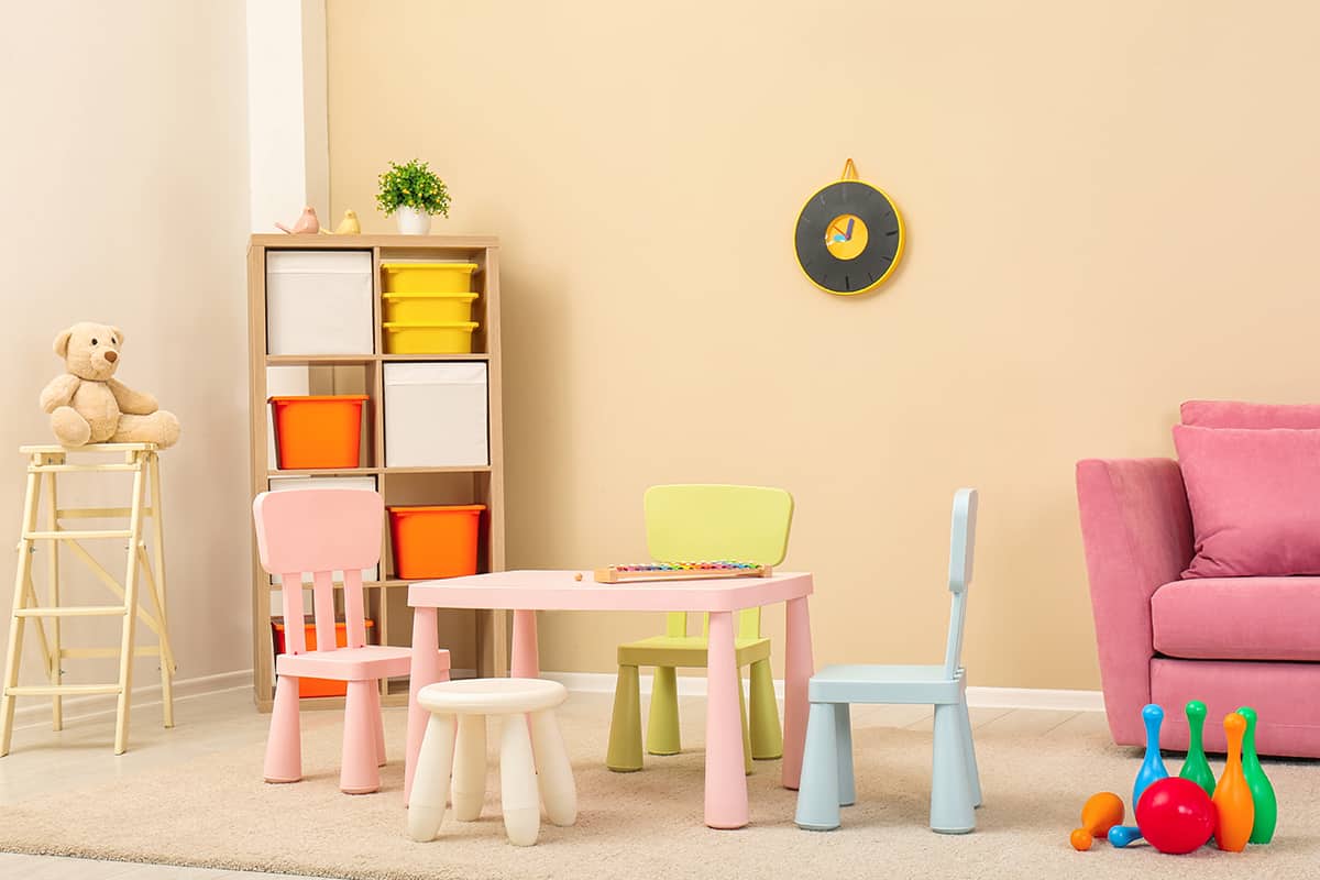
Alabaster is a beautiful neutral shade to use as a backdrop for pastel colors in a nursery or child’s room. It is simple enough to not inflict any sense of personality on a space, so it will let the pastel shades you have chosen do the talking, but it is also preferable to pure white because it will add a warm feel.
Muted blue-gray shades will look stunning with alabaster to create a mild contrast, or use pastel shades of peach or coral for a warm and delicate look. Pastel green shades like mint and faded sage will create a nice natural look with alabaster for a wildlife-themed nursery or a botanical style with flowers and insects.
Classic luxury
| Shade | Hex Code | CMYK Color Code (%) | RGB Color Code | Color |
| Alabaster | #e6e3d7 | cmyk(0%, 1%, 7%, 10%) | rgb(230, 227, 215) | |
| White | #ffffff | cmyk(0%, 0%, 0%, 0%) | rgb(255, 255, 255) |
Alabaster will create a luxury feel in a classic style when used with other neutrals such as black and white. Opt for a smart monochrome look with alabaster walls and black trim or black wainscotting, and tie this color scheme together with gray furniture or furnishings such as a gray sofa or gray bed sheets.
A room with high ceilings will look grand with alabaster walls, creating a sense of space and elegance. Choose alabaster in small rooms as well, like a home office or guest bedroom, for an airy and breezy feel which is also warm and comforting.
