Purple is a secondary color which is made up of the primary colors, blue and red. True purple is located equidistant between blue and red on the color wheel, though different variations of purple lay on either side, created by altering the proportions of red and blue in the mix.
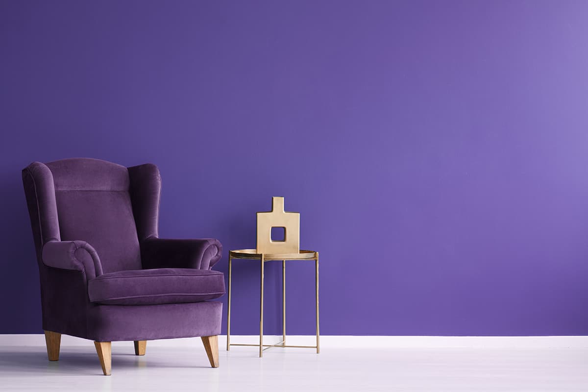
Purple is one of the lesser-used colors when it comes to interior design, but it can be used to great effect if you want to invoke a sense of elegance and glamor or if you are creating a space based on a spring-time floral theme.
Here we explore some of the best shades of purple, along with their hex codes and how to use these colors in home decor.
Meaning of Purple
Purple has long been synonymous with royalty, wealth, and luxury. This is because hundreds of years ago, purple was one of the most difficult types of dye to source. Of course, supply and demand meant that the cost of purple dye was more than ordinary people could afford, and therefore the only people within society who wore purple were the nobility.
The association of purple with power and wealth continues today, and as a result, purple is widely used to create a sense of grandeur, elegance, luxury, and sophistication. Different shades of purple can also represent other meanings. For example, dark purple can be associated with mystery, while light purple is widely associated with flowers and springtime.
How to Make Purple
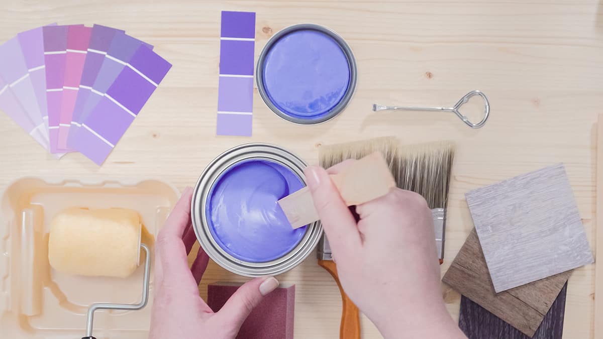
Purple is created by mixing blue with red, and it is one of the basic secondary color mixes that most of us learn about as children. To achieve a true, standard shade of purple, which is centrally positioned between primary blue and primary red on the color wheel, then you need to mix equal parts of blue and red paint.
This means one part blue paint to one part red paint. The proportion is not the only important thing here; you also need to ensure that the blue and red paint you are using are the true primary versions of themselves. Mixing an aqua blue with primary red will give you a different result, as would mixing dark red with primary blue.
The shades of blue and red you use will determine the final outcome, and you can also alter the proportions you use to achieve varying shades of purple.
For a cooler purple which leans more towards blue on the color wheel, add more blue than red. For a warmer shade of purple, more red will be needed. Using black and white as well as blue and red will also alter the shade. The addition of white paint will make the color lighter, while a few drops of black paint will make the color darker.
Types of Purple Shades
There are numerous shades of purple in existence, ranging from delicate pastel purples through to deep and dark purples. Purple is an interesting color because although it is largely considered to be a cool color, you can also get shades of purple that have a more obvious red undertone, which results in a warmer feel.
Here we explore some of the more popular shades of purple and reveal their hex codes. You can also find out here how to use different shades of purple in home decor, by learning what type of atmosphere they will create, and which colors they pair well with.
Bright Purple- Hex Code #AC4FC6
This shade of purple is known as ‘bright purple’ though it is sometimes also referred to as ‘medium orchid’. It leans slightly more towards the bluer side of the spectrum which gives it a cooler feel.
In terms of CMYK color space, bright purple is made up of 13.1% cyan, 60.1% magenta, 0% yellow, and 22.4% black. In RGB color space, bright purple is a combination of 67.5% red, 31% green, and 77.6% blue.
Using Bright Purple in Home Decor
Bright purple is an uplifting and quite playful color. It has a medium saturation and lightness which means it is neither deep and dark, nor pale and subtle. Instead, it brings a vibrancy to a room that could feel overwhelming in large swathes, so use it as an accent color, or for a feature wall.
Yellow always pairs well with purple shades, and in the case of bright purple, lemon yellow is a particularly good choice to draw on the cooler undertones of the color. Yellow shades of green would also be a nice option, such as chartreuse or even lime green, for a fun and energetic atmosphere.
Byzantium- Hex Code #702963
This is a dark shade of purple which has a subtle warmth and richness. In CMYK color space, Byzantium is created using 0% cyan, 63.4% magenta, 11.6% yellow, and 56.1% black. In RGB color space, it is made up of 43.9% red, 16.1% green, and 38.8% blue.
Using Byzantium in Home Decor
Byzantium is a nice color choice for an interior color palette if you want to create an atmosphere that is intimate and intellectual while also being quite eclectic. It would work well on all of the walls in a dining room, creating a rich space that envelopes the guests and brings about a sense of grandeur and maturity.
As this is a dark color, you might be tempted to pair Byzantium with a pale color or soft neutral, however, it actually is most effective when a darker color scheme is maintained across the space. Consider using dark olive green accents or cool charcoal accents alongside this color in home decor.
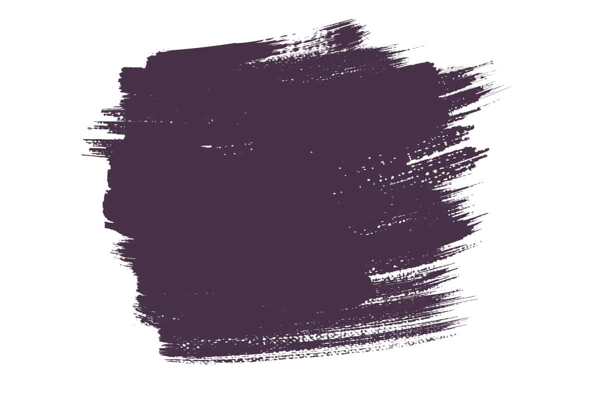
Eggplant- Hex Code #483248
Eggplant is a very dark shade of purple, named after the skin of the popular vegetable. Eggplant is so dark that it can appear black or dark gray in low light, which is no surprise given the amount of black needed to create this color. It is not only dark but also very cool since it shows no obvious undertone of red.
In CMYK color space, eggplant comprises 0% cyan, 30.6% magenta, 0% yellow, and 71.8% black, while in RGB color space it is made up of 28.2% red, 19.6% green, and 28.2% blue.
Using Eggplant in Home Decor
Eggplant has a much cooler vibe than other shades of dark purple since it lacks warm undertones and therefore comes across as very modern and cosmopolitan. Eggplant will look effortlessly stylish, set against mid to pale gray colors or with accents of khaki green.
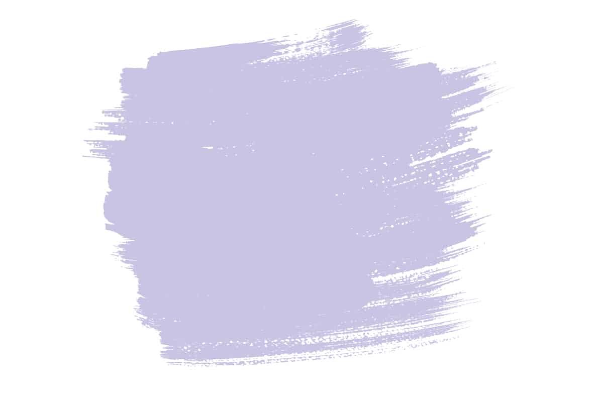
Light Purple- Hex Code #CBC3E3
Light purple is also known as ‘light pastel purple’ and ‘melrose’. It has a saturation of 36.4% with a lightness of 82.7%, giving it a pale and mellow look. Light purple has both cool and warm undertones, but it is predominantly a cool color, leaning more towards blue than red.
The overall effect is soothing and calming. In a CMYK color space, light purple is made from 10.6% cyan, 14.1% magenta, 0% yellow, and 11% black. In an RGB color space, it is 79.6% red, 76.5% green, and 89% blue.
Using Light Purple in Home Decor
Light purple is a really popular color to use in home decor because it is easy on the eye and has a calming effect. It can also feel quite refreshing, especially when used with cool shades of green such as mint.
Light purple will be a nice accent in a white room if you want to provide some interest and color while maintaining a fairly neutral atmosphere, or you can create spring vibes by using light purple on the walls with lemon yellow accents.
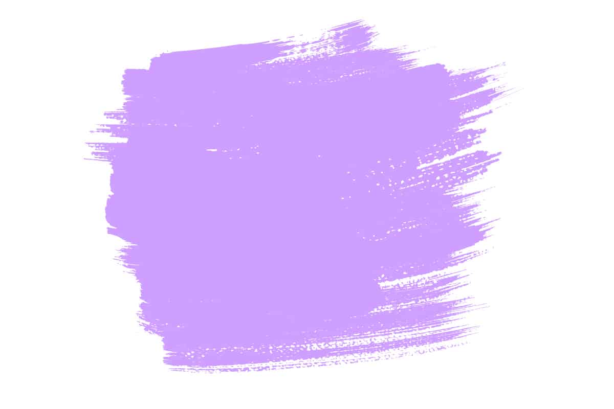
Light Violet- Hex Code #CF9FFF
Light violet is a medium to light shade of blue-purple, which reads as cool and youthful. In the CMYK color space, light violet is made of 18.8% cyan, 37.6% magenta, 0% yellow, and 0% black. In the RGB color space, it is composed of 81.2% red, 62.4% green, and 100% blue.
Using Light Violet in Home Decor
Light violet has a flirty and feminine feel, making it a nice choice of color in the bedroom. It will look crisp and fresh as an accent to cool off-white walls, and it can also be used to create a contrast with pistachio green or mint green.
Lilac- Hex Code #C8A2C8
Lilac is a light shade of purple that has a slightly pink undertone. The result is that the color comes across as more playful and feminine compared with other light shades of purple, such as lavender, which is more blue.
In a CMYK color space, lilac is made of 0% cyan, 19% magenta, 0% yellow, and 22% black. In an RGB color space, it is made from 78.4% red, 63.5% green, and 78.4% blue.
Using Lilac in Home Decor
Lilac is broadly associated with flowers, so it’s common to see this color in a floral or botanical-themed interior decor scheme. It has a lighthearted and easygoing nature and is symbolic of spring and new beginnings.
It can be used to create a soft atmosphere when paired with cream or pastel yellow or achieve a style-led space by contrasting lilac with sage green.
Mauve- Hex Code #E0B0FF
Mauve is a light shade of blue-purple, with a saturation of 100% and a lightness of 84.5%. It is named after the mallow flower and is linked to feelings of romance and nostalgia. In a CMYK color space, mauve is made up of 12% cyan, 31% magenta, 0% yellow, and 0% black. In the RGB color space, it is 87.8% red, 69% green, and 100% blue.
Using Mauve in Home Decor
Mauve works well with many other colors, including teal, mint, and salmon. Despite being a lighter color, it can look quite intense when used across all of the walls in a room, so many people who enjoy this color prefer to use it in smaller amounts, for example as curtains or cushion covers.
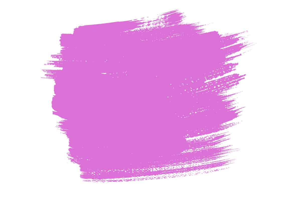
Orchid- Hex Code #DA70D6
Orchid is a pink-purple color named after the flower, and it has strong fuchsia undertones. It is a bold and confident shade of purple, with a saturation of 58.9% and a lightness of 64.7%. In the CMYK color space, orchid color is made of 0% cyan, 49% magenta, 2% yellow, and 15% black, while in an RGB color space, it is comprised of 85.5% red, 43.9% green, and 83.9% blue.
Using Orchid in Home Decor
Orchid has an exotic feel to it, making it well suited for use in a tropical-themed room or in a garden room. It pairs well with bright shades of pink for an analogous look, or contrast it with yellow-toned greens such as lime green for vibrancy or olive green for subtlety.
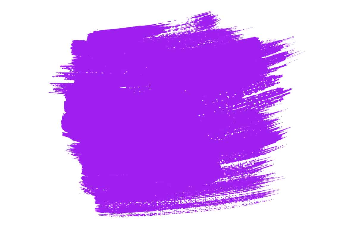
Purple- Hex Code #A020F0
The hex code for purple is #A020F0. It sits centrally between red and blue on the color wheel because it is a combination of both of these primary colors. In a CMYK color space, purple is comprised of 33% cyan, 87% magenta, 0% yellow, and 6% black. In an RGB color space, this color is made from 62.7% red, 12.5% green, and 94.1% blue.
Using Purple in Home Decor
Purple is a color that is synonymous with royalty, prestige, wisdom, and grandeur, so it can be used to invoke a sense of elegance when used in home decor. As quite a strong color, purple can be intense.
For this reason, it is best used as an accent color to add pops of vibrancy to a space. Add purple cushions to an emerald green sofa, or pair it with other jewel tones for a sumptuous look. Velvet is a texture that always looks decadent and regal in purple, so consider using this material if you want to create a luxurious vibe in your home.
