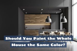
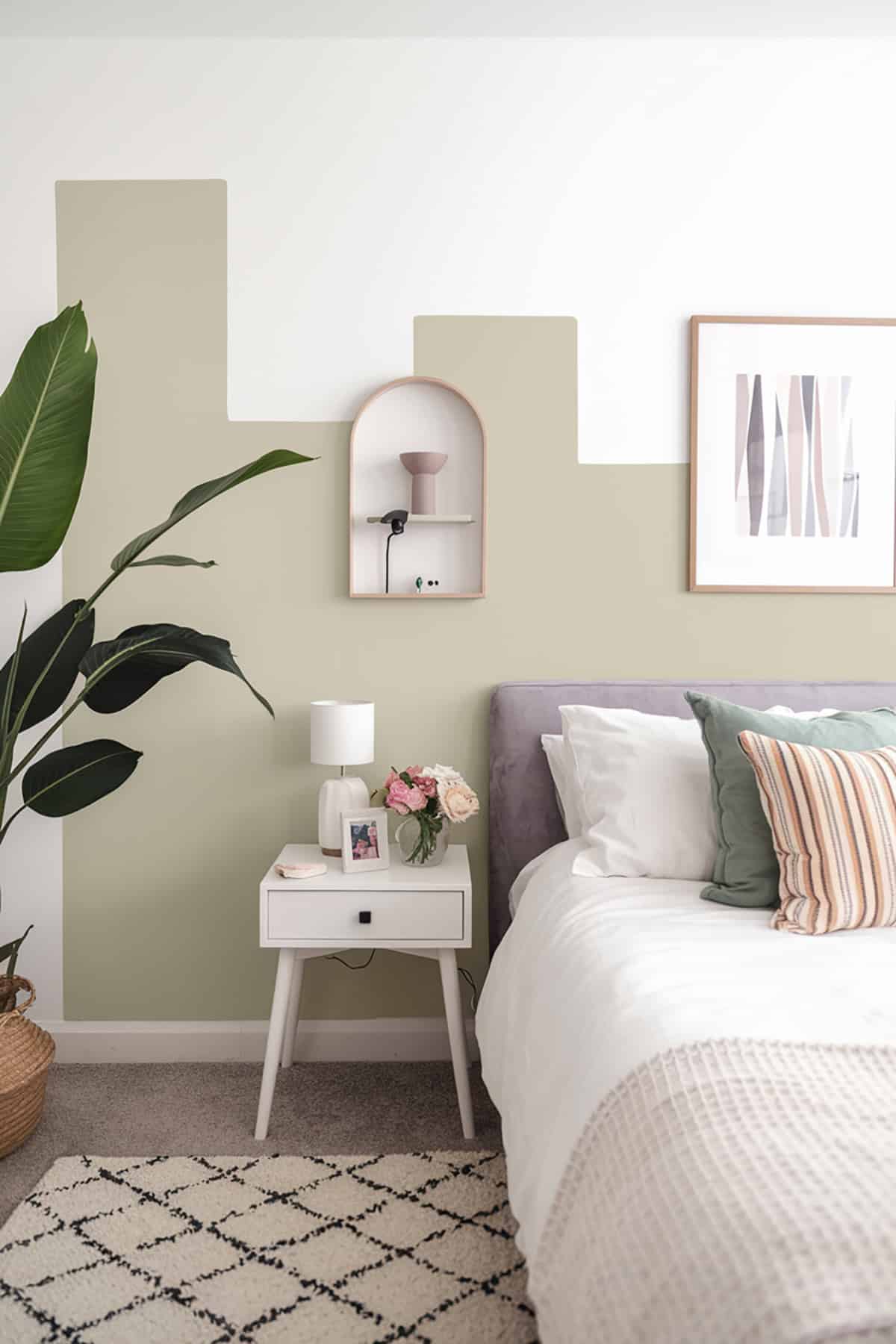
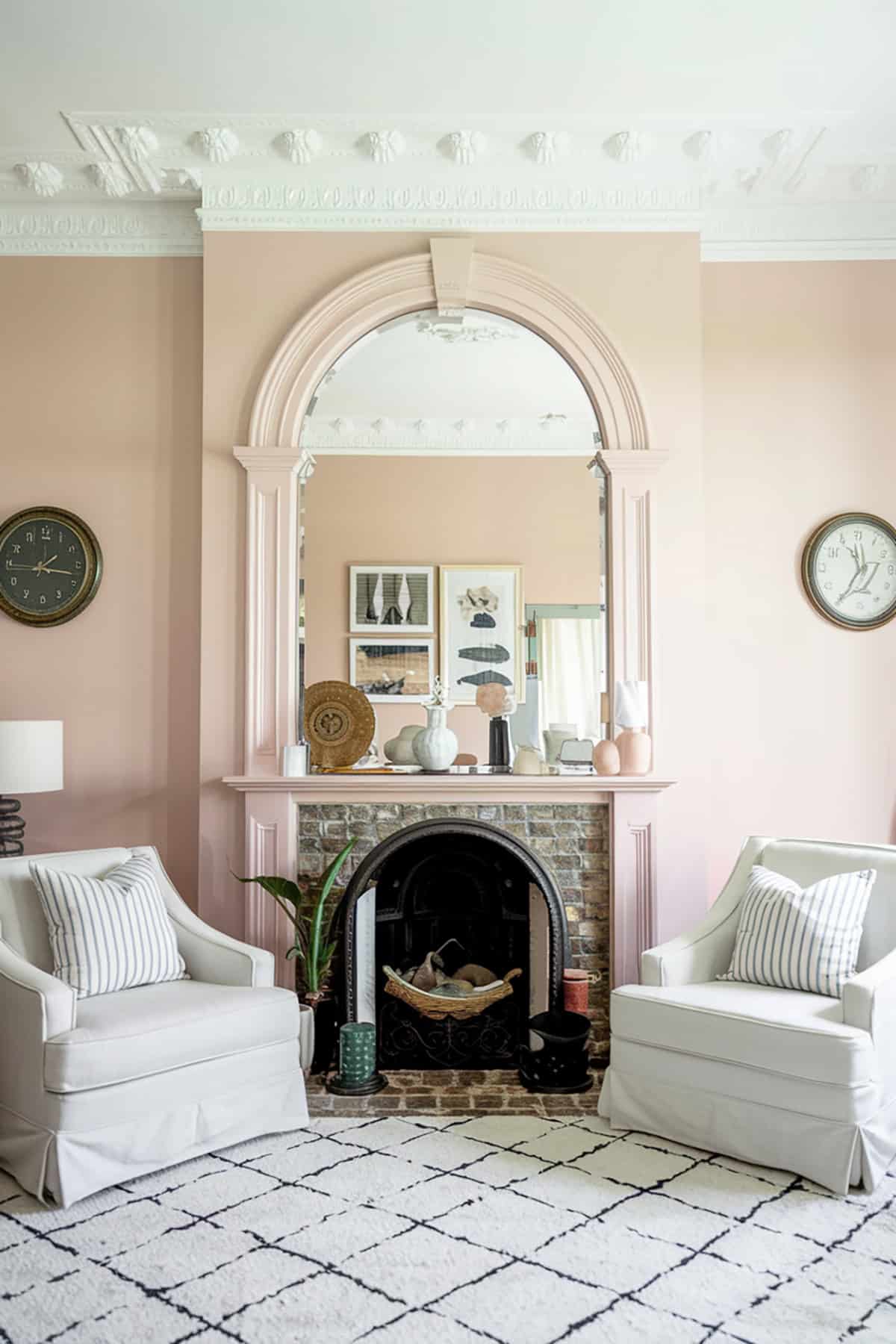
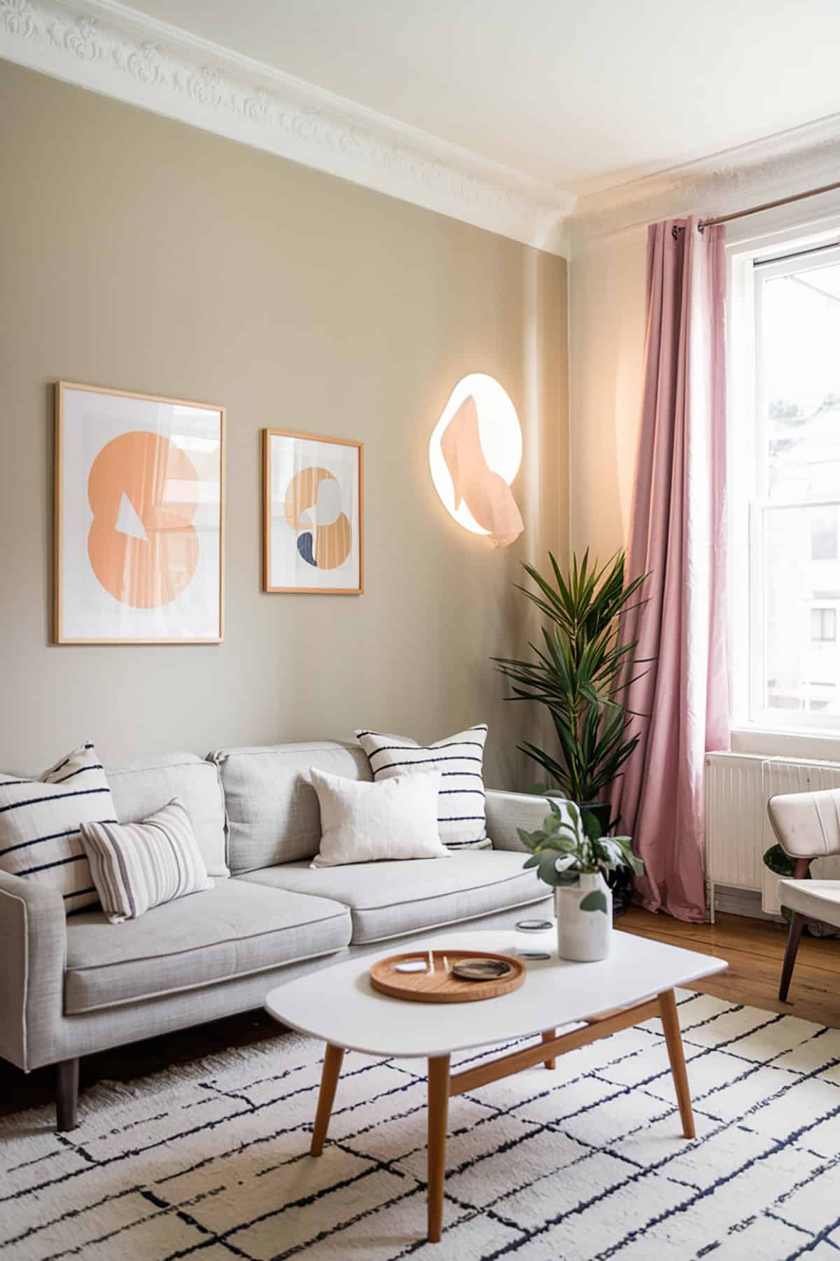
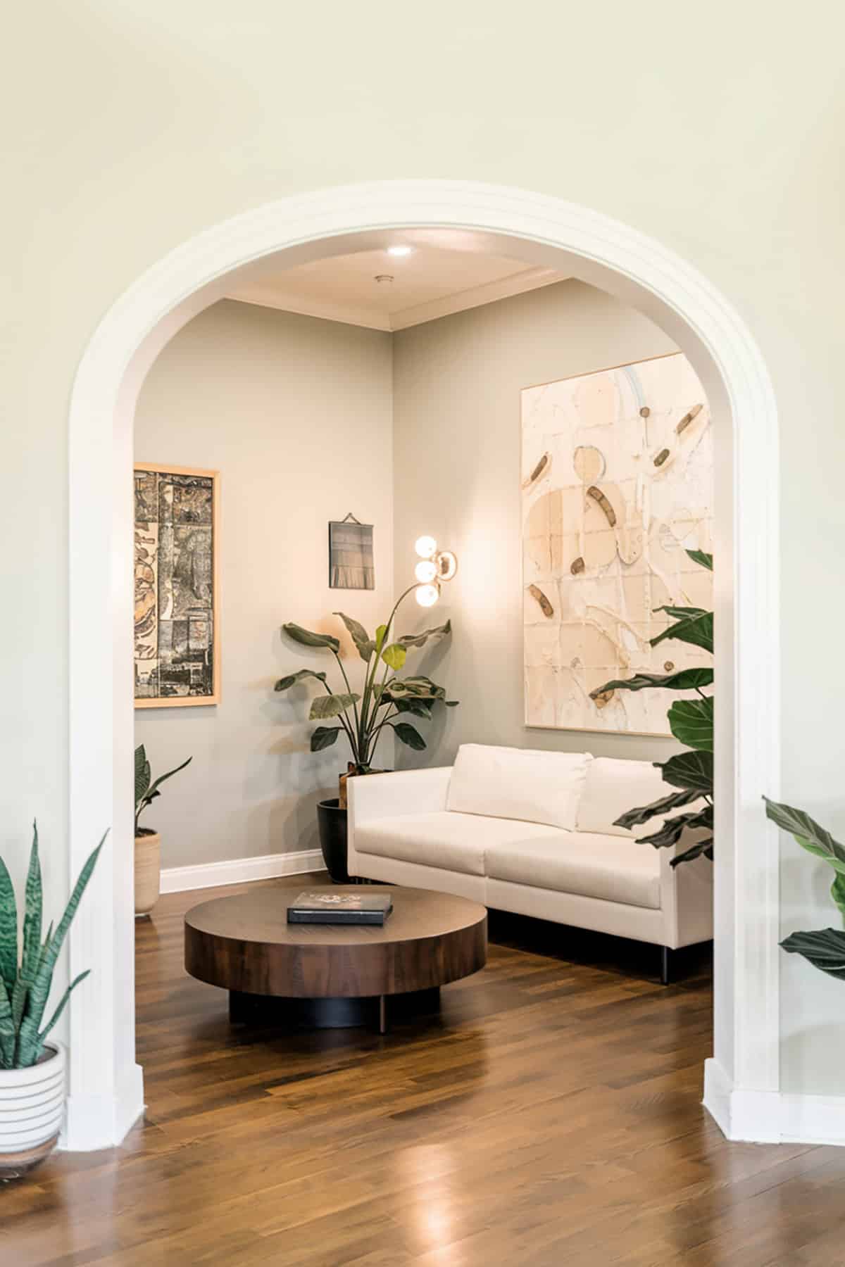
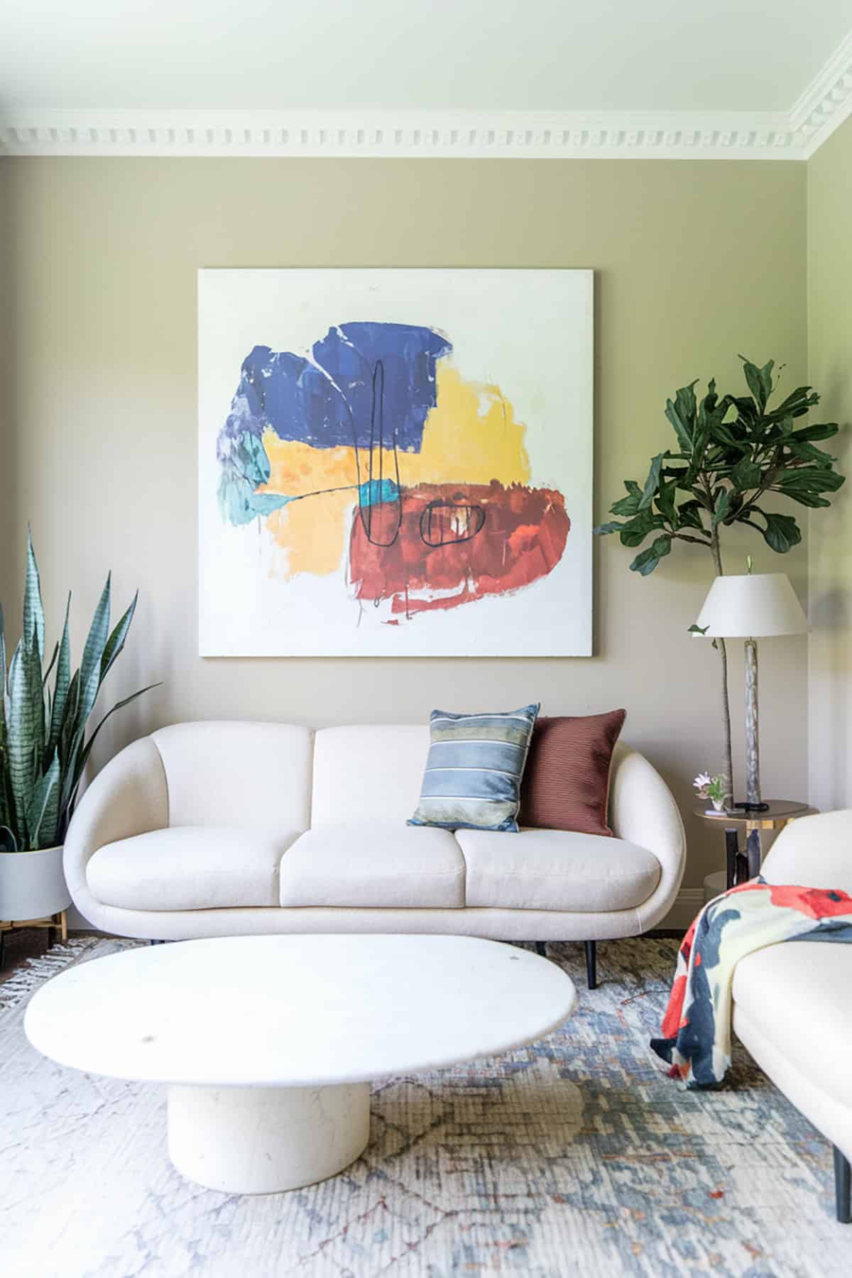
A new wall color can breathe fresh life into any room, but finding the perfect shade can feel like an endless search. Don’t worry, we’ve got you covered. From soft neutrals to vibrant hues, here are the best paint colors for interior walls that are guaranteed to create a space that feels just right.
Best Paint Colors For Interior Walls
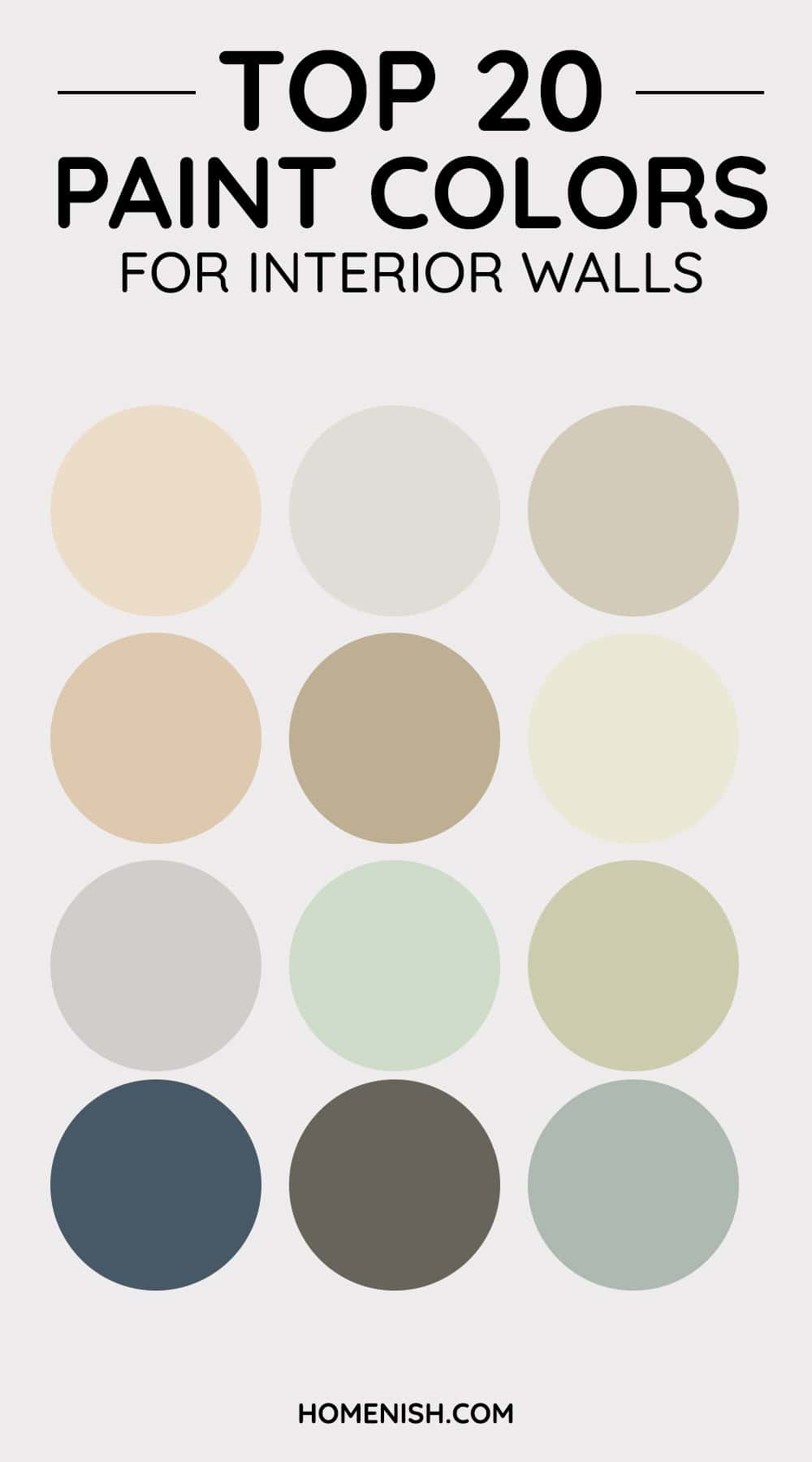
The right shade of paint for interior walls can create an inviting, calming, or invigorating atmosphere. Below, find a breakdown of popular paint colors from various brands like Sherwin-Williams, Benjamin Moore, and Farrow & Ball, each offering unique characteristics to enhance your interior design.
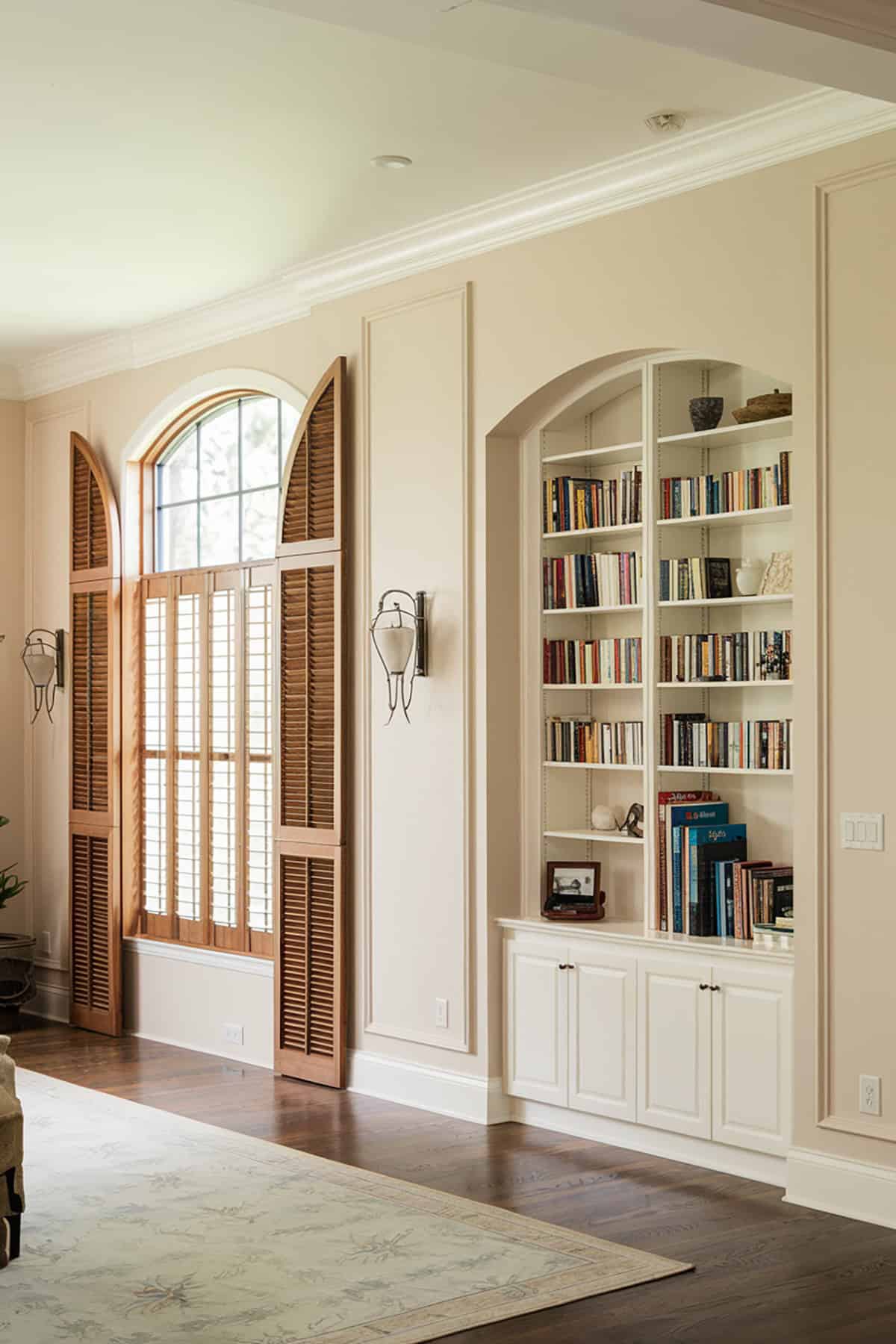
Off-White – Sherwin-Williams Alabaster (SW 7008)
Sherwin-Williams Alabaster is a versatile off-white shade. It offers a warm, neutral backdrop that works well in diverse settings. Its soft tones make a room feel cozy and open.
Alabaster can be paired with bolder colors for contrast. It’s ideal for creating a serene environment. Whether for living rooms or bedrooms, it complements various design styles. The subtle warmth ensures your space feels inviting without overwhelming the decor.
White – Benjamin Moore Chantilly Lace (OC-65)
Benjamin Moore’s Chantilly Lace is a classic white. Known for its crisp, clean appearance, it brings a modern vibe to any room. This shade reflects light beautifully, enhancing natural brightness and creating an airy atmosphere.
It’s perfect for minimalistic designs or highlighting architectural elements. The color’s simplicity exudes sophistication, making it a favorite for contemporary interior walls. Pair it with other neutrals or use it as a backdrop for vibrant accents.
Greige – Sherwin-Williams Agreeable Gray (SW 7029)
Agreeable Gray by Sherwin-Williams is a popular greige. It blends gray with beige, resulting in a neutral that suits many styles. This color adapts to lighting changes throughout the day, adding dimension to spaces.
Agreeable Gray is frequently chosen for its balance, neither too cool nor too warm. It works well for interior walls in large open areas or small intimate spaces. Pair it with both light and dark furnishings for versatility.
Warm Earthy Tone – Benjamin Moore Revere Pewter (HC-172)
Revere Pewter is another widely favored neutral for interior walls. This Benjamin Moore color offers a warm, earthy tone that’s adaptable to many settings. It brings warmth while maintaining a soft, understated elegance.
This shade works wonders in entryways and family rooms. It’s forgiving under different lighting conditions, ensuring consistency in appearance. Compliment it with white trim for a classic, timeless look that never goes out of style.
Warm Gray with Lilac Undertone – Farrow & Ball Elephant’s Breath
Elephant’s Breath offers a lightweight, warm gray with a subtle hint of lilac. This Farrow & Ball color is sophisticated yet not overwhelming. It’s well-suited for spaces aiming for a modern yet cozy ambiance.
It’s great for open-plan living areas or bedrooms. The undertones allow it to interact uniquely with furniture and light. It’s a shade that can stand alone or support more colorful accents, effortlessly working with various decors.
Creamy Soft White – Behr Swiss Coffee (12)
Behr’s Swiss Coffee is a creamy, soft white that envelops rooms in a warm glow. It’s known for versatility, often used in both traditional and modern designs. The hue lends a soothing quality, perfect for spaces requiring tranquility.
The shade pairs effortlessly with wood tones and other earthy elements. It’s often used in kitchens and bathrooms to create a clean, refreshing feel. Swiss Coffee has the ability to invite comfort while retaining a sense of contemporary elegance.
Neutral Beige – Sherwin-Williams Accessible Beige (SW 7036)
If you look for a good neutral paint color for interior walls, Accessible Beige from Sherwin-Williams is a go-to option. It brings warmth without overwhelming color. This shade is highly adaptable, shifting between beige and gray hues under different lighting.
It’s an excellent choice for creating a unified look throughout your home. Compliment it with white molding or dark wooden floors. This hue supports various design elements, allowing others to shine while offering a peaceful backdrop.
Soft Airy Greige – Benjamin Moore Edgecomb Gray (HC-173)
This Benjamin Moore favorite is perfect for those who adore neutral shades with warmth. Edgecomb Gray with its soft and airy greige offers an inviting quality that lends well to both public and private rooms.
Its adaptability allows it to complement many styles, from sleek contemporary to cozy traditional. The subtle warmth brings depth and character, making it a preferred choice for open living spaces and dining areas.
Green-Blue with Gray Undertones – Sherwin-Williams Sea Salt (SW 6204)
For a delicate green-blue with gray undertones, opt for Sea Salt by Sherwin-Williams. It evokes calm and relaxation, reminiscent of coastal retreats. This shade is popular for walls in bathrooms and bedrooms for its soothing effect.
The color works exceptionally well under natural light, enhancing its soft undertones. Pair it with white or muted neutrals for a serene palette.
Light Airy Blue with Green Hints – Benjamin Moore Palladian Blue (HC-144)
Palladian Blue offers a light and airy blue with hints of green. Benjamin Moore created a color that reflects the tranquility of the sea and sky. It’s a refreshing choice for living rooms or coastal-themed walls.
This hue instantly brightens rooms, adding a sense of calmness. Use it to create an inviting atmosphere in guest rooms. It pairs wonderfully with white trim and natural elements like wood or stone.
Green-Blue – Sherwin-Williams Rainwashed (SW 6211)
Rainwashed provides a peaceful mix of green and blue. Created by Sherwin-Williams, this shade invokes a sense of serenity and peace found in natural environments. It’s great for spaces needing a gentle, refreshing vibe.
Use Rainwashed in bathrooms, bedrooms, or kitchens. Its versatility allows it to complement various styles. When paired with light woods and textiles, it enhances the comforting aspect of the home.
Balanced Gray with Warmth – Benjamin Moore Gray Owl (OC-52)
Benjamin Moore has crafted a neutral with a hint of warmth that adds sophistication without overstatement. Gray Owl performs well in both modern and traditional spaces.
The color is perfect for creating a backdrop that allows other elements to stand out. It’s frequently used in bedrooms and living areas. Gray Owl maintains its neutral appeal under many lighting conditions.
Navy Blue – Sherwin-Williams Naval (SW 6244)
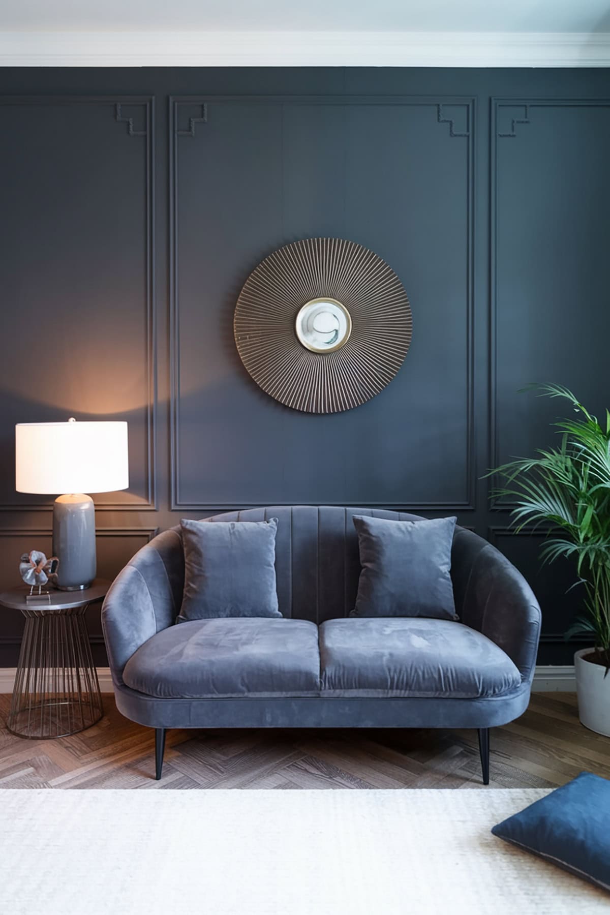
Naval is a bold and striking navy blue. Sherwin-Williams brings a color that delivers both drama and elegance. Suitable for interior walls, accent walls or entire rooms, it creates an atmosphere of depth and luxury.
Pair it with white or gold accents for a classic nautical look. This shade can transform a space into an elegant, sophisticated haven. It’s a timeless choice that adds character to both modern and traditional interiors.
Rich Deep Blue – Benjamin Moore Hale Navy (HC-154)
With a rich, deep blue tone, this Benjamin Moore color is versatile, working as both a backdrop and a standout shade. It’s perfect for interior walls, creating an accent or bringing a touch of elegance to cabinetry.
This deep, bold hue pairs beautifully with lighter neutrals. It provides a modern, classic feel, suitable for libraries, dining rooms, or entryways. Hale Navy adds depth without overwhelming the senses, striking a fine balance in interiors.
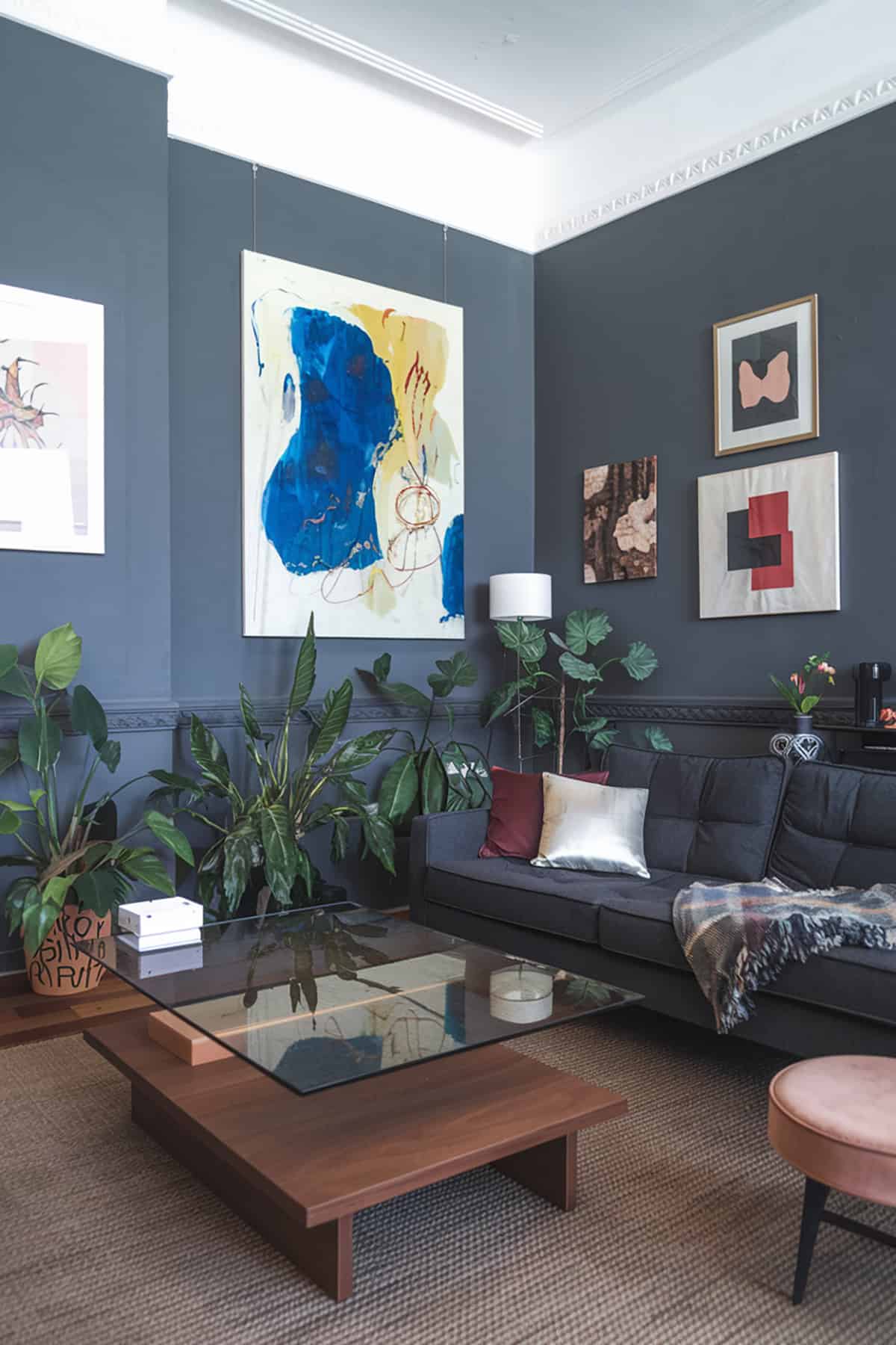
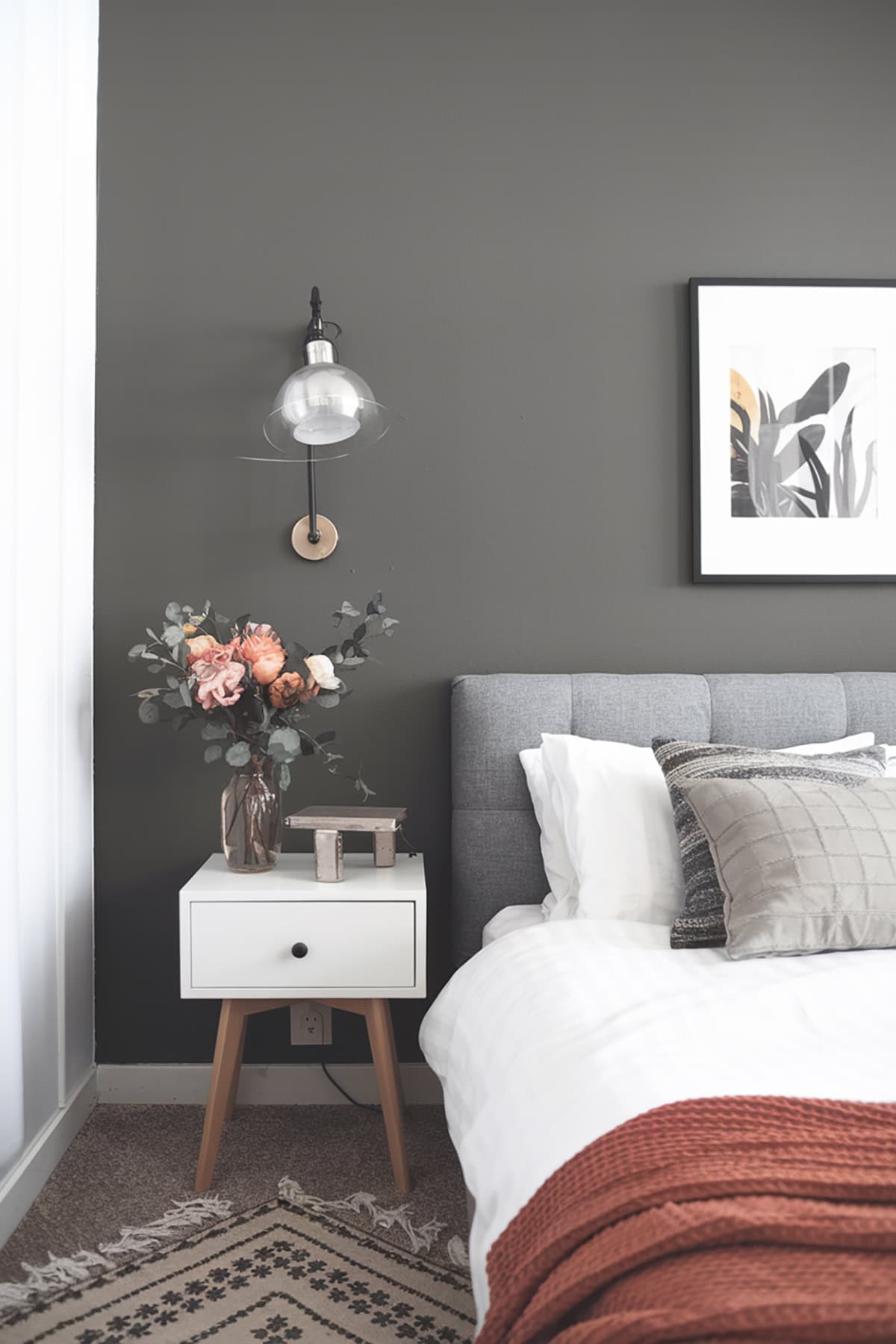
Moody Gray-Brown – Sherwin-Williams Urbane Bronze (SW 7048)
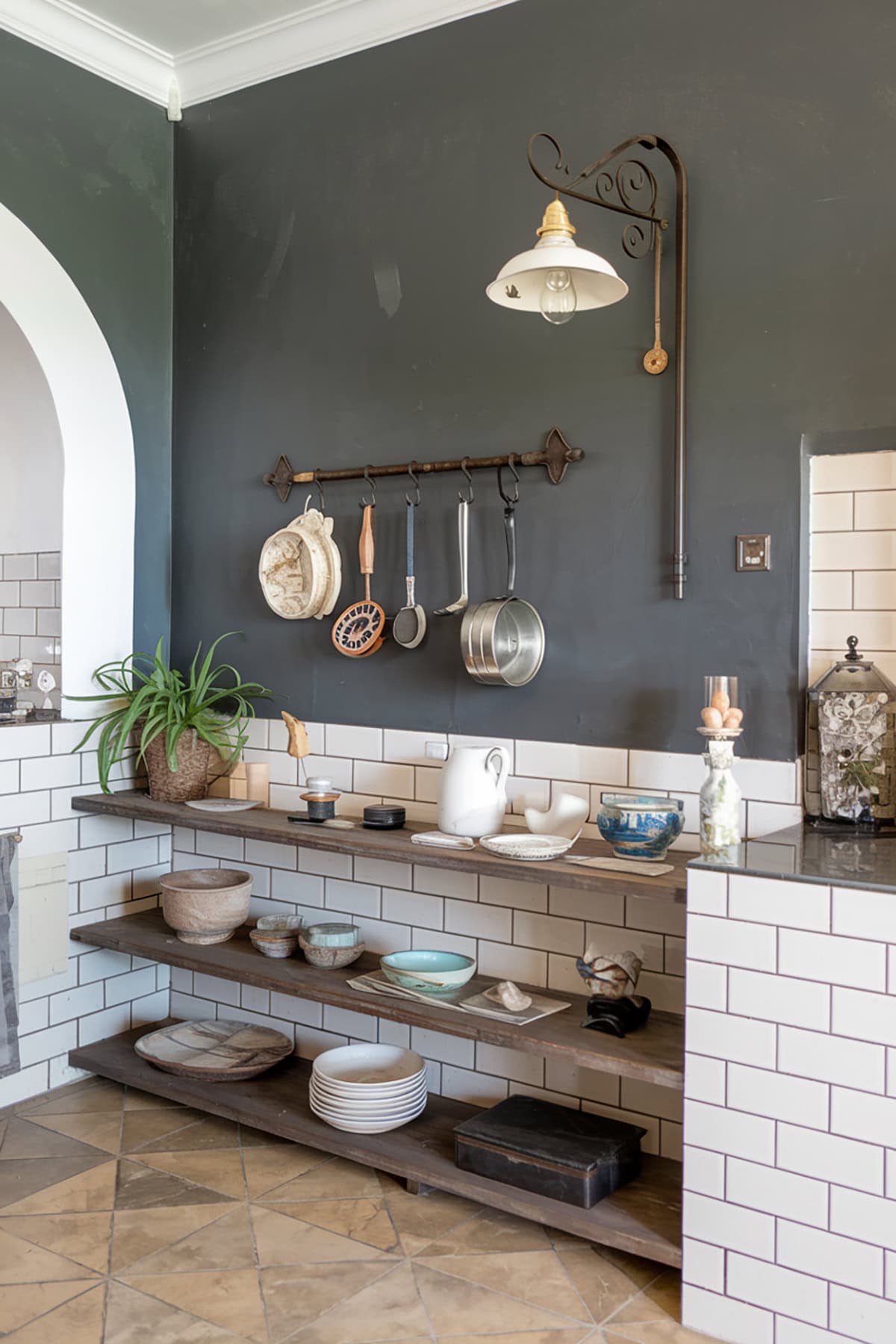
The moody gray-brown of Sherwin-Williams’ Urbane Bronze evokes warmth and earthiness so it brings a grounding element to interiors. The shade finds favor in spaces aiming for a cozy yet modern vibe.
Use it for a feature wall or a complete room transformation. It’s especially effective in rooms with ample natural light. Urbane Bronze works well with metallic accents, creating an industrial chic aesthetic. It’s a warm, welcoming choice for any space.
Deep Rich Gray – Benjamin Moore Kendall Charcoal (HC-166)
Kendall Charcoal provides a deep, rich gray with character. This Benjamin Moore shade is sophisticated and versatile, perfect for accent walls or cabinetry. It’s a grounding choice for interiors aiming to add drama and depth.
Combine with light colors for contrast and balance. Kendall Charcoal is suited for both modern and traditional designs, offering timeless appeal. It works well in living rooms, dens, or as an exterior paint choice.
Soft Green with Gray Undertone – Sherwin-Williams Evergreen Fog (SW 9130)
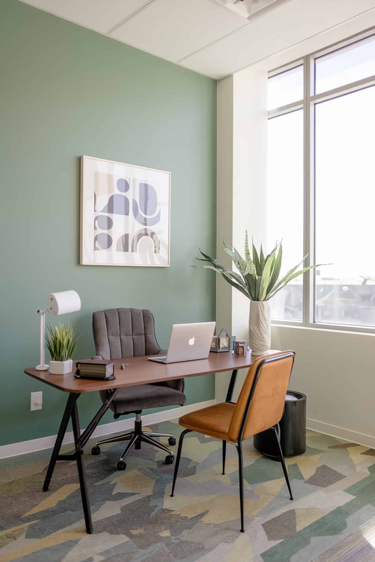
Sherwin-Williams designed this soft green with a gray undertone to bring a sense of renewal and tranquility. It’s subtle and works in both contemporary and nature-inspired interiors.
Use it in living spaces or bedrooms to create a refreshing environment. Its neutral nature allows it to pair with other earth tones or whites. Evergreen Fog adds an organic touch, perfect for bringing nature indoors.
Gentle Quiet Green – Benjamin Moore October Mist (1495)
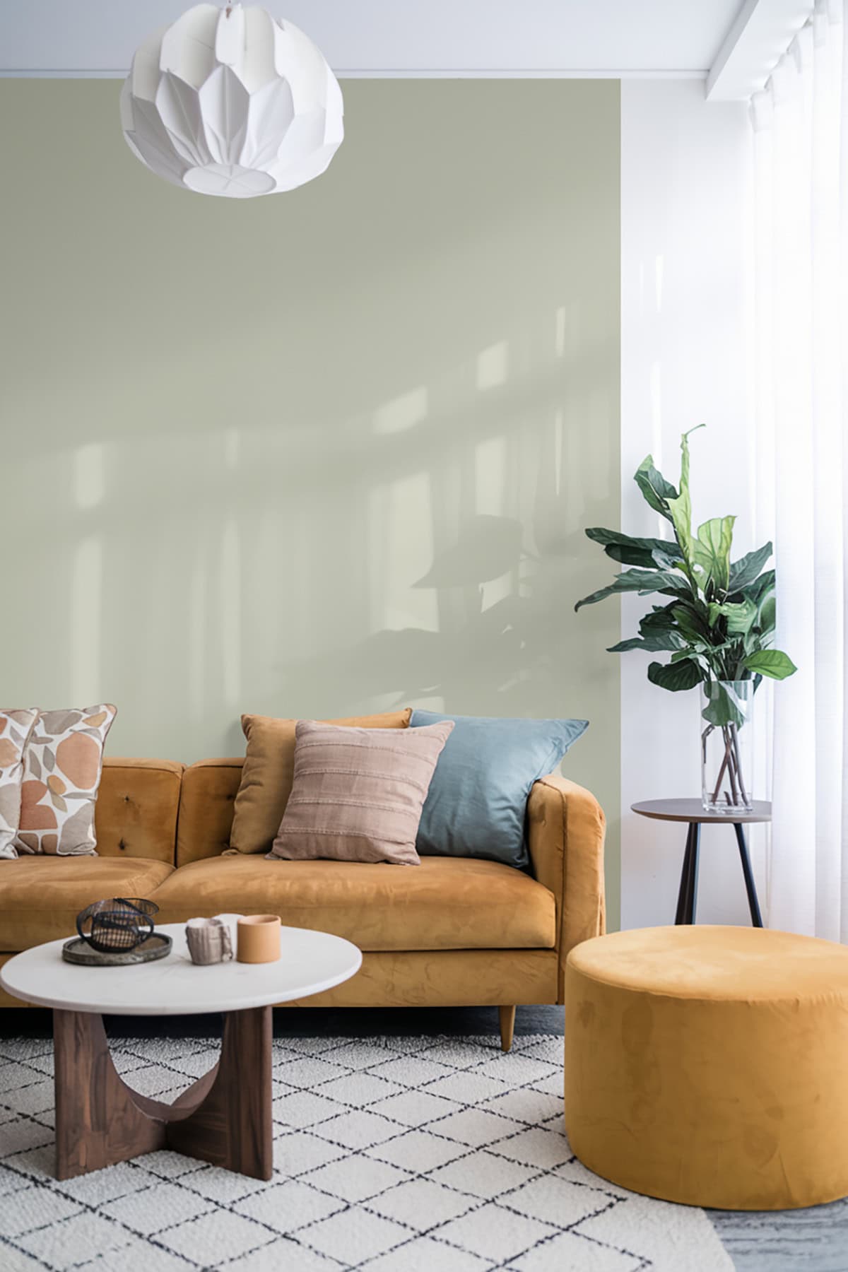
This shade from Benjamin Moore draws inspiration from nature with its gentle, quiet green, which adds freshness to interiors
Suitable for kitchens and living areas, it complements a variety of styles. This shade adds understated elegance and pairs well with both light neutrals and darker wood tones. October Mist functions well as a main color or accent, supporting diverse decor choices.
Rich Green – Farrow & Ball Sap Green
Farrow & Ball Sap Green brings a touch of the outdoors inside, creating a serene and welcoming space. Best for study rooms or dining areas.
This color adds character without overwhelming the senses, perfect for traditional and contemporary designs. Pair it with muted tones for balance. Sap Green’s charm is its ability to adapt while maintaining an original, timeless quality.
Deep Calming Green – Sherwin-Williams Forestwood (SW 7730)
Forestwood is a deep, calming green by Sherwin-Williams. It channels the essence of nature, offering depth and richness that enhances any room. Ideal for accent walls or as a primary color in rooms seeking coziness.
Use Forestwood in dens, studies, or bedrooms for a calm retreat. Its ability to pair with neutrals or other greens makes it versatile. This hue creates a warm and harmonious atmosphere perfect for relaxed, inviting spaces.