Home design & decorating tips about architecture, color schemes, paint colors, interior styles, and so on.
Decorating
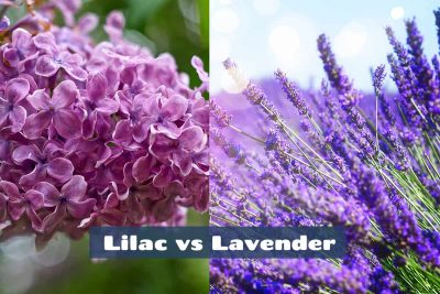
While many people mistakenly assume that lilac and lavender are interchangeable, they actually have subtle differences that mean they can create totally different responses and atmospheres.
Rustoleum offers a number of fast-drying paints that are touch-dry in as little as 30 minutes. In this article, we take a closer look at the drying time of different types of Rustoleum paints.
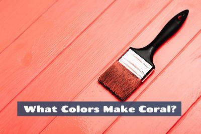
Coral is a vibrant and playful color that’s essential for any summery color palette. It is a cross between orange and pink, and can be used to contrast against cool tones or add personality to neutral color palettes.
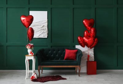
Red is a bold and vivid color that can be used in various ways to sybolize different meanings. The colors used alongside red will have a large impact on how the mood of red is perceived, for example when red is paired with green it will look festive, while red paired with pink will look flirtatious or romantic.
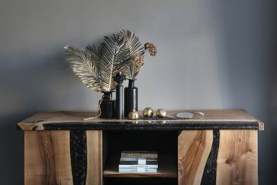
The meaning of gold and its link to glamor and decadence makes it a good choice for creating a luxurious style in fashion and home decor. Here we explore the psychology and meaning of gold and look at the ways this can be implemented into interior design color schemes to achieve a sense of wealth.
The term ‘accent color’ is thrown around liberally in the world of home decor and interior design, but have you ever stopped to think about what it really means? Accent colors are hues used to draw attention to, or contrast against, certain items or colors, but there’s so much more to learn about accent colors. Here we explore exactly what accent colors are, how to choose accent colors, and how to use them in the home.
The Art Nouveau movement continues to inspire modern interiors, over 100 years after it was first created. This is a look the feels effortlessly elegant, with a strong tie to the natural world which helps us to feel comfortable and grounded.
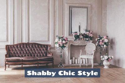
The shabby chic look is a favorite among homeowners and designers alike for a whole host of reasons, including the fact that it is so easy to achieve on a wide range of budgets. Here, we explore exactly what shabby chic style is, what the key elements of this look include, and how to create a shabby chic style in your home.
White is a true neutral color since it lacks any other hues. It is broadly considered to be the color of purity and innocence, and it can help to brighten up any color scheme. Here we explore the meaning of the color white and explain the best way to use white shades in interior design.
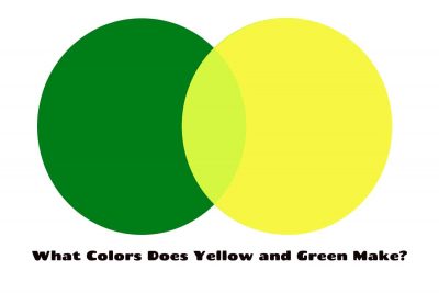
Yellow-green is a tertiary color that you will get when you mix yellow and green together. This color can also be referred to as ‘chartreuse’.
Iridescence can be a tricky concept to come to terms with, but it’s actually very easy to incorporate into a home decor style.
Ivory is a warm neutral that makes a perfect base for so many color palettes, but it can also be used effectively as an accent shade. Here we explore exactly what color ivory is, how to make it, and how to use it in home decor.
