Home design & decorating tips about architecture, color schemes, paint colors, interior styles, and so on.
Decorating
‘Perfect Greige’ is a paint color by Sherwin Williams which encompasses the best attributes of both gray and beige. This is an enormously popular color that is used to achieve a sophisticated balance between warmth and elegance. If you want to incorporate greige into your home, consider these colors that will go well alongside it.
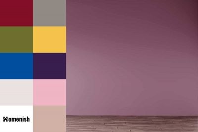
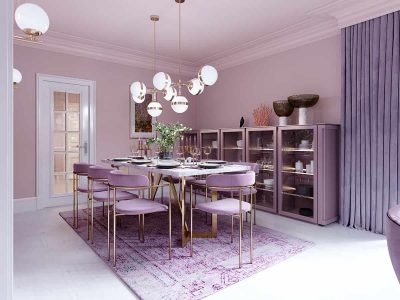
Mauve is a dusky shade of pale purple, which is great for spaces where you want to achieve a soft and feminine look without being overly frilly and girlish. Mauve provides a nice balance between vintage and modern, which means it can be used in a variety of different decor styles. Here we will look at some of the best colors that go with mauve.
Lilac is a color that is named after the pink-purple bloom of the same name, though it is considered to fall under purple more so than pink. Lilac is not a bright or strong shade of purple, but it is not light or pale either. It is darker than lavender and has less of a blue-gray tone than this other popular purple shade.
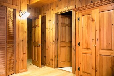
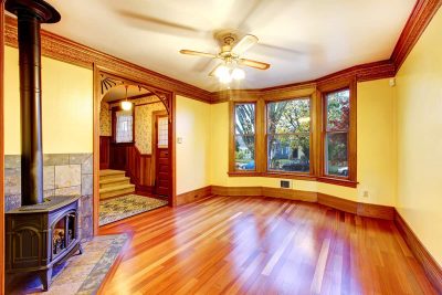
Whether you have inherited knotty pine furniture or moved into a home with knotty pine paneling or flooring, you might be wondering how to pick a color palette that will complement this traditional finish of wood. Knotty pine has been popular in interior design for many decades and is still favored as a decor finish because of its rich, warming honey-like tones. Here we will look at which colors you can use with knotty pine to achieve a variety of different styles.
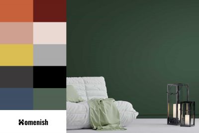
Forest green, as you might expect from the name, is an earthy color found in natural environments. It is a mid-colored green with similar tones to hunter green, but not as deep or dark. This is a color that can work well as the main wall color in a room, and it also works well as an accent shade.
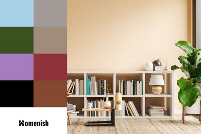
Cream is a warm neutral shade that is made by mixing white with a very small amount of yellow. As a neutral shade, you might expect that cream will work with any other color, and while this is technically true, there are some shades that will bring out the best in cream. Here we will look at some of the best colors to pair with cream to achieve the mood and style you’ve been looking for.
Gray is an enormously popular color in interior decor whose reputation has rapidly been transformed from that of a dull and drab color to a highly sought-after color that is used to create sleek, cozy, or ultra-modern styles.
In the past, white has been the standard color for trim, and people have put very little thought into what to do with their trim from a decor point of view. Leaving the trim in its natural wooden state with a layer of varnish to protect it has also been a popular option in years gone by; however, painting trim in a colored paint is a trend that has been gradually taking off, and we are now seeing homes with trim in all sorts of shades. Here we will look at some of the best paint colors for trim and what wall colors to pair it with.
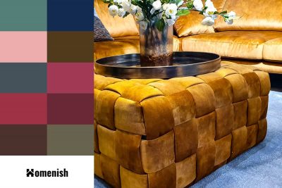
Mustard yellow is a dark shade of yellow with rich brown undertones. It is named after the culinary mustard of the same color. Yellow is generally thought of as an uplifting and joyous color, and mustard also carries these traits but in a more subdued way. Mustard yellow is positive and inspiring while also being deep and warming.
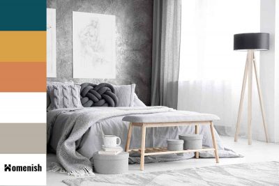
If you’re considering painting your nursery in gray, then you’ll be pleased to know that this is still a very stylish color option for a baby or child’s room, and it offers several benefits. Here we will look at the best shades of gray paint available that will work well in a nursery, as well as the colors that will work well alongside gray shades, and how to incorporate them flawlessly into a nursery for the dreamiest result.
Black has long been thought of as a classic and elegant color in fashion; just look at the little black dress or tuxedo suits. However, in homes, black is often considered an oppressive or gloomy color. We have also been taught for many years that dark interiors will make a room feel small and claustrophobic. Since we have faced decades of white, pale, or brightly lit interiors, people are now finding themselves drawn to darker shades, and an interior design revolution has occurred where darker colored walls and furnishings are highly sought after.
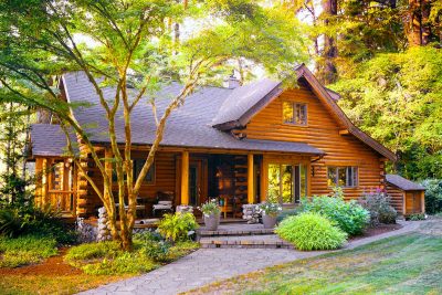
If you have recently built your ideal log cabin in your garden or purchased one as your weekend retreat, then you should think about the best paint color for the exterior. There are so many stain options to choose from when looking to give your log cabin a fresh coat of paint. Whether you want to enhance the natural beauty of your wood cabin by applying natural wood stain, or you want to brighten up the exterior by painting it an attractive color, we have some excellent suggestions for log cabin exterior paint colors as well as simple instructions on how to paint this wooden structure.