Home design & decorating tips about architecture, color schemes, paint colors, interior styles, and so on.
Decorating
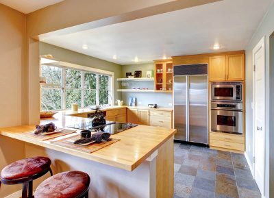
Maple kitchen cabinets were a popular choice for several decades due to their warm honey tones and medium shade that meant they felt inoffensive and easy to live with.
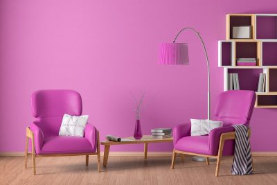
Fuchsia is a bright shade of pink, which is achieved by mixing purple and red together. Many people think of this color as being the same as magenta, and while it does have a lot of similarities, it is distinctly more purple than magenta, while magenta leans more towards red. Fuchsia is a vivid and energizing color that can be used in interior design to create a sense of fun or femininity.
Brass and gold are both finishes for metal that are commonly found in homes, typically on light fittings and ornaments, but also for plug sockets, door handles, and light switches. If you are trying to decide between these two finishes for decor in your home, then it can be useful to understand the differences in order to make the right choice for you. Here we look at what defines brass and gold from each other, as the two can sometimes be confused.
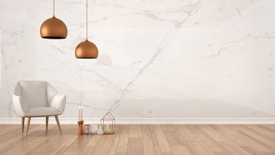
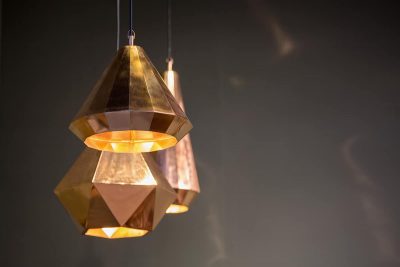
Copper is a metallic orange-gold shade that has exploded onto the interior design scene in the last few years, with a popularity that seems to be unwavering. This color has a warming effect while exuding luxury and glamour, making it suitable for use in any room in the home.
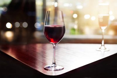
Merlot is a deep shade of red that is named after the French wine of the same name. The color merlot can come in several variations, from dark cherry red to a more richly purple color similar to eggplant. Most commonly, the color of merlot sits somewhere between the two, as a shade of red with distinctly purple tones.

Home decoration serves a special purpose as it emits a sense of positive feeling as we enter our home. This is why it’s important to show your personality by conveying liveliness. One such style that can achieve this is the Jamaican themed home decoration. By taking some inspiration from this Caribbean style home decor, you’ll be able to energize your interior and your life!
If you have chrome accessories or fittings in your home, check out this guide to find out what colors go best with chrome and how to incorporate chrome furnishings into your home for an impressive style.
As a neutral color, ivory will work with pretty much any other color you decide to put it with; however, there are a few colors that really go perfectly with ivory, and these color combinations are fool-proof for creating a stylish and appealing home interior.
Mint green is a fresh shade of green that can be both cooling and soothing. It is the epitome of spring and so can serve to make an interior space feel revitalized and vibrant. Mint green is a surprisingly versatile color that can work well in a wide range of color schemes as both an accent or primary color. This is a shade that is great for inspiring vintage or art deco styles, but equally, it can be utilized in more modern and contemporary interior themes.
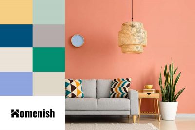
Here we look at the best colors that go with peach, particularly with reference to using peach as a wall color or an accent color in interior design.
Bronze is a dull metallic shade that traditionally was made as a metal material by mixing gold with tin. The resulting color that we know as bronze today lies somewhere between brown and orange, with significantly fewer yellow hues compared to gold. This is a good choice of metal for fixtures and fittings if you want a warm metallic color but find gold to be too showy or brash. Here we look at some colors that work well with bronze.
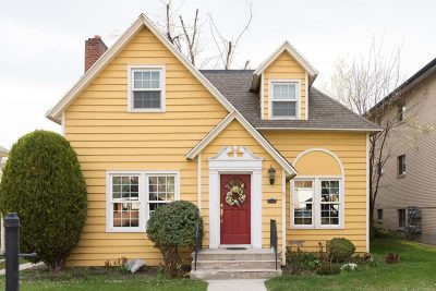
While yellow may not be the first color that people consider for their home’s exterior, it is in fact a warm and cheery hue that goes very well with many other color schemes. When you have a yellow house, there are tons of accent color palettes to pair with it.