Home design & decorating tips about architecture, color schemes, paint colors, interior styles, and so on.
Decorating
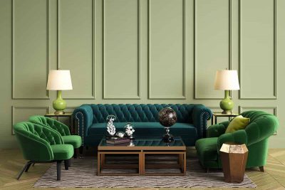
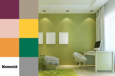
Green is a really versatile color because it can read as a neutral in some color schemes, or it can work as a bold and impactful color to make more of a style statement. Green is most commonly a cool color, but some shades of green have elements of brown that give the color a warmer temperature and therefore change the atmosphere that it will create in a room.
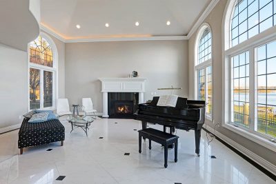
A large home that boasts an open-plan room with high ceilings is a great place for entertaining visitors or getting cozy with your family. Choosing the best paint colors for the tall walls and high ceilings can create the perfect focal point. Painting large rooms may not be an easy task, but with endless paint color possibilities, you might not know your best options. If you want to keep your large room bright and airy, you should opt for relaxing and soft hues.
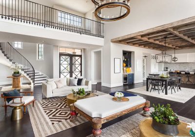
Decorating your house so that each room feels connected will create a harmonious feel throughout the property. This doesn’t mean that each room needs to look the same, or even that it has to have the same color scheme, but there should be elements in each area of the home that match or coordinate so that the space doesn’t feel disjointed, like an unconnected series of small rooms.
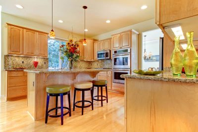
Maple wood is popularly used for making furniture, as well as kitchen cabinets and countertops, and it is also widely used for hardwood flooring. It has many beneficial qualities that make it an excellent choice for use in home decor. For example, it is hardwearing, long-lasting, and typically reasonably priced. Maple wood is favored for its pale creamy color, though it can also have a red-brown tinge.
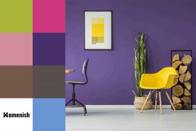
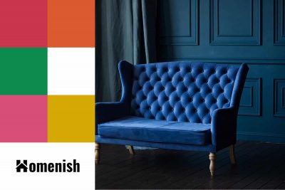
Purple and yellow are two colors that are often paired together because they are contrasting colors. This means that they sit opposite each other on the color wheel, and as such, they are able to provide balance together, as well as make each other appear more vivid.
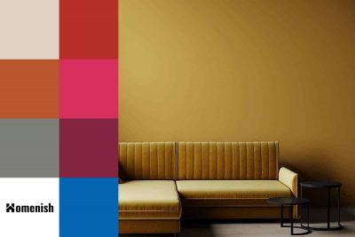
Ochre is often confused with mustard yellow, but while mustard is a dark shade of yellow, ochre is a dark orange-yellow. It can have varying levels of orange or yellow tones, which can affect which colors it will go best with.
Moss green is an earthy shade of green that has components of brown and yellow. It is named after the ground-level plant growth that covers the earth in lots of different environments around the world, which makes it a particularly good color for using in interior design styles based around natural and botanical themes that have risen in popularity over the last few years.
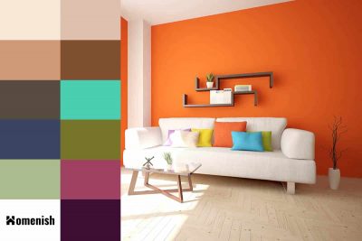
Burnt orange is a deep and dark shade of orange that is achieved by mixing bright orange with brown. It is not as bold and cheerful as bright orange, but it maintains a warm and positive feel and is still very vivid.
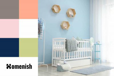
Baby blue is a soft shade of light blue that has long been associated with the arrival of baby boys. It is commonly used as a paint color in nurseries, and you will also see it making plenty of appearances at baby showers and christenings for baby boys. However, this is a color that can be a wonderful addition to many different styles of interior decor, so don’t dismiss it as a color only associated with newborns.
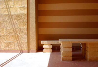
Sandstone is a type of natural rock that is commonly used as a building material for both interior and exterior decor. Slabs of sandstone can vary in color, including yellow, tan, orange, brown, and gray, as a result of the natural impurities within the minerals it contains. However, when sandstone is used for its ornamental value, it is typically a soft golden color that has cream or buttery yellow tones.
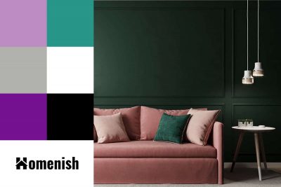
Pink and green is one of the standout color schemes that has been trending in interior design over the last two years, and it is showing no signs of fading. These colors complement each other so well in terms of the atmosphere they create and the feelings they elicit.
Indigo is a dark shade of blue that is most commonly associated with the much-loved blue jeans. However, this is a color that is popular in all areas of design, from fashion through to interiors. Indigo has an interesting history that saw it go from being originally associated with royalty and nobility to modern times, where it became a color more commonly linked to the working classes.