Explore popular colors that are used in home decor and ways to pair colors together with our in-depth ideas and tips
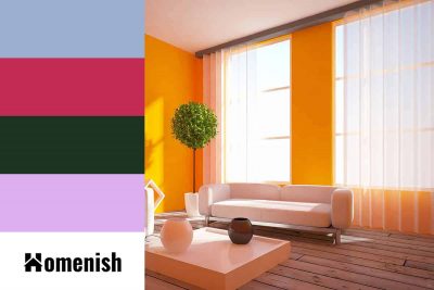
Bright orange is a vivid enthusiastic shade of orange that emits energy and tropical sunny areas. Let’s dive deep down into the bright orange color, some of its popular colors, and colors that go well with bright orange.
Walnut wood is known for its durability, shock resistance, and strength. As one of the most popular woods used to make furniture in the US, the color of walnut is much loved and used in many projects. In this article, we’ll cover what walnut color is, what walnut similar colors, and how to pair it with other colors.
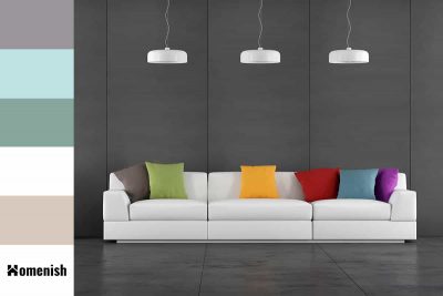
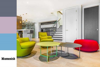
Slate can be gray, blue, dark red, brown, purple, and even black depending on where it is formed but the most common color of slate is gray. The slate color mostly refers to the slate gray color. Keep reading to learn more about what slate color is, similar colors, and colors to pair with slate. Keep reading to learn more about what slate color is, what it represents, and colors to pair with slate.
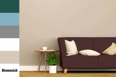
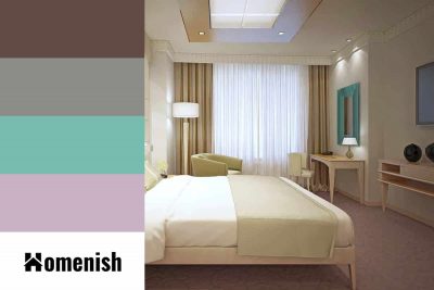
Brown by nature is a neutral shade, but it can be very well mixed with other undertones for the desired deepness. Expresso is a very dark shade of brown, similar to the roasting coffee beans which was then ground to make espresso. Like the strong flavor of espresso, expresso emits a powerful and secure vibe. Keep reading to learn what this color is, what it means, and how to pair with it.
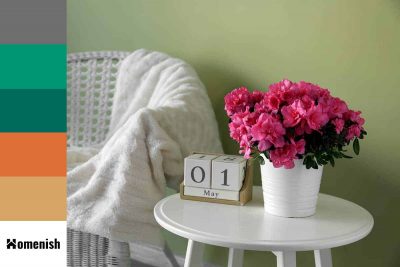
If you love roses, you might have been dazzled by the Azalea plant. Their pink shade brings a romantic and powerful feminine vibe to the atmosphere. If you like to learn more about Azalea pink, what it represents, some similar colors, and colors to pair with this color, read on.
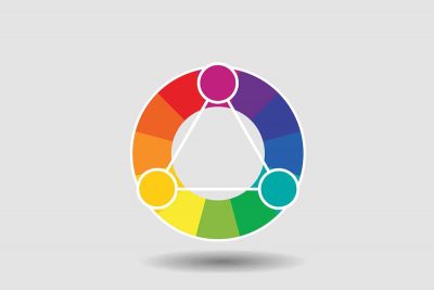
If you want to take out of the guesswork of selecting colors for your home project, you can choose some proven color schemes from the color wheel. We already discussed the analogous color scheme; so in this article, we’ll go into details about the triadic color schemes as well as give you some tips on how to make the best use of them in home decorating.
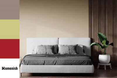
Ecru, which is a shade of beige color, comes from the French word “écru” meaning “unbleached. As a nearly neutral shade, it works fairly well with many colors. In this article, we’ll explore what ecru color is, what it means, and some colors that match with ecru.
Chartreuse, which is used as a herbal liqueur and for making cocktails, is an attractive green color with yellow undertones. Let’s discover what this color means, some similar colors, and how to use it for great effects in your home.
Learning how to pair colors is an art that each of us should know. They will come in handy greatly when you want to match clothes and decorate your homes. One of the most popular color schemes is the analogous color scheme. In this article, we’ll explore what it is and how to use it in decorating.
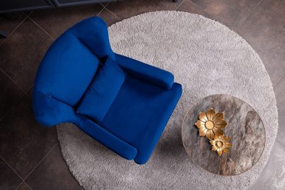
Sapphire blue is a heavily saturated blue color that is named after the gemstone of the same name. This color is darker than royal blue but not as dark as navy blue. It is currently an extremely popular shade in interior design and is being used in a wide range of styles.
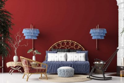
Red has been an intense color tone and one of the most popular and saturated of its shades is cherry red. Learning the right use of cherry red will improve the aesthetics of your home and your life quality. Here we’ll learn all about cherry red, how to use and pair it in your home.
Crimson is a bright shade of red that is synonymous with love, passion, and affection. It can also be considered a brutal or violent color since it is the same shade of red as blood. It is widely used in interior decoration during the holidays as it is a color traditionally associated with festive celebrations.
