Explore popular colors that are used in home decor and ways to pair colors together with our in-depth ideas and tips
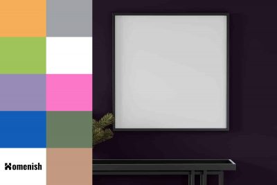
Eggplant is a deep purple color with brown undertones, named after the skin of the eggplant vegetable. It is also known as aubergine, since the eggplant is called aubergine in some regions. As a shade of purple, eggplant is associated with the same qualities as purple, such as luxury, nobility, and wealth. It works well with so many shades, as despite being quite dark, it is not heavily saturated and produces a muted look.
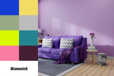
Light purple is not a color that you might instantly think of when decorating a room unless that room is a nursery for a baby; however, this is a versatile color that can make any room feel refreshing or soothing, and it works well with a variety of different shades. Here we look at some of the best colors to pair with light purple in home decor.
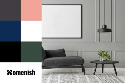
Light gray is a color that is achieved in its truest form by blending a small ratio of black with a large ratio of white. When it comes to wall paint, light gray is rarely presented as a true gray, and instead, it will have undertones of other colors. Light gray can be warm or cool, but most commonly, it has cool undertones of blue.
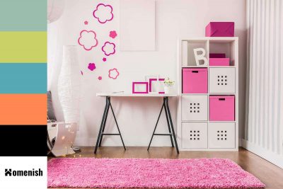
Hot pink, when used with black, is synonymous with the punk movement. It has taken on an almost ironic attitude as a shade of pink that refuses to conform with the rest of the dainty pink shades. While hot pink can be seen as rebellious in some contexts, it also has associations with femininity, as it is very close in color to barbie pink.
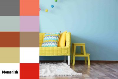
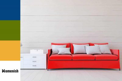
Blue and yellow are a color pairing that was widely used in the 1990s, especially in kitchens and bathrooms. They are also colors that are synonymous with Mediterranean styles. Here we look at other colors to include in a blue and yellow color scheme to provide balance, depth, and style.
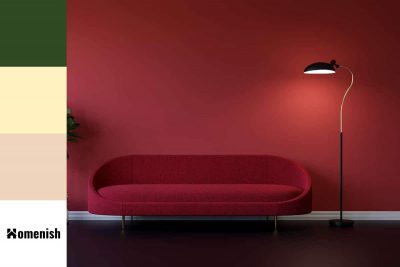
Crimson is a bright shade of red that has blue undertones, giving it a very subtle purple hue. The name was derived from the word ‘kermes’ because red dye was originally made by crushing the bodies of kermes vermilio insects. Discover what it means and how to pair with crimson in this article.
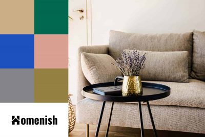
Black and gold can be used as a color scheme by themselves, but adding an extra color to the mix will make things more interesting, adding an extra dimension to a room’s decor.
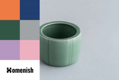
Celadon is a shade of pale blue-green, which is named after the Chinese glazed ceramics of the same name and color. Celadon ceramics originated in China, where they were highly regarded for several centuries by the Imperial Court.
Scarlet is a bright shade of red that is tinted slightly with orange. On the color wheel, it is in between red and orange but closer to red. This is a color that is warm and vibrant and is not widely chosen as a shade for interior design palettes. In this article, we’ll explore all about the scarlet color.
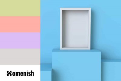
Pastel blue is a pale shade of blue that can be achieved by mixing a small amount of blue with a large amount of white. It is a color that is sometimes confused with baby blue, but although these two colors are both light shades of blue, they are not the same color. Learn all about the pastel color here.
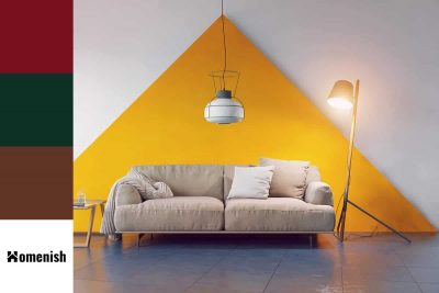
Amber is a bright and vibrant color that sits exactly halfway between yellow and orange on the color wheel. It is known as a pure chroma color because it is not darkened or lightened by the presence of black or white and instead is at full saturation with a mix of fifty percent yellow and fifty percent orange. Learn all details about amber color below.
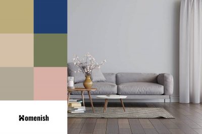
The color of pewter is based on this type of metal, and pewter has become a popular color of paint since the trend for gray interiors exploded. Pewter paint will have a medium to light gray color with a slight blue or green undertone. Some of the excellent colors that go pair with pewter include.
