Explore popular colors that are used in home decor and ways to pair colors together with our in-depth ideas and tips
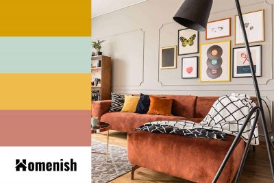
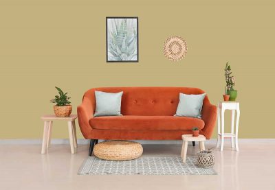
Green and brown are two colors that provide the background to much of our lives spent in the great outdoors. Brown is the color of soil, tree trunks, and rocks, while green is the color of almost anything that grows outside, from grass and flower stems to tree leaves and moss.
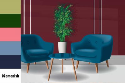
Cabernet color is a dark red color with purple undertones and is associated with luxury and richness. Learn more about this color, and what to pair with it.
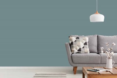
As Benjamin Moore’s ‘Color of the Year.’ in 2021, Aegean teal is much loved in many home interior and exterior projects. Learn all about Aegean teal color in this article.
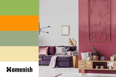
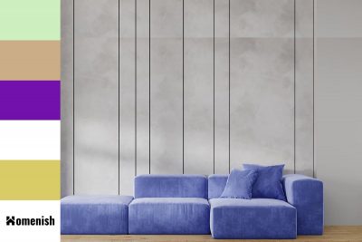
Pink and purple are widely considered feminine colors, so you will typically see them being used together in female-dominated spaces such as girls’ bedrooms, dressing rooms, and powder rooms. Here we look at a number of colors that go with pink and purple for use in interior design.
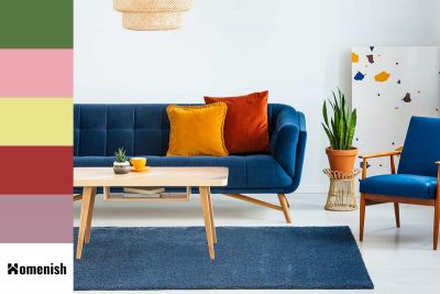
In home decor, blue is commonly chosen as a wall paint color because it has the effect of creating a relaxing and tranquil environment, while orange is a lesser-used color since it can come across as brash. However, the opposing qualities that blue and orange offer mean that they can create a sense of balance in interior design.
Rosewater is a popular undertone of pink with a mix of soft pink, white and red. It is rumored to have its origin in royalty and is now used a lot in clothing and home decor. Keep reading to learn in-depth about this color.
Looking for a calm and peaceful color tone for your home project, serenity color should be one of your top lists. Keep reading for further details on what this color is, what it means, and how to use it.
Orchid has been known as a color since the early 1900s, as a reference to the bright shade of pink-purple that orchid flowers often come in. Orchid is a bold and bright color that can demand attention, but it actually isn’t heavily saturated, so it doesn’t come across as overpowering or intense. Instead, it has a more lighthearted, almost flirtatious appeal.
Sand dollar is a shade of paint available from a number of prominent paint manufacturers, including Benjamin Moore, Sherwin Williams, and Dunn Edwards. Sand dollars that are not heavily bleached will have a light beige color, while those that have been in the sun for longer can have a color that is closer to white. For this reason, the color of sand dollars can be disputed as anywhere from off-white through to medium beige.
Blue is such a popular color that is used in many aspects of our life from business, marketing to home decor. And one of their most beautiful variations is cornflower. In this article, we’ll learn what cornflower color is, and how to use it in home decor and interior design.
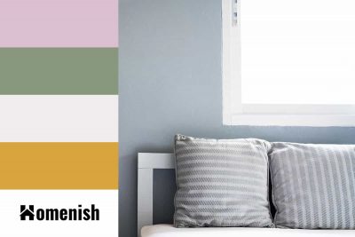
Cool gray is a medium gray shade that is made from an equal amount of black and white mixed together with a generous splash of blue. Cool gray is grayer than it is blue, but the blue undertones in it are clear to see, giving the color an obviously cool temperature.
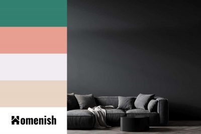
Jet black is a deep and dark shade of black. It is used to describe the darkest color of black hair, and it is considered to be the most intense shade of black you can get before you get to total black. Black is a neutral color that, by its very definition, lacks any color at all, whereas jet black will have a slight but typically imperceptible undertone.
