Explore popular colors that are used in home decor and ways to pair colors together with our in-depth ideas and tips
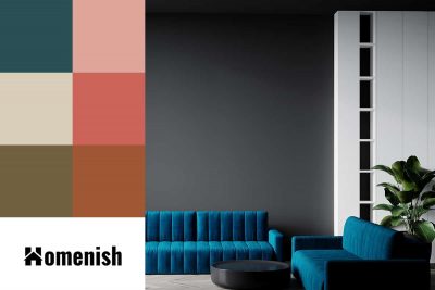
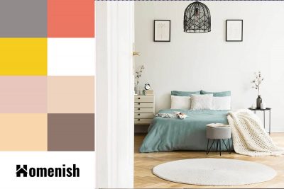
Blue and gray are well-favored colors in the interior design world, and they have been dominating home color palettes for the last 15 years. These are both cool colors that can read as neutrals, making them easy to live with while creating a modern look.
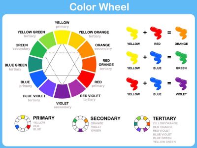
Here we look at how the colors on the color wheel are arranged and how you can use a color wheel in interior design to heighten the look of your rooms.
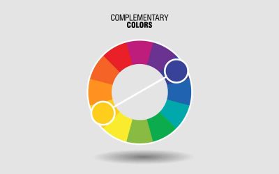
Understanding complementary colors is essential in interior design because it is one of the key concepts you will be working with. Here we delve deeper into the mechanics of complementary colors and how you can use them to your advantage.
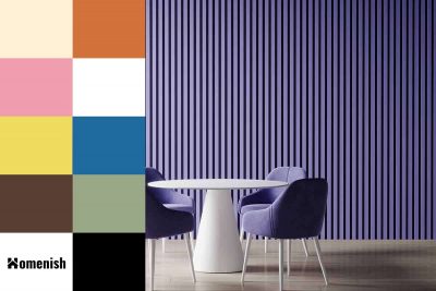
Purple is a popular color choice for rooms where a feminine feel is desired when pink seems too obvious. Parents with little girls will typically opt for purple as an alternative decor color when they don’t want to fall into the stereotypical pink camp.
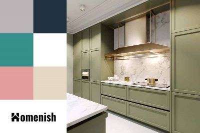
Sage green is a medium to pale shade of earthy green, with gray undertones. It is on the cooler side of the scale in terms of color temperature, which gives it a refreshing and crisp feel. This color has been popular in interior design over the last decade, and it shows no sign of waning.
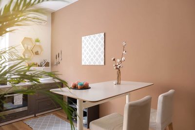
Just like tan and beige, caramel is a neutral color that blends well with bold hues. When you have painted your walls caramel, a classy addition to your living or sleeping space is a combination of cool and warm tones for a perfect balance.
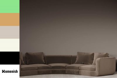
This extensive article will explain all about the mocha color. We’ll uncover what mocha color is, what it really means, how to use it in home decor and some brilliant colors that compliment mocha color.
Pistachio is a rich, earthy green that can be used to add color and depth to your wardrobe. It’s also a popular choice for interior designers, who often use pistachio as an accent color in kitchens and dining rooms. Pistachio is an easy-to-find color that can be used in decorating and fashion to great effect. Keep reading to learn what it is, how to make it, and how to use it well in home decor.Pistachio is a rich, earthy green that can be used to add color and depth to your wardrobe. It’s also a popular choice for interior designers, who often use pistachio as an accent color in kitchens and dining rooms. Pistachio is an easy-to-find color that can be used in decorating and fashion to great effect. Keep reading to learn what it is, how to make it, and how to use it well in home decor.
If you love a bright and happy color tone in your home, the marigold color could be one of the best options. Here we’ll uncover what makes marigold color, what it means, and how to pair with it.
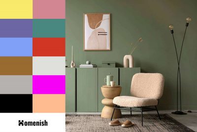
If you want to decorate around your sage green furniture, or you are thinking about ways you can make sage green furniture feel intentional in your home, then you’ll need to consider the colors that go with sage green furniture. Here we look at some stylish color palettes that incorporate sage green and colors that would accessorize well with sage green furniture.
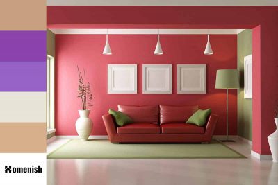
Red and green are contrasting and complementary colors because they are directly opposite each other on the color wheel. Contrasting and complementary colors are able to make each other appear more vivid and vibrant, and they can also be used to create a bold impact because the juxtaposition of contrasting colors can be startling to the eyes.
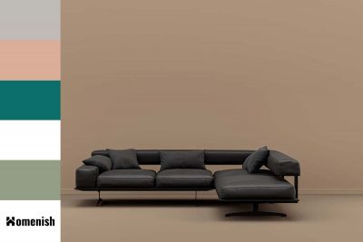
When tan and black are used together in home decor, they can create a really nice balance. Tan will serve to add warmth to a room, while black provides an even, level feel so that the space is neither too warm nor cool. Here we will look at ways to use tan and black in home decor, and colors that go with tan and black.
