Explore popular colors that are used in home decor and ways to pair colors together with our in-depth ideas and tips
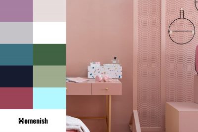
Rose gold is a relatively new color that first appeared in the late 1800s. It is a shade of pink with golden tones, and despite pink being ordinarily linked with femininity, rose gold is a popular shade across the board and is considered to be a gender-neutral color. Rose gold has seen a huge rise in popularity in both fashion and interior design over the last few years. Here we look at the best colors that go with rose gold.
The exterior of a coastal property should complement the natural surroundings, which is why so many beach houses have blue siding. However, there is a wide range of color options that can be stunning in a seaside environment, whether you want to stand out from the crowd or blend into the background.
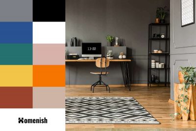
Gray is a neutral shade that can be successfully used with almost any other color. True gray is very versatile, and the fact that it lacks undertones means it is easy to use in a wide range of color schemes. However, there are many variations of gray when it comes to wall paint, including warm grays with beige undertones and cool grays with blue or purple undertones, which can be trickier to match.
Neutral colors are important in interior design and feature heavily in most people’s homes. Understanding neutral colors, how they work, and how to use them can help you achieve a style in your home that looks as though it was designed by a professional.
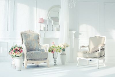
White can sometimes be seen as a stark and clinical color, which may seem at odds with neutral shades, which are typically subtle and easy on the eye. However, white is actually considered to be a true neutral shade because it lacks the presence of any other color at all.
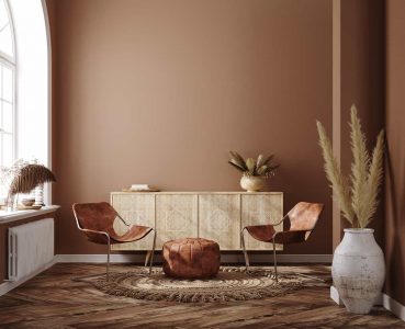
Brown is actually considered to be a pure neutral, which is the name of a group of colors that are completely void of undertones. However, not all shades of brown are pure neutrals because, in the case of interior paints, brown will often be mixed with a color to give it a different feel or depth.
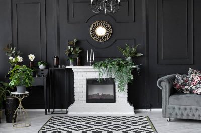
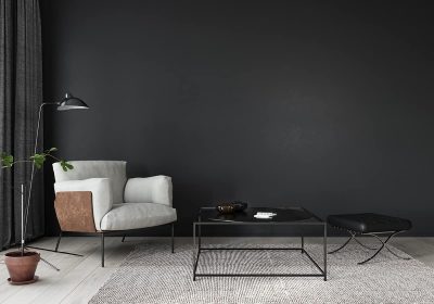
Black is not a color that immediately springs to mind when you think of neutrals; however, you may be surprised to find that black is a neutral color and actually is one of the pure neutral shades.
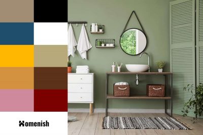
Olive green is a shade of green that sits between yellow and green on the color wheel. It is a dark shade of green which is achieved by adding a splash of red to green, though not too much as this will result in brown. The color is made up of blue, yellow, and red, which gives it a complex energy.
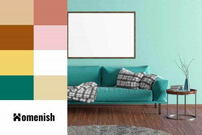
Turquoise is a blue-green color that sits right in between true blue and true green on the color wheel. It also contains yellow hues, which affect the way turquoise makes a room feel.
Looking for a tranquil, soft color that injects personality into your home without overpowering it? Do you think neutrals are just too bland and bold colors are too bright? For a subtle shade in between, how about periwinkle?
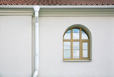
Many homeowners don’t realize the color of their gutters can make a big impact on the curb appeal of their homes. Gutters come in many colors that can be coordinated with your white home’s exterior. In this article, we’ll show you some attractive gutter colors for a white house as well as how to match gutter colors to your trims and how to paint your existing gutters in order to enhance your home’s aesthetic appeal.
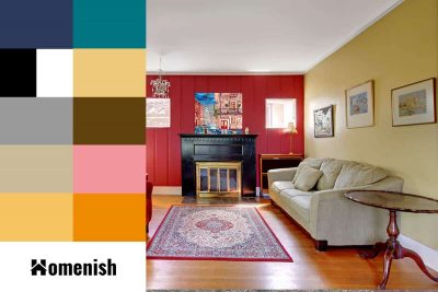
Red is an interesting color because it can evoke dramatically different emotions depending on the shade of red used. If you want to use red in interior design, then you’ll need to be aware of the various ways red can be used to achieve different styles and which colors it can be paired with.
