Explore popular colors that are used in home decor and ways to pair colors together with our in-depth ideas and tips
Merlot is a deep shade of red that is named after the French wine of the same name. The color merlot can come in several variations, from dark cherry red to a more richly purple color similar to eggplant. Most commonly, the color of merlot sits somewhere between the two, as a shade of red with distinctly purple tones.
If you have chrome accessories or fittings in your home, check out this guide to find out what colors go best with chrome and how to incorporate chrome furnishings into your home for an impressive style.
As a neutral color, ivory will work with pretty much any other color you decide to put it with; however, there are a few colors that really go perfectly with ivory, and these color combinations are fool-proof for creating a stylish and appealing home interior.
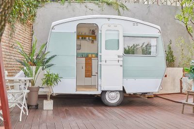
Mint green is a fresh shade of green that can be both cooling and soothing. It is the epitome of spring and so can serve to make an interior space feel revitalized and vibrant. Mint green is a surprisingly versatile color that can work well in a wide range of color schemes as both an accent or primary color. This is a shade that is great for inspiring vintage or art deco styles, but equally, it can be utilized in more modern and contemporary interior themes.
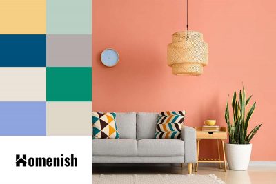
Here we look at the best colors that go with peach, particularly with reference to using peach as a wall color or an accent color in interior design.
Bronze is a dull metallic shade that traditionally was made as a metal material by mixing gold with tin. The resulting color that we know as bronze today lies somewhere between brown and orange, with significantly fewer yellow hues compared to gold. This is a good choice of metal for fixtures and fittings if you want a warm metallic color but find gold to be too showy or brash. Here we look at some colors that work well with bronze.
While yellow may not be the first color that people consider for their home’s exterior, it is in fact a warm and cheery hue that goes very well with many other color schemes. When you have a yellow house, there are tons of accent color palettes to pair with it.
Apricot as a color is named after the skin of apricot fruit, which is a shade of orange-yellow. However, when it comes to apricot in interior design terms, it is a distinctly more pinkish hue. In fact, when used to describe interior colors, apricot can include anything from orange-pink right through to rusty terracotta. This is a color that has seen a huge revival over the last two years and has become one of the key trendy colors in modern interior design styles.
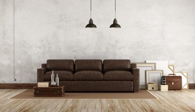
The classic brown leather sofa is the focal point of every living room. When you choose the right decorating colors that go with a brown leather sofa, this furniture item can truly stand out. Since brown is a warm, earthy color, it can be paired with many color schemes to enhance the visual interest of your living space. Check out our best color ideas to coordinate with your brown leather sofa by reading the rest of this article.
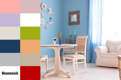
Light blue is a color that induces peace and serenity, making it a nice choice for home decor to help us feel calm and at ease. Light blue is synonymous with clear blue skies and shallow placid ocean waters, which are both linked to feelings of happiness and relaxation, which again make this shade a popular option in interior design because most people want to enjoy tranquility in their own homes. Here we look at colors that go well with light blue for a range of color scheme options which include this soothing shade.
Navy is one of the darkest shades of blue, and as such, is a primary color. Blue is known to have a calming effect on the mind and body, which can make navy a good color choice in the bedroom; however, navy is also a color that is associated with law enforcement and the Navy, which means it is also associated with authority and power and can be used to convey dominance or superiority. Navy is also a color that is heavily tied to nautical and beach themes, so it is commonly used in coastal-style interior decor.
Gray has become a staple color in interior design over the last decade. This color which was once thought of as dull and drab, has been transformed into a shade that signifies all that is modern and stylish. Gray is a neutral shade that works well as a base color in a room, or it can alternatively be used as the focus in a color scheme.
