Explore popular colors that are used in home decor and ways to pair colors together with our in-depth ideas and tips
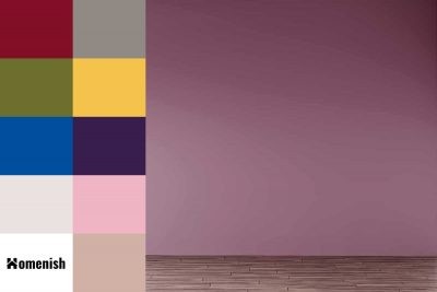
Mauve is a dusky shade of pale purple, which is great for spaces where you want to achieve a soft and feminine look without being overly frilly and girlish. Mauve provides a nice balance between vintage and modern, which means it can be used in a variety of different decor styles. Here we will look at some of the best colors that go with mauve.
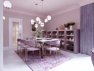
Lilac is a color that is named after the pink-purple bloom of the same name, though it is considered to fall under purple more so than pink. Lilac is not a bright or strong shade of purple, but it is not light or pale either. It is darker than lavender and has less of a blue-gray tone than this other popular purple shade.
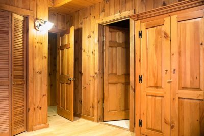
Whether you have inherited knotty pine furniture or moved into a home with knotty pine paneling or flooring, you might be wondering how to pick a color palette that will complement this traditional finish of wood. Knotty pine has been popular in interior design for many decades and is still favored as a decor finish because of its rich, warming honey-like tones. Here we will look at which colors you can use with knotty pine to achieve a variety of different styles.
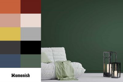
Forest green, as you might expect from the name, is an earthy color found in natural environments. It is a mid-colored green with similar tones to hunter green, but not as deep or dark. This is a color that can work well as the main wall color in a room, and it also works well as an accent shade.
Cream is a warm neutral shade that is made by mixing white with a very small amount of yellow. As a neutral shade, you might expect that cream will work with any other color, and while this is technically true, there are some shades that will bring out the best in cream. Here we will look at some of the best colors to pair with cream to achieve the mood and style you’ve been looking for.
Gray is an enormously popular color in interior decor whose reputation has rapidly been transformed from that of a dull and drab color to a highly sought-after color that is used to create sleek, cozy, or ultra-modern styles.
Mustard yellow is a dark shade of yellow with rich brown undertones. It is named after the culinary mustard of the same color. Yellow is generally thought of as an uplifting and joyous color, and mustard also carries these traits but in a more subdued way. Mustard yellow is positive and inspiring while also being deep and warming.
Royal blue is a heavily saturated shade of blue that sits somewhere in between being a medium and dark color. It is a vibrant and bold shade, which sometimes gets incorrectly confused with navy blue. Some people have a habit of using the terms ‘navy blue’ and ‘royal blue’ interchangeably, but in fact, royal blue is not as dark as navy blue, and it has a much brighter hue. Here we look at royal blue in more depth and offer color suggestions that go well with royal blue. These color combinations can be used in your own home to create stylish interiors in various styles.
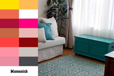
Aqua is a color that sits somewhere between blue and green, and it comes in a wide variety of shades that can be anywhere from bright and cheerful to calm and tranquil. The colors that you put with aqua will make a big impact in determining the type of style and atmosphere you achieve in a space. Here we look at various colors that go really well with aqua for a variety of interior decor styles.
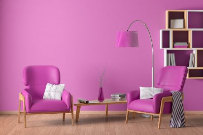
Fuchsia is a bright shade of pink, which is achieved by mixing purple and red together. Many people think of this color as being the same as magenta, and while it does have a lot of similarities, it is distinctly more purple than magenta, while magenta leans more towards red. Fuchsia is a vivid and energizing color that can be used in interior design to create a sense of fun or femininity.
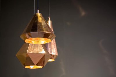
Brass and gold are both finishes for metal that are commonly found in homes, typically on light fittings and ornaments, but also for plug sockets, door handles, and light switches. If you are trying to decide between these two finishes for decor in your home, then it can be useful to understand the differences in order to make the right choice for you. Here we look at what defines brass and gold from each other, as the two can sometimes be confused.
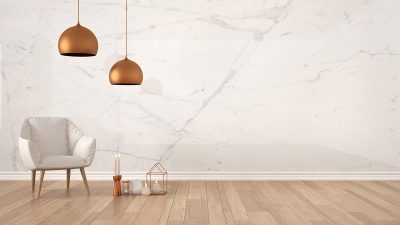
Copper is a metallic orange-gold shade that has exploded onto the interior design scene in the last few years, with a popularity that seems to be unwavering. This color has a warming effect while exuding luxury and glamour, making it suitable for use in any room in the home.
