Explore popular colors that are used in home decor and ways to pair colors together with our in-depth ideas and tips
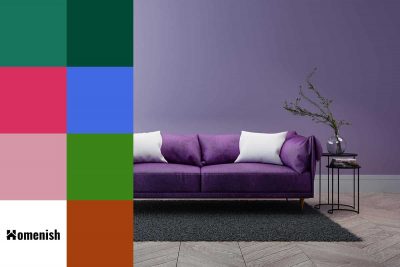
Dark purple is a deep purple shade that is sometimes known as royal purple because of the long history of this color being used by monarchs. Dark purple can vary from eggplant through to plum or mulberry, and it sometimes has blue undertones, or it can also have red undertones, which give it a fiery intensity.
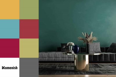
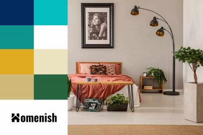
Dark green is a huge trend in interior design right now, which keeps going from strength to strength. One of the reasons why dark green has longevity and is taking center stage on the interior scene for longer than you might expect is because it can actually be used as a neutral. Here we look at how to use this popular color in your interior space and which colors to pair it with.
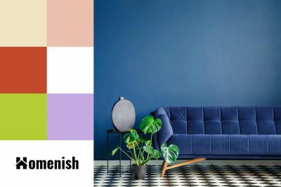
Historically, dark blue has not been very trendy in interior design because, for a long time, people have leaned towards paler and more neutral colors. However, this is all changing with the rise in popularity of dark decor and the new understanding that dark rooms don’t always result in a small feeling space.
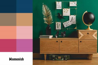
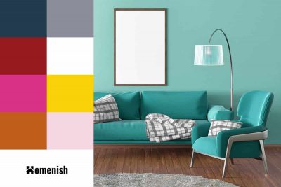
Emerald green is a rich and deep shade of green that has become a favorite color for interior designers and decorators alike over the last two years, and it is showing no sign of slowing down. Emerald green is a stunning jewel-toned color that can be used to create a sense of luxury and wealth in a room, or it can be paired with more neutral tones for an earthy and natural vibe.
Cyan is a color that is achieved by mixing blue light with green light, and so it sits right between blue and green on the color wheel. However, anyone looking at the color of cyan would most likely say that it is a shade of blue and not green.
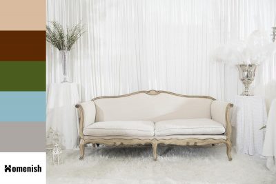
The warmth in cream and antique white can make them difficult to match with other colors, but they can look very classic if you pair them with the right shades. Here we will look at some of the best colors to use with antique white and tips on using this shade in home decor.
Terracotta falls within the ‘orange’ color palette, but it is far from bright and vivid like most shades of orange. Instead, terracotta contains a lot of brown tones with a hint of gray to give it a really earthy, dusty hue. This is a color that is intensely warm, and therefore it lends itself well to cozy interiors.
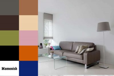
‘Taupe’ can be translated from French to mean ‘mole,’ which tells us a lot about this color already. The shade was named after the color of the French mole, which is a mix between gray and brown. Here we look at some of the best colors to pair with taupe to achieve a variety of different styles within the home.
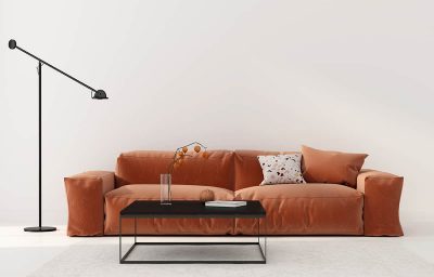
Rust is an orange-brown shade with a subtle hint of red. It is very heavily saturated, which gives it an intense depth, and it is undoubtedly warming and rich. Rust is a similar shade to cinnamon, and it is a beautifully striking color to use in both fashion and interior design.
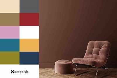
If you have chocolate brown furniture you are thinking about replacing because it doesn’t go with your modern home, then think again. There are plenty of ways to update chocolate brown and give it a fresh style. Here we will look at colors that go well with chocolate brown and how to use them in your home.
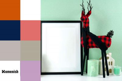
As a color that promotes renewal and invigoration, seafoam green is a popular choice for bathroom decor, and it also works well in health settings such as spas and exercise rooms. If you want to incorporate seafoam green into your interior decor, follow these tips.
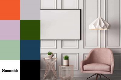
Pastel pink can range anywhere from a sweet and soft pale bubblegum pink to a more subdued dusky gray-toned pink. Here we will look at the different ways colors that go with pastel pink can be used to transform the look of a room.
