Explore popular colors that are used in home decor and ways to pair colors together with our in-depth ideas and tips
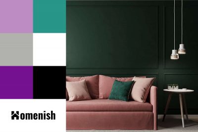
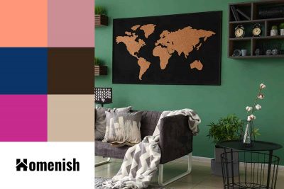
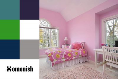
Pink and green is one of the standout color schemes that has been trending in interior design over the last two years, and it is showing no signs of fading. These colors complement each other so well in terms of the atmosphere they create and the feelings they elicit.
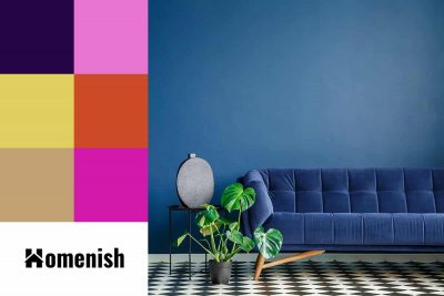
Indigo is a dark shade of blue that is most commonly associated with the much-loved blue jeans. However, this is a color that is popular in all areas of design, from fashion through to interiors. Indigo has an interesting history that saw it go from being originally associated with royalty and nobility to modern times, where it became a color more commonly linked to the working classes.
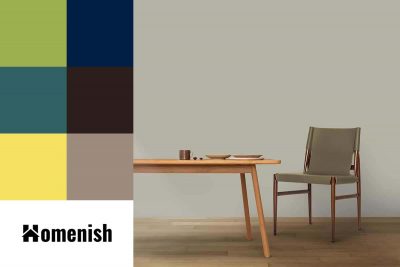
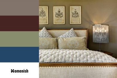
Greige is a shade that is achieved when blending gray with beige. Many interior designers think of greige as the perfect neutral because it balances the warmth of beige with the modernity of gray. Beige is a color that can easily go wrong and end up looking too pink with a 90’s vibe or even too orange.
Green and blue, sitting side by side on the color wheel, naturally evoke a sense of balance and tranquility, offering a seamless aesthetic appeal. To elevate your decor, introducing a third color can add dimension and contrast, enhancing the visual interest. In this article, we’ll explore the vast array of green and blue shades and the complementary colors that can optimize their impact in your home.
Some people are able to throw different colors together and make them look great, but this isn’t a skill that comes naturally to everyone. Here we will look at colors that go with each other and tactics you can use to ensure your color schemes always look perfect.
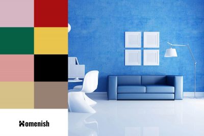
Blue and white is a classic color combination that is popular in interior design since blue is a soothing and relaxing color to be around, and white helps it to be seen in its truest light. Blue and white are very versatile and can be used in a wide range of interior styles, depending on what furniture and accessories you choose and which accenting color you put with them.
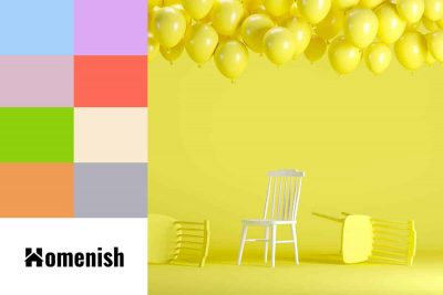
Yellow is a cheerful and vibrant shade, but it can feel too stimulating in home decor, which might be one of the reasons that bright yellow isn’t commonly used as a wall paint choice or for soft furnishings in homes. However, as a pastel color, pastel yellow presents a much softer and more delicate color which makes for a warm and cozy atmosphere that is joyful without being intense.
Jade green is a medium shade of green with blue undertones. It definitely leans more towards green than blue, though some people do describe this color as blue-green. It is named after the precious gemstone of the same color, which has been treasured for centuries across Asia.
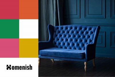
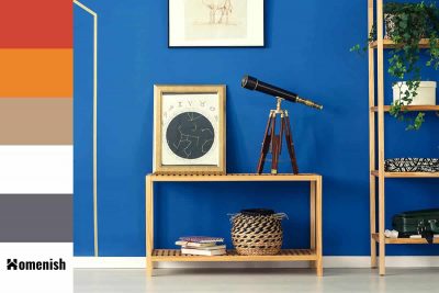
Cobalt blue is an extremely intense shade of blue that borders on electric blue. It is neither dark nor light and sits somewhere in the middle of blue shades. The vibrant and potent nature of this color can make it a difficult shade to pair with other colors, but when used alongside complementary shades, it can make a stunning statement in interior decor.
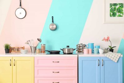
Light pink can encompass a range of pink shades, from pale bubblegum pinks to duskier blush shades of pink that have come to be known as ‘millennial pink.’ While sweet pinks are still popular in children’s bedrooms, it is the dustier light pinks that have really become a mainstay of interior design for any room in the home.
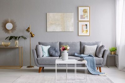
Light gray is a color that, in interior design circles, was once considered to be drab and dull. It is a shade that doesn’t offer much personality and is void of color, but this is a quality that can be useful when creating a neutral room.
Khaki is a sandy shade of light brown with yellow undertones. It is not the same as khaki green, which has more of an olive green color. Khaki is synonymous with military uniforms around the world, but particularly in desert environments where it offers a good level of camouflage.
