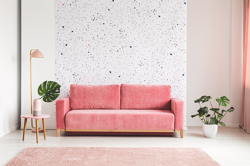
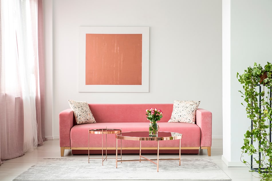
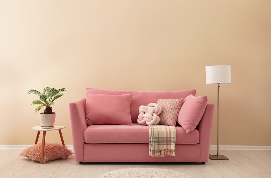
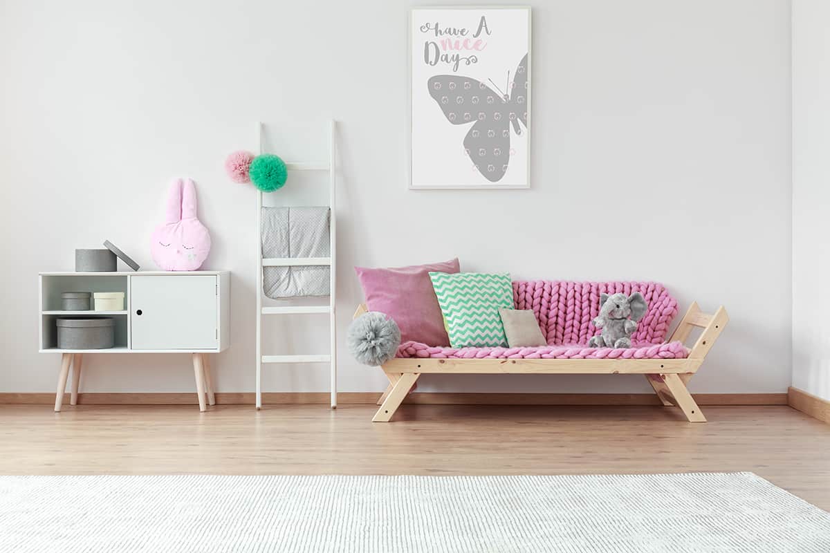
Pink is a color that has rapidly moved from being considered the only color for a baby girl’s room to being a color that can feature prominently in every area of the home. Pink has undergone a massive transformation in interior design, and we are seeing more and more ways to use it in home settings.
If you want to incorporate pink into your space, you will need to know which colors work best with pink and how to use them in interior decor.
Pink Decor in the Home
When it comes to interior design, pink is a color that traditionally is chosen for nurseries or children’s bedrooms, but it is often shied away from in more common areas of the home. This is a shame because pink is a color that can be represented in so many ways and has the impact of creating a calming or vibrant mood in space, depending on the shade you use.
Fortunately, over the last few years, pink has made its way back onto the interior design scene in a big way. Pink has been rebranded as a contemporary gender-neutral color rather than a color specifically designated for female spaces.
Pairing Pink with Other Colors
One reason people avoid incorporating pink into their interior palette is that it can be an intimidating color to pair with other colors. For inspiration on which colors work best, check out this guide on all of the top colors that go with pink.
Pink + Teal
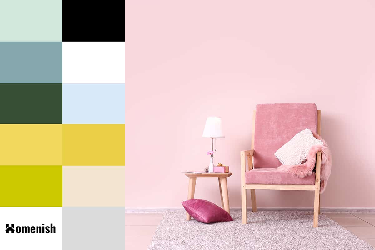
| Shade | Hex Code | CMYK Color Code (%) | RGB Color Code | Color |
| Pink | #ecc3d5 | cmyk(0%, 17%, 10%, 7%) | rgb(236, 195, 213) | |
| Teal | #d3e9e0 | cmyk(9%, 0%, 4%, 9%) | rgb(211, 233, 224) |
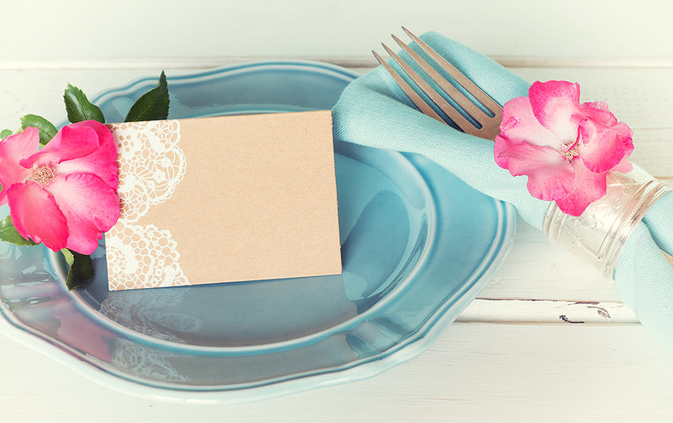
Teal is a deep blue with a subtle hint of green pigment, which gives it an intense feeling, like a bottomless ocean. This color has been popular in interior design for several years and can be accented nicely with a pale shade of blush pink.
If you want to incorporate pink into your design scheme but are worried that it will feel too feminine or flowery, you can use teal or similar shades of dark blue such as navy to tone it down.
Using dark shades of blue with a pale pink gives a strong contrast which can work as a less harsh version of monochrome. Introducing some pale pink into a dark blue room can make it feel more comfortable and inviting, for example, adding some blush pink velvet cushions onto a dark blue sofa or hanging pale pink curtains on a wall painted in deep blue.
Check out our article for more teal color palettes’ 10 Colors that Go Well with Teal (with Pictures) ‘
Pink + Sapphire Blue
| Shade | Hex Code | CMYK Color Code (%) | RGB Color Code | Color |
| Pink | #ecc3d5 | cmyk(0%, 17%, 10%, 7%) | rgb(236, 195, 213) | |
| Sapphire Blue | #84a7ac | cmyk(23%, 3%, 0%, 33%) | rgb(132, 167, 172) |
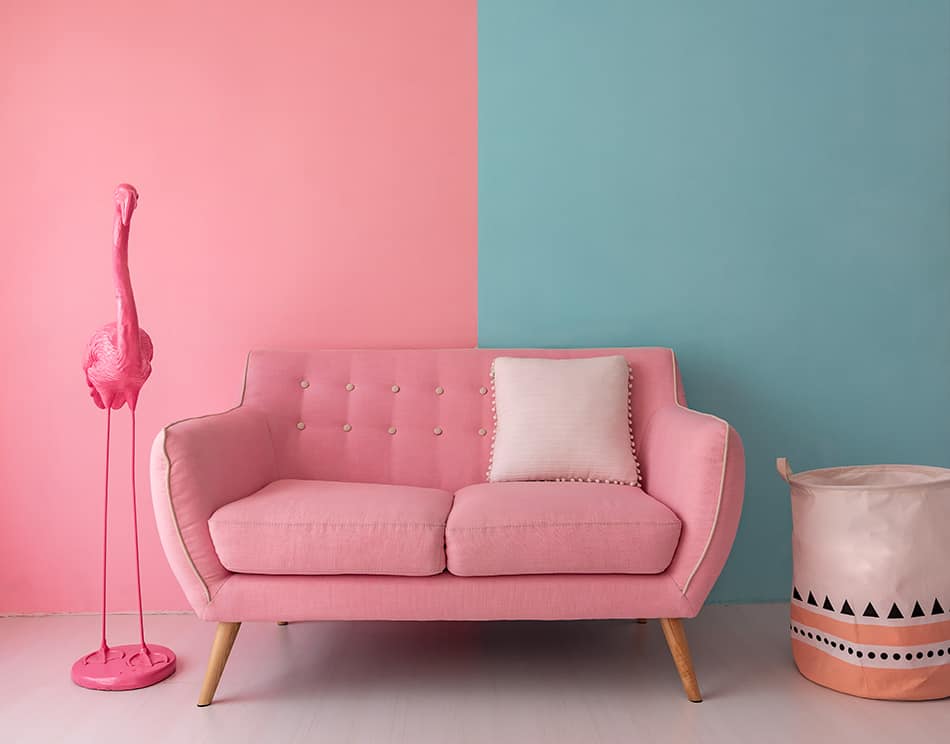
If gemstone colors are your thing, then try the hot pink color scheme with sapphire blue for a bold and fun palette. These colors are at opposite sides of the color spectrum, and so they really bounce off each other to make for a vivid and vibrant interior space.
The richness of this color combination can bring life to a room, so if you have a dull space that maybe doesn’t get much natural light, or is struggling to have any real personality, then injecting hot pink and sapphire blue into the room will instantly bring it alive.
Pink + Emerald Green
| Shade | Hex Code | CMYK Color Code (%) | RGB Color Code | Color |
| Pink | #ecc3d5 | cmyk(0%, 17%, 10%, 7%) | rgb(236, 195, 213) | |
| Emerald Green | #364f34 | cmyk(32%, 0%, 34%, 69%) | rgb(54, 79, 52) |
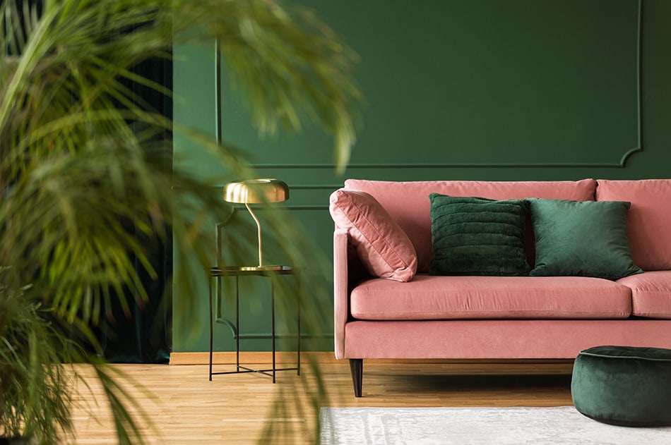
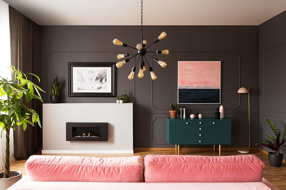
Emerald green or forest green is very on-trend right now. This is a color that feels rich and luxurious and can be used in a variety of styles, including modern, art deco, and traditional. One of the best colors to pair with emerald green is dusky pink. The two colors together are different enough that they make each other pop, but not so much so that there is a startling contrast.
This means these colors work well in a space where you want to create an intimate or romantic vibe. For a cozy atmosphere, paint walls in forest green and accent with dusky pink accessories such as throw pillows and other soft furnishings. For a more airy look, paint walls in a dusky pink and opt for a bold forest green sofa or upholstered bed frame.
Pink + Black
| Shade | Hex Code | CMYK Color Code (%) | RGB Color Code | Color |
| Pink | #ecc3d5 | cmyk(0%, 17%, 10%, 7%) | rgb(236, 195, 213) | |
| Black | #000000 | cmyk(0%, 0%, 0%, 100%) | rgb(0, 0, 0) |
Black and pink are timeless duos that can work in so many ways. The style you are going for will dictate the shade of pink you use, but you simply cannot go wrong with pink and black. For a sophisticated yet feminine room, paint the walls in a pale shade of pastel pink and opt for black accents such as black photo frames on the walls and black candles.
For a more fun vibe, such as in a teenager’s bedroom, compliment bright pink walls with black velvet cushions and throws. Black and pink also work really well in a bathroom. Paint all of the walls in black for an intimate space, and insert pink accessories such as towels and plant pots. Select blush pink with gold detailing for an elegant look or hot pink for a striking effect.
Pink + Sunny Yellow
| Shade | Hex Code | CMYK Color Code (%) | RGB Color Code | Color |
| Pink | #ecc3d5 | cmyk(0%, 17%, 10%, 7%) | rgb(236, 195, 213) | |
| Sunny Yellow | #f1d95a | cmyk(0%, 10%, 63%, 5%) | rgb(241, 217, 90) |
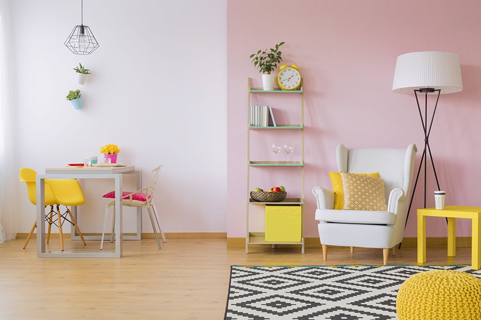
If you want to create a cheerful and energetic space, then pair pink with yellow. Any shade of pink will work well with any shade of yellow; these two colors just look fabulous together in any combination. They are ‘happy’ colors which make even a small space feel lively and full of opportunity.
Flamingo pink can be toned down with a lemon yellow or brought to life by an intense mustard yellow. These two colors together will undoubtedly make a space feel unapologetically feminine, so maximize on that with floral prints or frilly fabrics. For a more laid-back style, use pastel shades of pink and yellow together in a guest bedroom to create a welcoming and airy space.
Pink + Lime Green
| Shade | Hex Code | CMYK Color Code (%) | RGB Color Code | Color |
| Pink | #ecc3d5 | cmyk(0%, 17%, 10%, 7%) | rgb(236, 195, 213) | |
| Lime Green | #cdc900 | cmyk(0%, 10%, 63%, 5%) | rgb(241, 217, 90) |
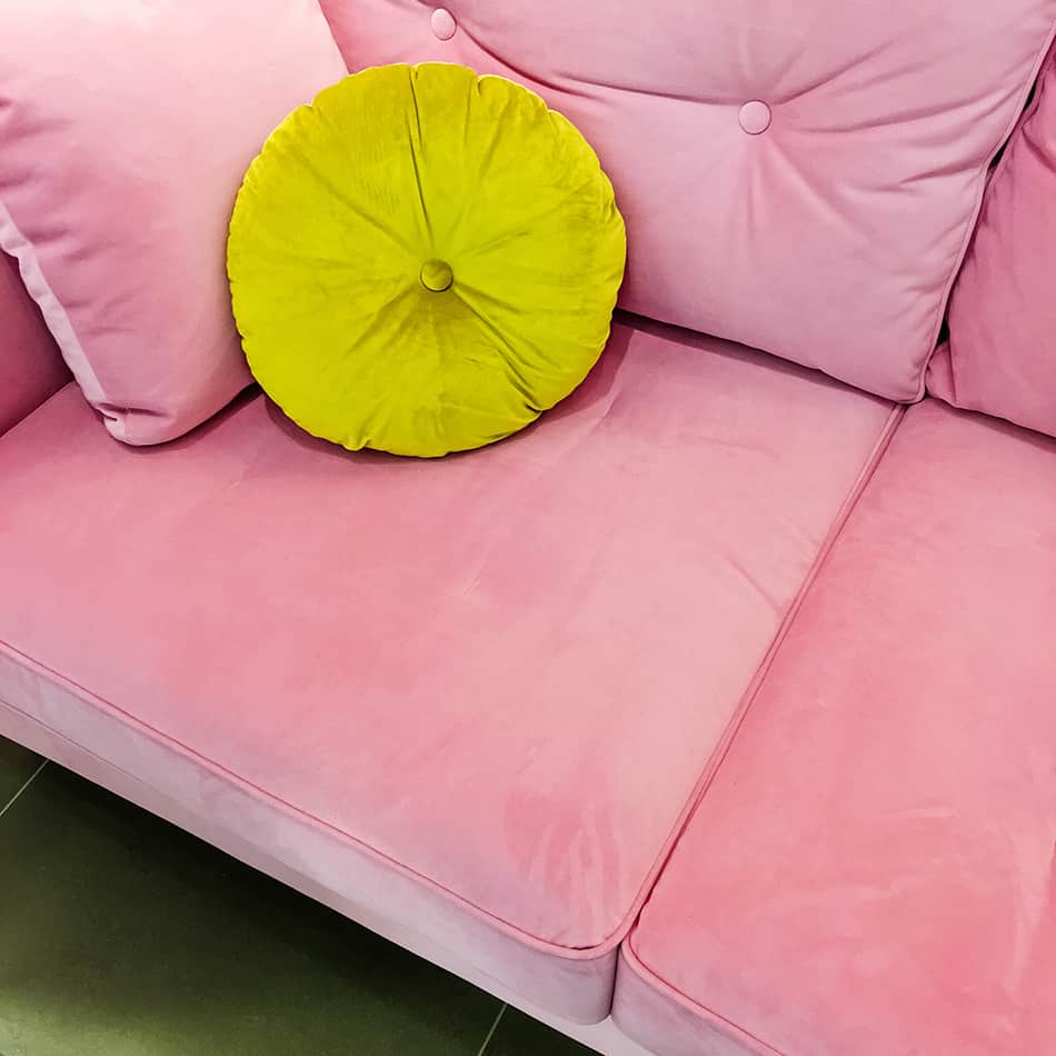
In some contexts, lime green interiors can look a little dated, as this was a color scheme that was popular in the ’90s. However, when paired with the right shade of pink, lime green can look modern and refreshing.
Try to avoid pinks that have a lot of red in them, as this can clash harshly against lime green. Instead, opt for pinks with an orange hue, such as peach.
Orangey pinks, especially those with a dusty appeal, can be used with lime green to create a contemporary and unexpected interior decor style. The lime green provides vibrancy which is increased as it bounces off the pink, while the dusky orange-pink adds depth.
Pink + Baby Blue
| Shade | Hex Code | CMYK Color Code (%) | RGB Color Code | Color |
| Pink | #ecc3d5 | cmyk(0%, 17%, 10%, 7%) | rgb(236, 195, 213) | |
| Baby Blue | #d8e9f9 | cmyk(13%, 6%, 0%, 2%) | rgb(216, 233, 249) |
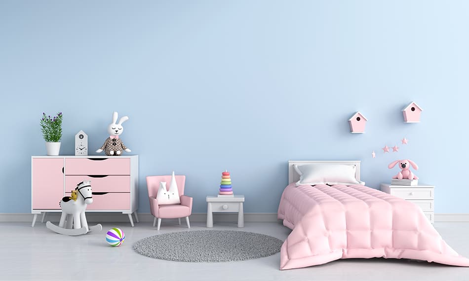
Baby pink and baby blue do not need to be exclusively reserved for interior nursery decor. Baby pink is a nice color combination with baby blue in a variety of styles, most notably art deco and country chic.
The cool tone of baby blue stops the warmth of baby pink from becoming too sickly sweet and provides an attractive yet subtle contrast. For a bolder look, pair baby blue with hot pink.
Pink + White
| Shade | Hex Code | CMYK Color Code (%) | RGB Color Code | Color |
| Pink | #ecc3d5 | cmyk(0%, 17%, 10%, 7%) | rgb(236, 195, 213) | |
| White | #ffffff | cmyk(0%, 0%, 0%, 0%) | rgb(255, 255, 255) |
White and pink are a classic combination that can make a space feel light, airy, and relaxed. In smaller rooms, paint the walls white and choose pale pink furnishings for a laid-back yet elegant look.
With this color scheme, you can opt for an ultra-feminine vibe, or it can also work well in a coastal style by introducing natural fabrics such as linen and rustic light-colored wood. For a more sophisticated take on pink, select a muted shade of pink to paint paneled walls or choose dusky pink closet doors for an injection of color.
Pink + Gold
| Shade | Hex Code | CMYK Color Code (%) | RGB Color Code | Color |
| Pink | #ecc3d5 | cmyk(0%, 17%, 10%, 7%) | rgb(236, 195, 213) | |
| Gold | #e8d043 | cmyk(0%, 10%, 71%, 9%) | rgb(232, 208, 67) |
Any shade of pink can be brought to life with gold accents. A pale pink room will feel uplifted and instantly more refined with gold accessories, while a hot pink or dark pink room will be made to feel luxurious with gold details.
Painting a wall gold is a bold statement that is often a step too far for most people’s tastes, so instead, introduce gold in accessories such as photo frames, plant pots, and wall art.
A good way to incorporate gold and pink together is to look for pink wallpaper with gold accents. You could fix this to a feature wall and pick out the gold details with gold metal fixtures such as a chandelier or table lamps, or decorate every wall in the room with the wallpaper to give a feeling of being fully immersed in pink and gold.
Pink + Beige
| Shade | Hex Code | CMYK Color Code (%) | RGB Color Code | Color |
| Pink | #ecc3d5 | cmyk(0%, 17%, 10%, 7%) | rgb(236, 195, 213) | |
| Beige | #f2e5cf | cmyk(0%, 5%, 14%, 5%) | rgb(242, 229, 207) |
Beige may not be a color you instantly think of to pair with pink, but it can work really well with the right shade. Dusky pinks or blush pinks can have their muted tones highlighted when teamed with natural beige.
By adding beige to a pale pink room, you will tone down the pink color and make it feel more casual and neutral. Incorporate natural textures such as a hessian rug or thick wool blankets to further bring out the relaxed and informal elements of the pink areas.
Avoid using bubblegum pink with beige, as these two shades do little for each other. The beige will look dowdy next to the vibrancy of hot pink.
Pink + Gray
| Shade | Hex Code | CMYK Color Code (%) | RGB Color Code | Color |
| Pink | #ecc3d5 | cmyk(0%, 17%, 10%, 7%) | rgb(236, 195, 213) | |
| Gray | #dbdbdb | cmyk(0%, 0%, 0%, 14%) | rgb(219, 219, 219) |
Gray is a common theme running through various interior design styles at the moment, with full rooms being entirely decorated with gray walls, gray furnishings, and gray accessories.
While this is a stylish and sophisticated look, it can be too bleak to live with on a full-time basis. Gray rooms can look void of character or overwhelmingly masculine with no complementary color.
If you want to add a flash of color to your gray space, then pink is a perfect match. Blush pink or salmon pink look great with gray, as the gray helps to tone them down and ensures these colors maintain a classy appeal rather than looking cheap. Gray kitchens have been very popular in recent years, but to update the solid gray look, you could incorporate some dusty pink kitchen cabinet doors for a two-tone effect or introduce pale pink accessories.
Gray and pink also work well together in a baby or child’s room for a more modern take on traditional pink girls’ bedrooms. Any shade of gray can be teamed with pink, from the lightest off-white, gray right through to a deep charcoal gray.
Best Pink Paint Colors
Choosing a color scheme that works with pink will rely on selecting a suitable shade of pink in the first place. The shade of pink you choose should reflect the type of atmosphere you want in the room while also working with the type of natural light available in the space. Consider these beautiful pink paint colors as a backdrop to your room.
Farrow and Ball- Pink Ground
This is a soft and pale shade of pink that is flattering on almost any surface. It has a classic appeal and a gentle feel which means it is great for a backdrop and won’t be overpowering. Pair it with forest green or aqua blue for a balanced contrast.
Benjamin Moore- Opal
This is a very light shade of pink that will read as off-white in some lights. Use this color for a subtle glamor in a dressing room or bathroom, alongside white quartz countertops and dazzling spotlights.
Sherwin Williams- Rachel Pink
If you are looking for a pink shade of paint for a child’s room that has personality without being too bold, then this is the ideal option. It has a muted and understated appeal which allows a room to feel calm while still offering a sense of fun you often get with medium pink colors. It is subtle enough to use on all of the walls in a bedroom, though it would also work well as an accent wall for a more diluted impact.
Benjamin Moore- Chippendale Rosetone
This is a distinctly warm shade of pink that has dusky brown undertones to give it a color that almost borders on rust. It has a mature air about it that makes it well suited for a country cottage living room, a floral guest bedroom, or a modern master bedroom. Use it with pure white trim for a classic look, or pair it with gray accessories for a cozy contemporary style.
