The color orange was unsurprisingly named after the citrus fruit. The color name of ‘orange’ dates back to the 15th century, prior to which the color was known as ‘yellow-red,’ which are the two primary colors used to mix together and make the resulting orange shade.
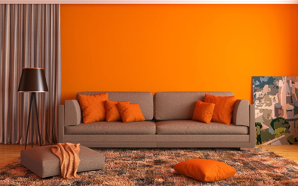
Orange is a bold color that is both warm and energetic. It is often used to convey an atmosphere of fun, but depending on which color your pair it with, it can also be successfully used to create a feeling of inspiration or relaxation. Orange is a very striking color that is most often best used as an accent color rather than as the base color because it can be overwhelming for the senses.
Most people do not consider orange as an option when thinking of interior design because it is an easy color to get wrong.
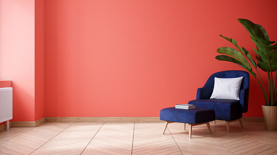
However, there are so many beautiful shades of orange you are missing out on if you run from it in fear! Deep burnt oranges can create a warming autumnal feel in a room, while apricot and coral orange can be delicate and pretty for bedrooms.
To learn about the colors that go with orange and how to use them, read on.
Orange + Pink
| Shade | Hex Code | CMYK Color Code (%) | RGB Color Code | Color |
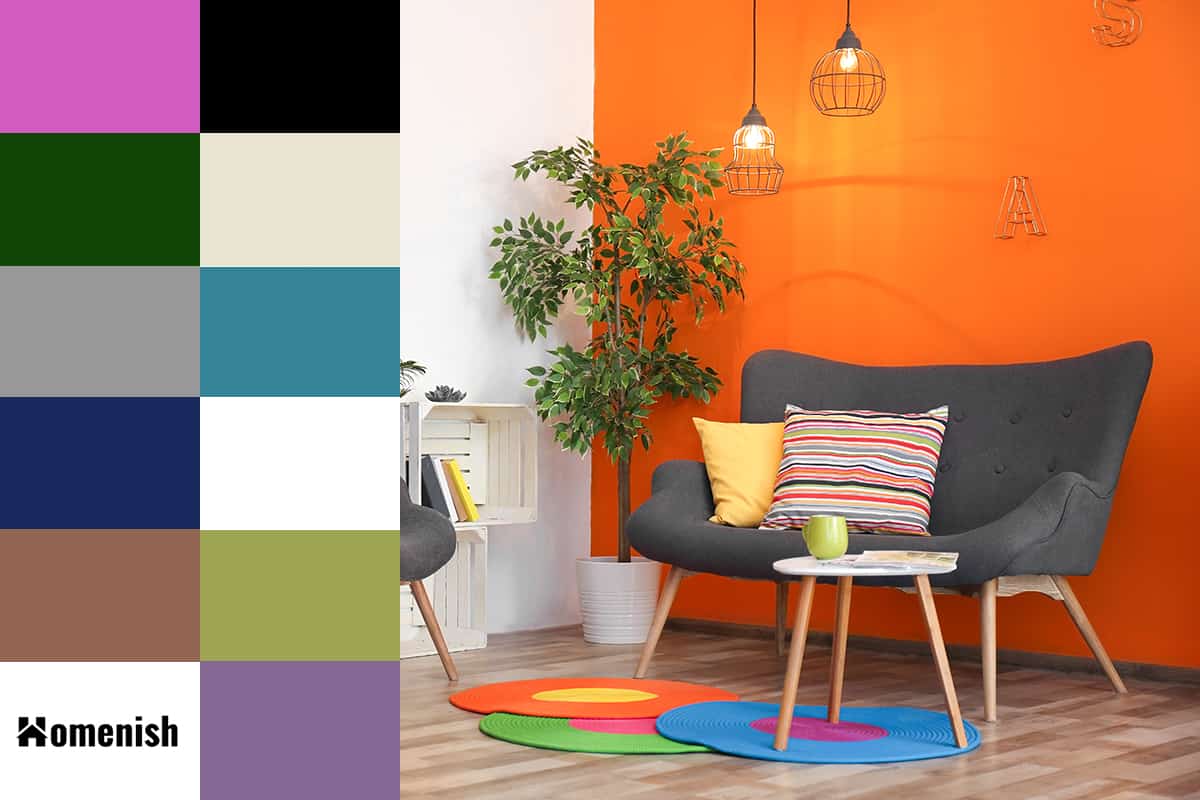
| Orange | #f75b00 | cmyk(0%, 63%, 100%, 3%) | rgb(247,91,0) | |
| Pink | #d05cbf | cmyk(0%, 56%, 8%, 18%) | rgb(208, 92, 191) |
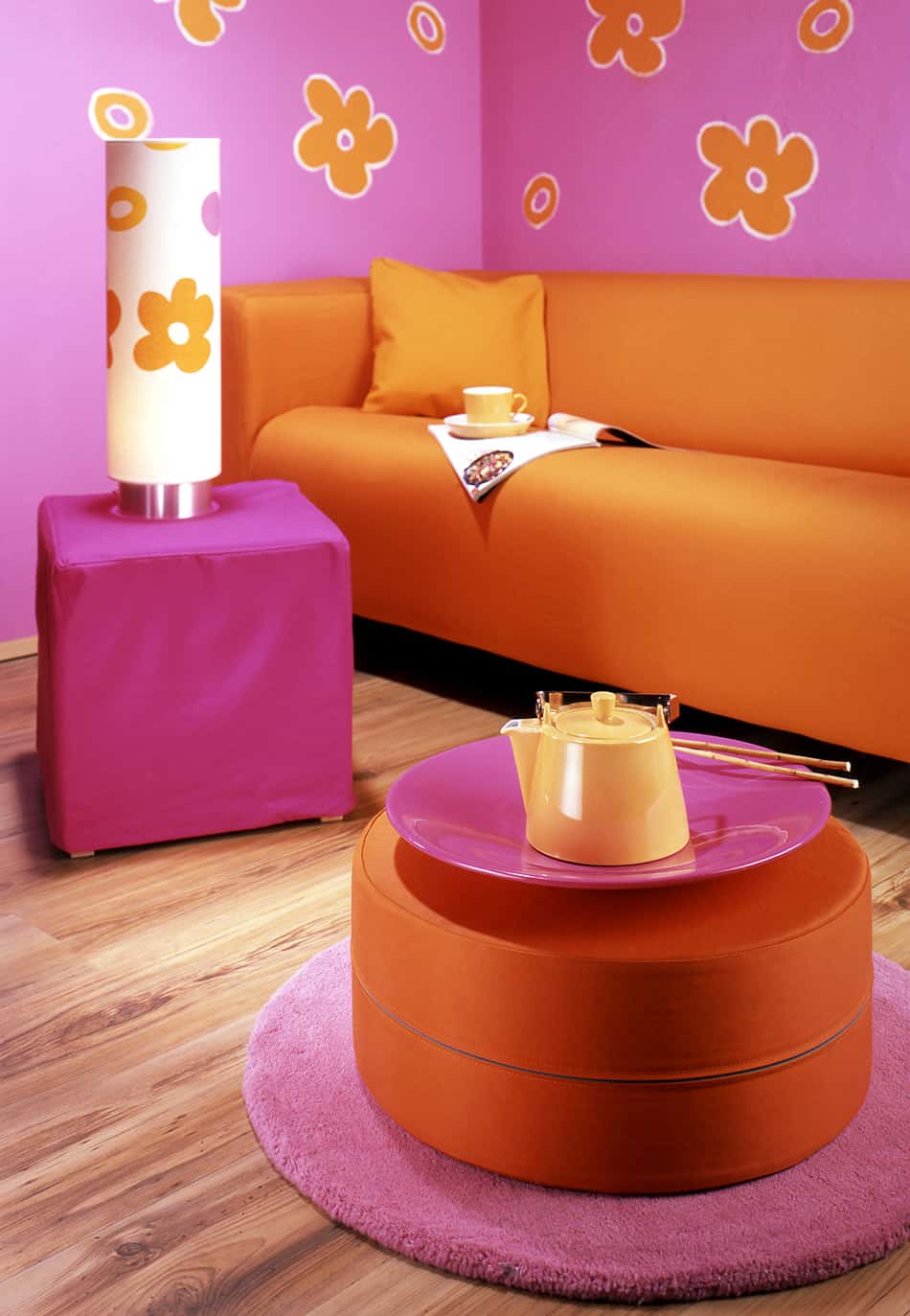
Pink and orange go great together in a variety of combinations. Depending on the look you are going for, try a bright, zesty orange with a dusky pink for a vintage feminine style, or striking hot pink with apricot orange for a playful, vibrant feel.
Pink and orange are colors that were commonly used together in 1960’s fashion and decor, so you may be able to find some funky vintage print fabrics to create cushion covers with. The combination of pink and orange is undoubtedly a cheerful mix that will add personality and warmth to any room.
For more pink color inspirations, follow our guide on colors that go with pink.
Orange + Emerald Green
| Shade | Hex Code | CMYK Color Code (%) | RGB Color Code | Color |
| Orange | #f75b00 | cmyk(0%, 63%, 100%, 3%) | rgb(247,91,0) | |
| Emeralg Green | #104507 | cmyk(77%, 0%, 90%, 73%) | rgb(16, 69, 7) |
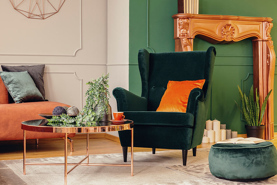
Orange is a secondary color that faces blue and green on the color wheel, meaning these are the colors you should pair with orange for the greatest contrast. Emerald green is a sophisticated color choice that is brought to life by burnt orange accents.
The vivid contrast creates a feeling of intense energy, which works well in kitchens and living rooms.
To prevent these colors from being too loud, choose a neutral color as a base for the room, for example, white or beige walls. You can then layer orange and emerald green components by adding curtains, cushions, throws, and lampshades in these colors.
Orange + Gray
| Shade | Hex Code | CMYK Color Code (%) | RGB Color Code | Color |
| Orange | #f75b00 | cmyk(0%, 63%, 100%, 3%) | rgb(247,91,0) | |
| Gray | #989898 | cmyk(0%, 0%, 0%, 40%) | rgb(152, 152, 152) |
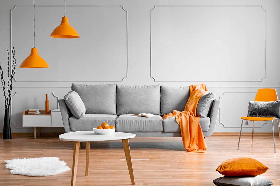
Gray and orange have been a popular color combination in interior design for a handful of years. These shades create a nice contrast that isn’t too extreme, making it a good choice for rooms you want to relax in, such as a bedroom. Gray and orange together create a distinctly modern vibe with a masculine edge.
Orange accents can help to prevent a gray room from feeling too gloomy by adding splashes of vibrant color to the space. There are a variety of different orange shades which work well with gray, including bright orange, peach, and burnt orange.
Whether you choose dark gray or pale gray, you won’t need a neutral base because gray doubles up as the neutral color. Paint all of the walls in a room gray and accent the space with soft orange furnishings.
Orange + Indigo Blue
| Shade | Hex Code | CMYK Color Code (%) | RGB Color Code | Color |
| Orange | #f75b00 | cmyk(0%, 63%, 100%, 3%) | rgb(247,91,0) | |
| Indigo Blue | #182a5e | cmyk(74%, 55%, 0%, 63%) | rgb(24, 42, 94) |
Orange and indigo blue are colors that are commonly seen together in Mediterranean or Aztec style items, for example, on patterned fabrics, vases, and dinnerware.
If you want to create a Mediterranean look in your home, then a bright orange and a vivid blue are perfect colors to use. The orange and indigo blue color schemes should also be used alongside white to create a balance and prevent the deeply saturated colors from becoming overwhelming.
This color combination looks vivid and energetic, as the two fresh shades contrast against each other and make the opposite color pop.
If you want to create a more retro look, then you can be more heavy-handed with orange and blue and use less white in the space. This can make a space feel young and funky, with throwback vibes to the 1950s.
Orange + Brown
| Shade | Hex Code | CMYK Color Code (%) | RGB Color Code | Color |
| Orange | #f75b00 | cmyk(0%, 63%, 100%, 3%) | rgb(247,91,0) | |
| Brown | #926653 | cmyk(0%, 30%, 43%, 43%) | rgb(146, 102, 83) |
For a classy and luxurious space, pair a deep burnt orange with a rich shade of chocolate brown. This color combination creates a feeling of decadence and opulence, which works well in formal living rooms or dining rooms.
To fully embrace this type of style, be sure to choose sumptuous fabrics such as velvet or silk for soft furnishings.
Alternatively, you can pair bright orange with brown for a 1970’s vibe. To achieve this look, choose a bold print with a large floral design or a funky pattern. You can make subtle nods to the ’70s with printed cushions in brown and orange or go all out with a retro-style wallpaper to make a big statement.
Orange + Cream
| Shade | Hex Code | CMYK Color Code (%) | RGB Color Code | Color |
| Orange | #f75b00 | cmyk(0%, 63%, 100%, 3%) | rgb(247,91,0) | |
| Cream | #e9e4d0 | cmyk(0%, 2%, 11%, 9%) | rgb(233, 228, 208) |
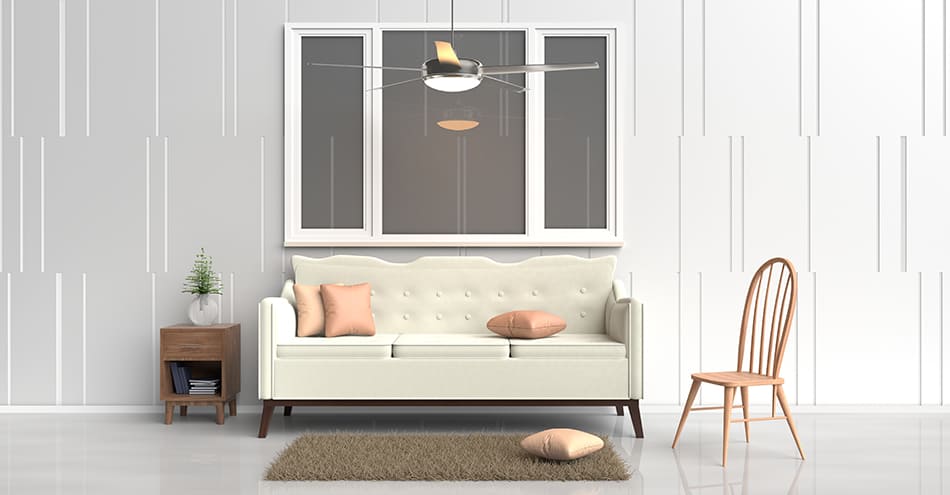
Orange is a very sunny color that can be quite loud and vibrant. If you like orange in your decor but want to tone down the vibrancy level, then you should pair it with cream. Cream helps to neutralize orange and play down its funky vibes so that you can hold onto the warmth orange creates but let go of its boldness.
Any shade of orange will work well with cream, so this is a good color combination to choose if you feel unsure of yourself when it comes to making interior design decisions.
It’s a very safe bet that cream will look classy and stylish with orange, making it a good option to start with. You can use cream as a base in your room and add orange furnishings such as an orange sofa or orange curtains.
Once you have gained some confidence in your interior design skills, you could add an accent color at a later date, such as blue cushions. For a laidback feel, use a dark orange bordering on terracotta with cream or a muted shade of orange with pink tones.
Orange + Teal
| Shade | Hex Code | CMYK Color Code (%) | RGB Color Code | Color |
| Orange | #f75b00 | cmyk(0%, 63%, 100%, 3%) | rgb(247,91,0) | |
| Teal | #358497 | cmyk(65%, 13%, 0%, 41%) | rgb(53, 132, 151) |
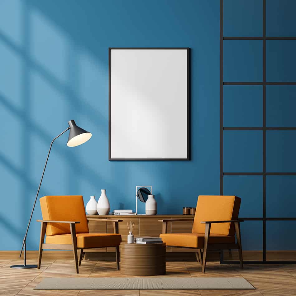
Burnt orange and teal are a contrasting color combination that works well in modern or minimalist interiors. These two rich colors can be used alone to create a cozy and intimate space or used in a white room to give it a bright and contemporary vibe. If you have teal walls, you can uplift the room by adding orange drapes or orange upholstered furniture.
Although orange is a bold color, it can look very sophisticated if used in the correct way, for example, a modern style velvet orange dining chair. When using teal and orange together, you should decide which is your primary color and use this the most heavily.
For example, if teal is your favorite shade of the two, then use it on 70 to 80 percent of the room and orange on the remaining 20 or 30 percent. Avoid using both colors in equal measure because the stark contrast will make them look as if they are competing with each other and create an atmosphere that is too busy.
Orange + White
| Shade | Hex Code | CMYK Color Code (%) | RGB Color Code | Color |
| Orange | #f75b00 | cmyk(0%, 63%, 100%, 3%) | rgb(247,91,0) | |
| White | #ffffff | cmyk(0%, 0%, 0%, 0%) | rgb(255, 255, 255) |
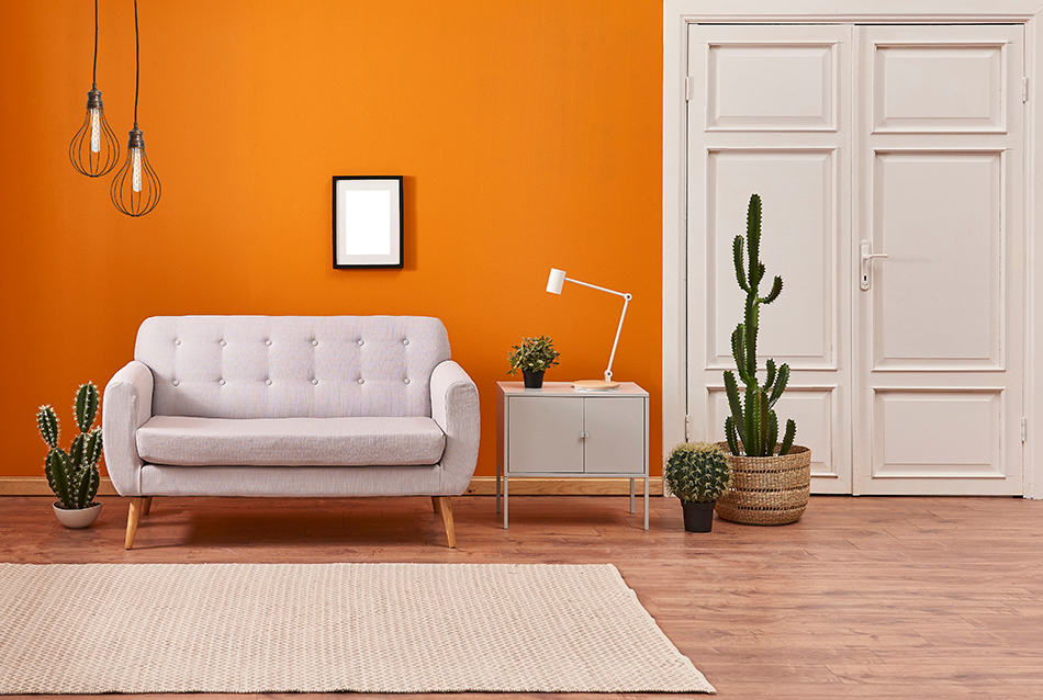
White walls in a room are a good choice with any color, and orange is no exception. If you have bold items of furniture such as an orange sofa or orange bed sheets, then you can help them to both stand out while not looking too gaudy by putting them in rooms with white walls.
You can also incorporate other white accents to give a feeling of continuity with the color scheme, such as white lampshades or painted white furniture.
Orange + Black
| Shade | Hex Code | CMYK Color Code (%) | RGB Color Code | Color |
| Orange | #f75b00 | cmyk(0%, 63%, 100%, 3%) | rgb(247,91,0) | |
| Black | #000000 | cmyk(0%, 0%, 0%, 100%) | rgb(0, 0, 0) |
Black and orange go well together, but whether you are using them for an outfit or in interior design, you need to be careful to avoid looking like you are gearing up for Halloween!
To steer clear of pumpkin vibes, use a dark burnt orange or muted orange with black, and stay away from anything that is bright orange.
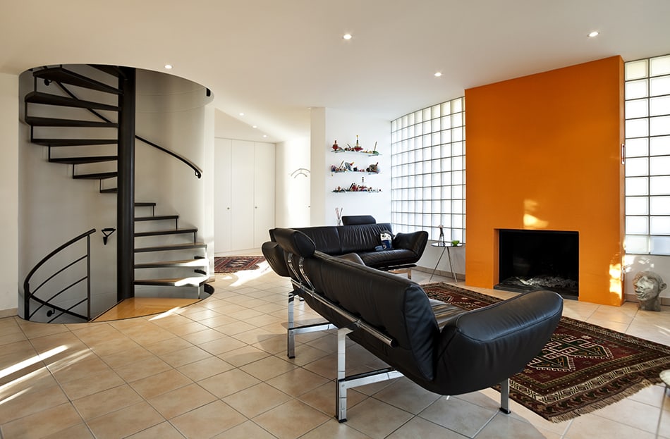
You can use these two colors alone to create an intimate and sensual space, for example, a room with black walls and dark orange velvet drapes and cushions.
Alternatively, for a cleaner and more modern look, choose black and orange furnishings in a room with white walls.
Orange + Lime Green
| Shade | Hex Code | CMYK Color Code (%) | RGB Color Code | Color |
| Orange | #f75b00 | cmyk(0%, 63%, 100%, 3%) | rgb(247,91,0) | |
| Lime Green | #9da553 | cmyk(5%, 0%, 50%, 35%) | rgb(157, 165, 83) |
Bright orange is the ultimate funky color combination with lime green. In terms of interiors, these colors are a good choice for a teenager or college student’s bedroom if they want the space to feel young and vibrant.
This is also a good color combination for retro-style spaces if you are trying to channel a 1970’s feel. For a full-on contrast, use the brightest lime green you can find and a fierce orange, or select a deeper burnt orange to give the room a slightly more toned-down look.
Orange + Lilac
| Shade | Hex Code | CMYK Color Code (%) | RGB Color Code | Color |
| Orange | #f75b00 | cmyk(0%, 63%, 100%, 3%) | rgb(247,91,0) | |
| Lilac | #856793 | cmyk(10%, 30%, 0%, 42%) | rgb(133, 103, 147) |
Any shade of purple will provide contrast against orange, but for a more delicate interior design style, choose lilac and coral orange.
These two delicately feminine colors work together to make a pretty yet understated space. They should be teamed with a neutral color, ideally white, to help set them off and keep them looking fresh and vibrant.
