Apricot as a color is named after the skin of apricot fruit, which is a shade of orange-yellow. However, when it comes to apricot in interior design terms, it is a distinctly more pinkish hue.
In fact, when used to describe interior colors, apricot can include anything from orange-pink right through to rusty terracotta. This is a color that has seen a huge revival over the last two years and has become one of the key trendy colors in modern interior design styles.
Here we look at what other colors work well with apricot and how you can incorporate this color into your own home decor.
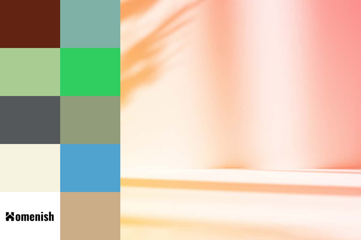
Chocolate Brown
| Shade | Hex Code | CMYK Color Code (%) | RGB Color Code | Color |
| Apricot | #f6c5a7 | cmyk(0%, 20%, 32%, 4%) | rgb(246, 197, 167) | |
| Chocolate Brown | #602311 | cmyk(0%, 64%, 82%, 62%) | rgb(96, 35, 17) |
Apricot in its duskier versions can be a really earthy and sultry shade. This is really beautiful alongside rich chocolate browns to create a luxurious yet natural feel.
Apricot is a color that can use together with chocolate brown to create a vintage 1920’s style decor, or they can work well in eclectic modern interiors.
Turquoise
| Shade | Hex Code | CMYK Color Code (%) | RGB Color Code | Color |
| Apricot | #f6c5a7 | cmyk(0%, 20%, 32%, 4%) | rgb(246, 197, 167) | |
| Turquoise | #7fb0a8 | cmyk(28%, 0%, 5%, 31%) | rgb(127, 176, 168) |
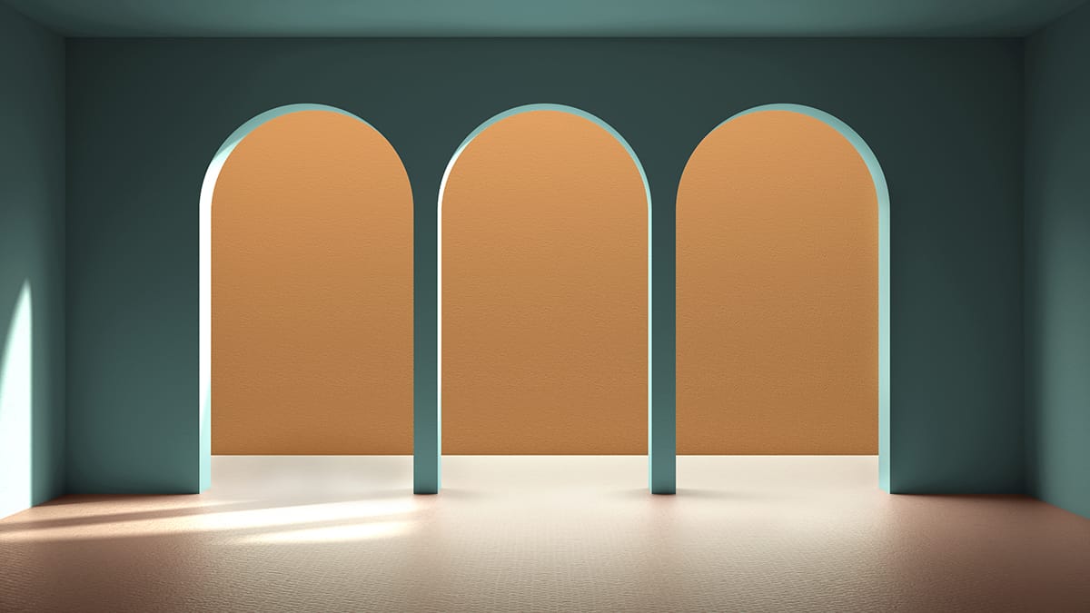
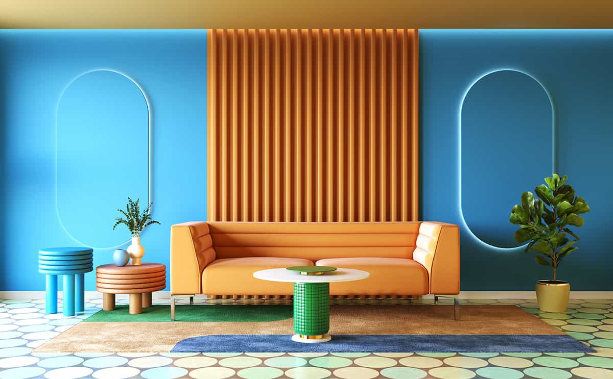
Apricot is a color that makes a truly dreamy pairing with turquoise. They contrast each other beautifully and really allow the other color to shine. The cool tones in turquoise help to balance out the warmth in apricot and vice versa.
Turquoise is a lively and vibrant color, and when used alongside apricot, the resulting effect is a tropical, exotic style of decor. These colors can be used together to create an art deco style Hollywood glamour of days gone by or retro diner-themed decor.
Use gold features to create further interest in this color palette, in glossy finishes such as high shine gold chair legs and shelf brackets.
Mint Green
| Shade | Hex Code | CMYK Color Code (%) | RGB Color Code | Color |
| Apricot | #f6c5a7 | cmyk(0%, 20%, 32%, 4%) | rgb(246, 197, 167) | |
| Mint Green | #a8cb93 | cmyk(17%, 0%, 28%, 20%) | rgb(168, 203, 147) |
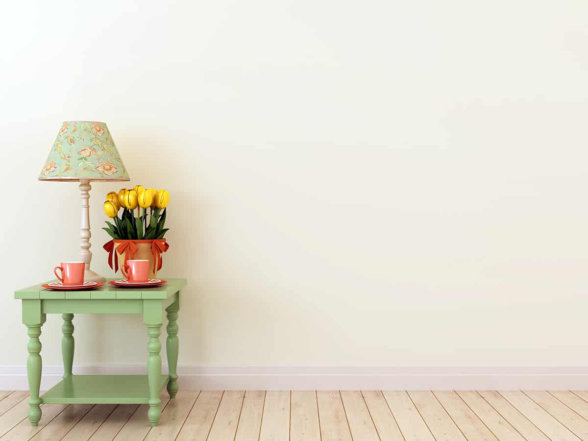
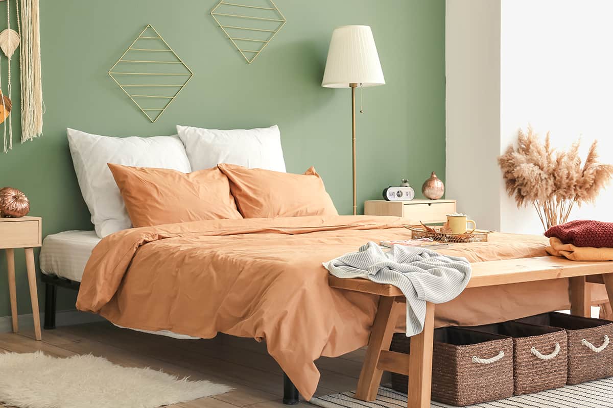
Mint green and apricot is a fresh and vibrant color pairing that can be used to create a romantic vibe or a fun and playful vibe, depending on the style you want to achieve.
With apricot walls, choose neutral furniture such as cream sofas, then add small touches of mint green, for example, mint green plant pots, mint green candles, or a patterned mint green area rug.
Cushion covers incorporating both mint green and apricot would help to tie the color scheme together really nicely, and as hugely popular colors in interior design right now, cushions of this type shouldn’t be hard to find.
Modern natural themed prints such as palm leaves or bold florals would be a good choice of pattern, and decorative touches such as apricot-colored pom-pom trim around the edge of the cushions will add fun and whimsical feel.
Emerald Green
| Shade | Hex Code | CMYK Color Code (%) | RGB Color Code | Color |
| Apricot | #f6c5a7 | cmyk(0%, 20%, 32%, 4%) | rgb(246, 197, 167) | |
| Emerald Green | #30cd62 | cmyk(77%, 0%, 52%, 20%) | rgb(48, 205, 98) |
Apricot can be a cheerful rosy pink-orange color or a dusty desert shade. Either of these types of apricot will go well with emerald green. For a feminine, glam style, choose the more playful pink-toned apricot with emerald green and opt for sumptuous fabrics such as silk and velvet.
For a more mature interior decor style, such as a mid-century modern look, go for a dustier version of apricot with more subdued tones. This can work really well with deep emerald green and dark woods such as walnut.
Olive Green
| Shade | Hex Code | CMYK Color Code (%) | RGB Color Code | Color |
| Apricot | #f6c5a7 | cmyk(0%, 20%, 32%, 4%) | rgb(246, 197, 167) | |
| Olive Green | #909c7c | cmyk(8%, 0%, 21%, 39%) | rgb(144, 156, 124) |
Olive green is a natural tone, and this can be contrasted beautifully with a clay-like apricot orange. Orange works so well together with olive green because they are both earthy shades, so they don’t feel bold or vibrant and instead offer a soothing, reflective kind of atmosphere.
However, since they are almost opposite each other on the color wheel, they present a really satisfying contrast that adds depth and richness to a space.
For a really immersive experience with these colors, use them liberally. Walls could be painted in olive green, with an apricot-colored sofa, and accessories in varying shades of both colors.
The use of houseplants and natural materials such as jute baskets will really help to reinforce the earthy look in a room featuring these colors.
Gray
| Shade | Hex Code | CMYK Color Code (%) | RGB Color Code | Color |
| Apricot | #f6c5a7 | cmyk(0%, 20%, 32%, 4%) | rgb(246, 197, 167) | |
| Gray | #55595c | cmyk(8%, 3%, 0%, 64%) | rgb(85, 89, 92) |
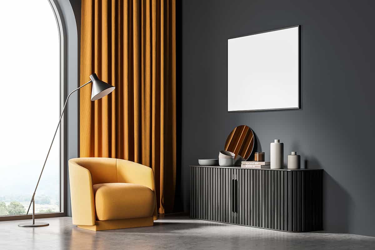
Apricot is a distinctly warm shade, which can be balanced out by the cool tones in gray. Avoid pale shades of gray with apricot as this can result in a washed-out look; instead, opt for deep and dark shades of gray such as lead gray and iron-gray.
If you want to ensure that apricot doesn’t look too feminine and frilly, then using it with gray will tone down this aspect of it. Gray accents will also help to ensure that an apricot room looks current and stylish.
Cream
| Shade | Hex Code | CMYK Color Code (%) | RGB Color Code | Color |
| Apricot | #f6c5a7 | cmyk(0%, 20%, 32%, 4%) | rgb(246, 197, 167) | |
| Cream | #f6f1df | cmyk(0%, 2%, 9%, 4%) | rgb(246, 241, 223) |
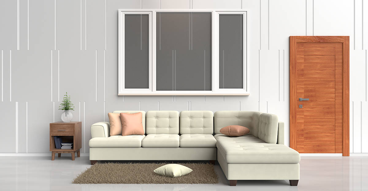
Apricot is a match in heaven with cream. These two colors look luscious together, and as such, it is no surprise that this is a popular color scheme used for weddings.
Apricot, when paired with cream, makes for a cheerful, optimistic, and sensual appeal, and therefore is a nice color combination for bedrooms as well as living rooms. To add a modern edge to a cream and apricot space, add small hits of black, such as skinny black picture frames and black wire storage boxes.
Royal Blue
| Shade | Hex Code | CMYK Color Code (%) | RGB Color Code | Color |
| Apricot | #f6c5a7 | cmyk(0%, 20%, 32%, 4%) | rgb(246, 197, 167) | |
| Royal Blue | #50a2ce | cmyk(61%, 21%, 0%, 19%) | rgb(80, 162, 206) |
Blue and orange are contrasting and complementary colors, so they make for a very striking pair when used in close proximity.
Royal blue is a rich and heavily saturated shade of blue, which makes apricot look vibrant, but avoid using these colors too heavily because they can be too intense and result in an overstimulating atmosphere.
Choose a third color to use with apricot and royal blue, ideally a muted neutral shade such as ivory or cream, to break up the shades so they can be appreciated in their best light. Warm-toned wood will look great with these colors, such as oak hardwood flooring or walnut countertops in a kitchen.
Tan
| Shade | Hex Code | CMYK Color Code (%) | RGB Color Code | Color |
| Apricot | #f6c5a7 | cmyk(0%, 20%, 32%, 4%) | rgb(246, 197, 167) | |
| Tan | #cbae88 | cmyk(0%, 14%, 33%, 20%) | rgb(203, 174, 136) |
Apricot has a warming yet fresh feel, and this is an energy that is further enhanced when apricot is paired with tan.
Using these two colors together creates a modern and welcoming atmosphere, ideally alongside a shade of cream of off-white to break up the heavily saturated colors and prevent them from becoming overwhelming. Triangular motifs or geometric patterns work really well with these colors to ensure they feel contemporary.
