Cabernet color is a dark red color with purple undertones and is associated with luxury and richness. Learn more about this color, and what to pair with it.
What Color is Cabernet?
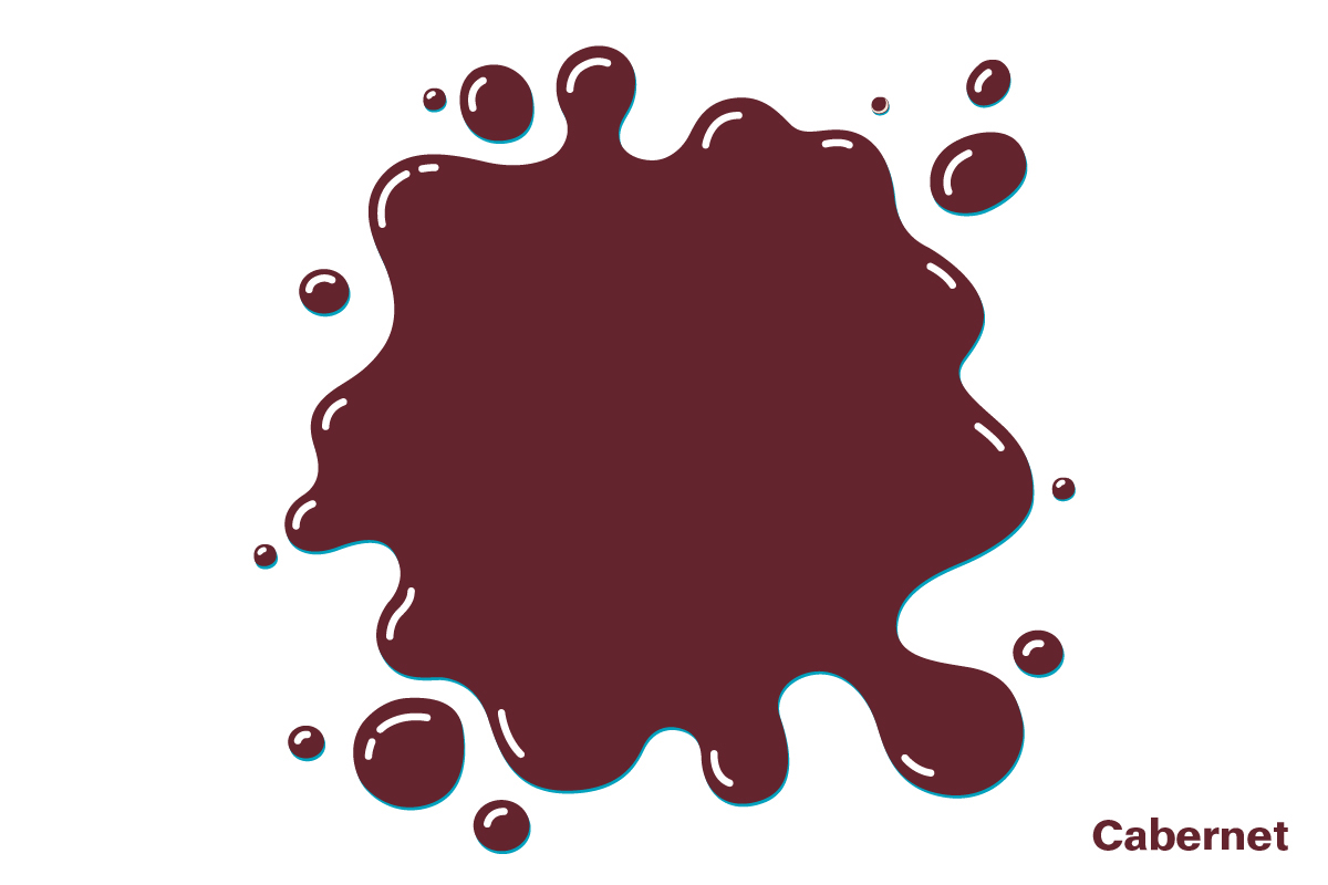
Cabernet is a deep and dark purple-red color, named after the cabernet sauvignon grape. This is a red wine grape that is widely grown in many wine-producing countries across the globe, and in fact, it is known to be the world’s most planted wine grape, occupying 3410 square kilometers.
The color cabernet is the same shade as cabernet wine, which is a luxurious and warm red color with purple undertones, as opposed to the grape itself, which has more of a purple-black color.
Qualities of Cabernet Color
Cabernet as a color is synonymous with luxury and wealth, and as such, it is widely used across fashion and interior design to inspire a sense of grandeur and old-world elegance. Since this is a dark yet warming hue, cabernet works well in formal and intimate spaces to create a comforting and dignified atmosphere.
You might easily be able to imagine this color bathing the walls in a traditional library or an old English manor. It has a depth and sense of mystery that lends itself perfectly to use in antique or vintage style spaces, yet it can also look classically contemporary when used in more modern-themed rooms.
If you want to convey a rich and regal feel in a room, the qualities of cabernet will be ideal for this. It can look elegant and stately when used alongside dark green colors, or it will be intensely warming when used in conjunction with gold details.
Cabernet Color Paint
Both Benjamin Moore and Valspar offer paint colors based on the cabernet grape or cabernet red wine.
Benjamin Moore- Cabernet
This paint color falls under the purple category rather than red, and it has a deep and dusky look to it. It is a dark purple shade with gray tones that make it feel effortlessly modern, though it still has a warmth thanks to the red required to make purple.
This paint color would look beautiful in a bedroom with gray accents to draw out the cooler tones in the shade. Despite the dark shade, it feels quite muted, so it is a nice choice for a deep purple color that won’t feel overwhelming.
Valspar- Cabernet Cork
This color is described by Valspar as one of their red shades; however, it reads as more of a purple hue in real life. It is a warmer and more vibrant shade compared with Benjamin Moore’s cabernet, which was noticeably more subdued.
This color is reminiscent of mulberry jam, with its dark purple hue and red undertones. It will work well as an accent color for a feature wall but may seem too overstimulating when painted on all of the walls in a room.
Colors to Use with Cabernet
Olive green
| Shade | Hex Code | CMYK Color Code (%) | RGB Color Code | Color |
| Cabernet | #63242d | cmyk(0%, 64%, 55%, 61%) | rgb(99, 36, 45) | |
| Olive Green | #b4b26a | cmyk(0%, 1%, 41%, 29%) | rgb(180, 178, 106) |
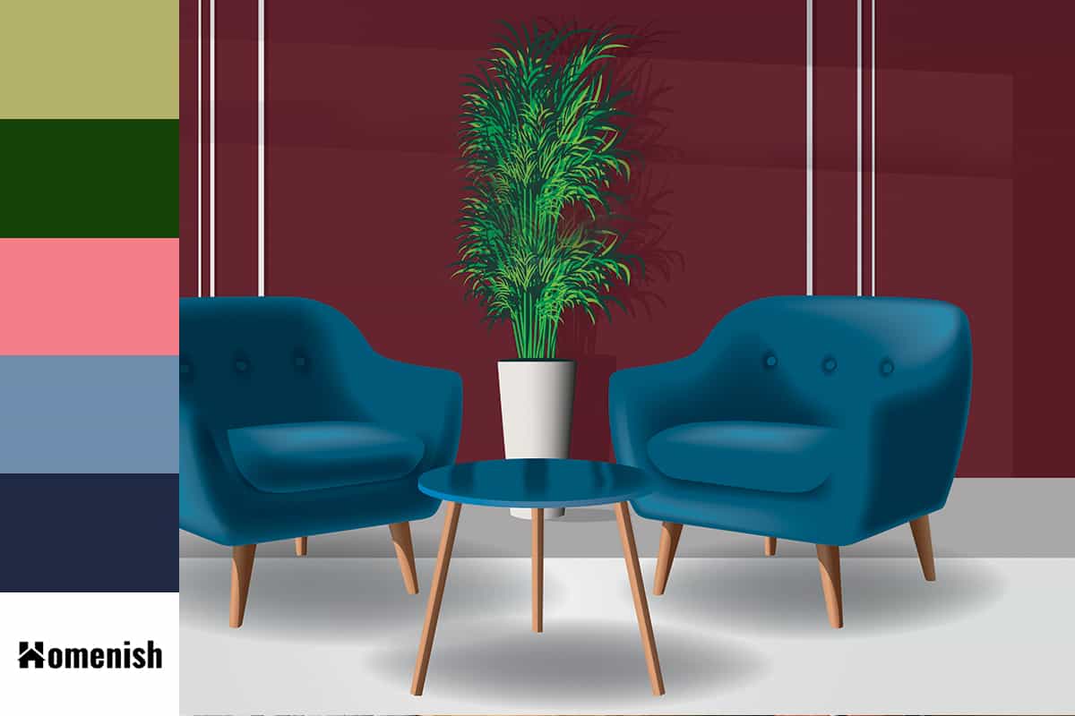
As cabernet is a purple-red color, it contrasts beautifully with any shade of green; however, for a stylish and understated look, use a muted shade of green such as olive. Red-based colors work so well with green-based colors because red and green face directly opposite each other on the color wheel. As a result, they are directly contrasting colors, which also means they are complementary colors.
These are colors that create a perfect balance of warm and cool while also bringing out the best in each other for an appealing look. With olive green as your primary color on living room walls, add cabernet-colored cushions and a cabernet rug to bring a sense of warmth and comfort into the space.
Forest green
| Shade | Hex Code | CMYK Color Code (%) | RGB Color Code | Color |
| Cabernet | #63242d | cmyk(0%, 64%, 55%, 61%) | rgb(99, 36, 45) | |
| Forest Green | #144206 | cmyk(70%, 0%, 91%, 74%) | rgb(20, 66, 6) |
Forest green is another shade of green that has a muted and almost neutral appeal, despite its darker hue. Cabernet can work with forest green the same way it does with olive green, but this color combination will result in a much more regal and potentially formal style.
These two colors are commonly seen together in stately homes and historic properties, so they give off a distinctive sense of heritage and luxury. Use this color palette in a space where you want to be taken seriously or create an upstanding atmosphere, such as a formal dining room or an office.
Blush pink
| Shade | Hex Code | CMYK Color Code (%) | RGB Color Code | Color |
| Cabernet | #63242d | cmyk(0%, 64%, 55%, 61%) | rgb(99, 36, 45) | |
| Blush Pink | #f67e88 | cmyk(0%, 49%, 45%, 4%) | rgb(246, 126, 136) |
If you want to create a lighter feeling in a room with cabernet decor, then team it with blush pink. This color is light in hue but also light in nature since it gives off a playful, relaxed, and sometimes flirtatious vibe.
In a bedroom with blush pink walls, opt for cabernet-colored bedsheets and curtains to add a richness that blush pink lacks. These colors together will create a warm and inviting environment that is conducive to intimacy and relaxation, perfect for an adult bedroom.
Pale blue-gray
| Shade | Hex Code | CMYK Color Code (%) | RGB Color Code | Color |
| Cabernet | #63242d | cmyk(0%, 64%, 55%, 61%) | rgb(99, 36, 45) | |
| Pale Blue-Gray | #6f8ead | cmyk(36%, 18%, 0%, 32%) | rgb(111, 142, 173) |
Cabernet is a warm color, but it does have cool tones due to the generous amount of blue that needs to be mixed with red to get purple undertones.
If you want to bring out the cool tones in cabernet, pair it with a dusty shade of blue-gray. This makes for a more subtle contrast, with the darkness of cabernet standing out against the pale quality of pale blue-gray. This is a color palette that will look refreshingly modern, offering a breath of fresh air even alongside a rich color such as cabernet.
Navy blue
| Shade | Hex Code | CMYK Color Code (%) | RGB Color Code | Color |
| Cabernet | #63242d | cmyk(0%, 64%, 55%, 61%) | rgb(99, 36, 45) | |
| Navy Blue | #1f2943 | cmyk(54%, 39%, 0%, 74%) | rgb(31, 41, 67) |
Cabernet is a color that can work together with navy blue in so many ways. They can be used with gold or brass to create a vintage or antique look, or they also work brilliantly with white as a third color to achieve a room that is modern and minimalist. As two dark colors, navy and cabernet are ideal for creating a space that feels intimate and cozy.
The navy blue color brings a coolness to the space, while the warmth of the cabernet balances it out for a room that feels even and stable. Choose this color combination in a country farmhouse kitchen with cabernet-painted walls and navy blue cabinets, or add a selection of navy and cabernet-colored cushions to a white sofa for a casual-luxe vibe.
