Steve Green
Posts by Steve Green:
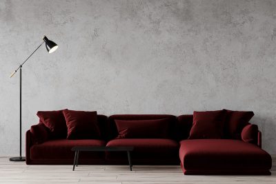
Jewel tones are a range of colors that are commonly, though not always, named after their correlating precious jewels. This includes sapphire blue, ruby red, emerald green, and amethyst purple.
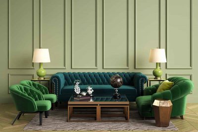
Green is a really versatile color because it can read as a neutral in some color schemes, or it can work as a bold and impactful color to make more of a style statement. Green is most commonly a cool color, but some shades of green have elements of brown that give the color a warmer temperature and therefore change the atmosphere that it will create in a room.
If you want to sell your home quickly, then it’s a good idea to stage it. Staging your home can include, but is not limited to, painting the walls in neutral colors that will appeal to a broad spectrum of buyers and replacing carpets to create a fresh and updated feel.
Having your own workbench in your garage is a necessity rather than a luxury for those of us who spend our spare time working on DIY projects. If you are looking for a new workbench to buy, or you’re thinking of building your own, then knowing which are the best dimensions for a workbench is going to be useful.
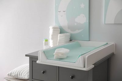
Changing pads are an essential item if you have a newborn baby, providing you with a safe and comfortable space for you to change your little one’s diaper. Changing pads do not come in a standardized size; however, most changing pads do come in a similar size which makes them suitable for use with most standard-sized changing tables.
You could buy a birdhouse or build one yourself, but first, you will need to consider the best size for a birdhouse so that it attracts the right types of birds.
Typically, spiral staircase sizes vary with the smallest standard spiral staircase having a diameter measurement of 3 feet 6 inches and a walking path width measurement of 17 inches to the largest standard spiral staircase with a diameter measurement of 6 feet and a walking path width measurement of 32 inches.
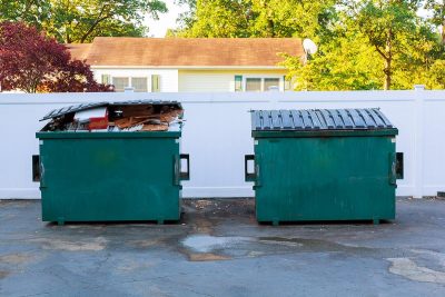
If you have limited space on your driveway or around your property, then you’ll also need to check the dimensions of the available dumpsters to make sure it is going to fit where you want them to go.
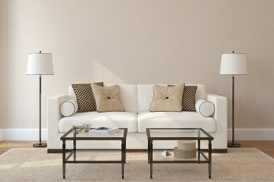
Beige walls are a common sight in home decor. This is a wall color that many people choose without even really thinking about it because it is known as an easy neutral color that can go with any color scheme, and it is so widely available.
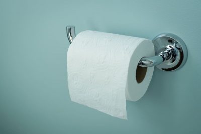
Toilet paper rolls may appear to have standardized dimensions, as they seem to look the same regardless of where you purchase them. However, the truth is that the size of toilet paper rolls can differ between manufacturers and even among different types available on the market. Understanding these dimensions can help you determine the right roll size for your needs and preferences.
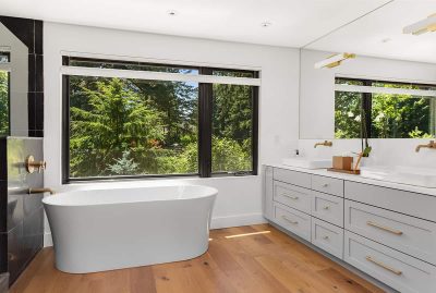
If you like to spend your free time luxuriating in a bathtub, then you will appreciate the benefits a soaker tub has to offer. These tubs are designed for soaking exactly as the name implies, and as such, they will be deeper and hold more water than your average bathtub, allowing the user to really immerse themselves in the water.
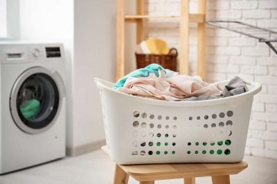
Laundry baskets are typically used to collect dirty laundry and transport it from one room to the laundry room. The size of a laundry basket will vary depending on the user.
