Steve Green
Posts by Steve Green:
When you are choosing a color for your new metal roof, you might initially think only in terms of how the color coordinates with the rest of your home’s exterior. Many people will choose a metal roof color that matches the color of their front door or garage door, or you might want to opt for a color similar to your siding color so that it blends in and creates a uniform look.
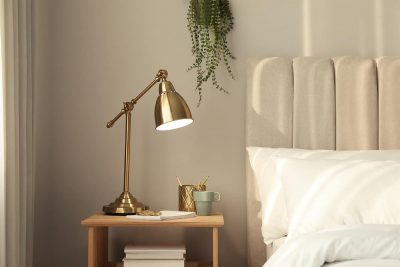
A nightstand is an essential part of every bedroom. It is the place for storing your books, alarm clock, lamp and other items. This low bedside table is usually placed next to the headboard of the bed, which is why many people prefer to match this furniture color to their bed.
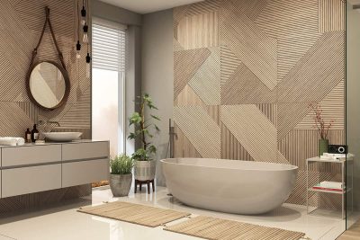
Wall tiles are among the most popular materials for wall coverings in bathrooms, but they are by no means the only option. If you want to renovate your bathroom, then there are other alternatives to consider besides tile. Here we investigate other wall decor possibilities and assess which are the best bathroom wall materials that are not tile.
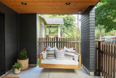
The standard porch swing size is around 48 inches wide and 28 inches in depth. Porch swings come in various widths, including 2 feet, 3 feet, 5 feet, and 6 feet. Common depths are 18 inches, 28 inches, and 46 inches.
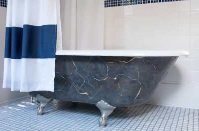
Here we look at the standard clawfoot tub size, and other dimensional considerations you should take into account when planning a bathroom layout with this classic type of tub.
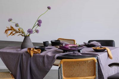
A tablecloth offers practical as well as aesthetic benefits. It protects your dining table from scratches due to dinnerware, fading from the sun, and spills from drinks. It also creates a softer look in a space, much like other soft furnishings, making for a room that feels more comfortable. If your table has seen better days, or the surface doesn’t match your current style, then you can use a tablecloth to hide the dining table and give it a complete transformation.
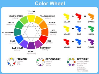
Here we look at how the colors on the color wheel are arranged and how you can use a color wheel in interior design to heighten the look of your rooms.
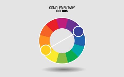
Understanding complementary colors is essential in interior design because it is one of the key concepts you will be working with. Here we delve deeper into the mechanics of complementary colors and how you can use them to your advantage.
We recommend installing board and batten between 8 inches to 30 inches. It depends on the height of your ceiling and the overall width of your wall.
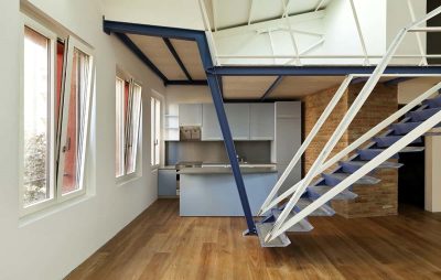
A mezzanine floor can be a great solution for creating extra floor space if you have tall or vaulted ceilings. Here we look at the pros and cons of mezzanine floors, along with the types of mezzanine floors commonly available, the ways you might choose to use them, and the typical costs associated with both residential and industrial mezzanine levels.
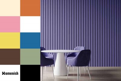
Purple is a popular color choice for rooms where a feminine feel is desired when pink seems too obvious. Parents with little girls will typically opt for purple as an alternative decor color when they don’t want to fall into the stereotypical pink camp.
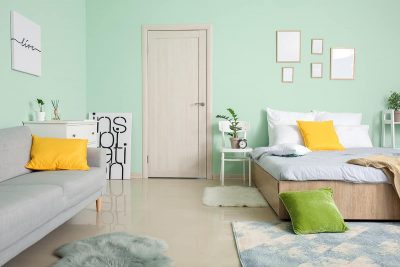
Bedroom doors are the unsung heroes of interior design. They keep our messes, and our children contained, they give us privacy when we need it, and they can even absorb noise. But there’s a long-standing debate over whether or not you should keep bedroom doors shut at night.

