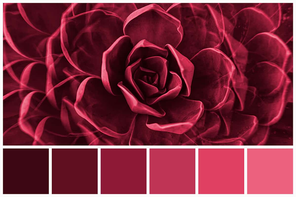
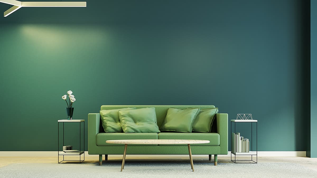
Monochromatic color schemes have become increasingly sought after in home decor throughout the last few years. A monochrome color palette will contain various shades, tints, and tones of the same color, creating a look that offers depth and interest without any stark contrasts that might be overstimulating.
It’s easier than you might think to achieve a designer-inspired monochromatic look as long as you understand color theory. Here we delve deep into this topic to uncover all of the facts you need to know about monochrome color.
What is Monochrome Color?
Monochrome literally translates to mean ‘one color’. A monochromatic color scheme in a room will use only one color, or a monochromatic outfit in fashion will include only one color.
For example, if your chosen color for a bedroom color scheme is pink, then all of the decorative elements in that room will be variations of pink. This does not mean that every item has to be exactly the same shade of pink; instead, it will be a range of tints, shades, and tones of pink while keeping the hue the same.
Tints, Tones, and Shades in Monochrome
When establishing a monochromatic color palette, you need to select between 3 and 7 varieties of the same color. This will ensure your room has depth and interest, avoiding a flat look. When a monochromatic color scheme talks about using variations of the same color, it’s important to understand exactly what this means.
A blue monochromatic color scheme will use different shades, tints, and tones of blue. By using tints, tones, and shades, the hue of the color remains exactly the same, but the saturation, darkness, and lightness of the color will change. This means that different types of blues, which are created using additional colors, will not make a monochromatic color palette.
For example, a blue color palette that uses aqua blue, sky blue, teal blue, and navy blue will not make for a monochromatic color palette. This is because some of these colors will have been achieved by adding green or yellow to them, therefore changing the hue.
Instead, to achieve a monochromatic color palette you will use only one type of blue pigment and create additional tints, tones, and shades by adding varying amounts of white, gray, and black to the pigment.
Choosing a Monochromatic Color Scheme
Monochromatic color schemes have skyrocketed in popularity recently, leading many keen home decor enthusiasts to attempt a monochromatic theme in their own homes.
Monochromatic color schemes can be tricky to replicate if you don’t have a strong grasp on the concept, however, by understanding a few key rules, you can recreate a stylish monochromatic look with ease.
Monochromatic Color Scheme Tips
- Use between 3 and 7 different versions of your chosen color. Any less than 3 will make your space feel flat and one-dimensional, while any more than 7 can look chaotic and messy.
- The textures used are important in a monochromatic color scheme. Since you aren’t using a range of different hues in a space, you’ll need to add depth and interest in other ways. One of the best ways to do this is with texture. Experiment with contrasting textures; for example, the juxtaposition of a soft velvet cushion on a smooth leather sofa will achieve a style that has greater complexity.
- Choose your color carefully. If you want a monochromatic color scheme then all of the colors in your room are going to be a variation of the same hue. This means it really needs to be a hue you love. A monochromatic color scheme envelops you in one color, which can make you feel safe and comforted if it’s a color you adore, but if the color isn’t your favorite then you might quickly get bored of being entirely surrounded by it.
- Always choose variations of your chosen color that have been altered in tint, shade, or tone. This means to arrive at different colors, either black, white, or gray, will need to be mixed with your original pure pigment color. Sticking to this rule is essential when creating a monochromatic color scheme because it ensures that the whole room will be made up of a single hue. If you use different hues, for example, emerald green, olive green, and mint green, then this won’t technically be considered a monochromatic color scheme. Instead, this would be an analogous color scheme because the colors are positioned alongside each other on a color wheel rather than being variations of the same hue.
Picking a Monochromatic Color
The first step in creating a monochromatic color scheme is deciding on a color. The type of atmosphere you want to achieve in a room will largely impact this decision since the color is going to completely cover the room, making color psychology an important consideration.
For example, if you want a calm and relaxing room, opt for blue and focus on some lighter tints and muted tones of this color. For a bold and creative room, choose orange and use more vibrant tones.
After choosing your color you’ll need to establish which tints, tones, and shades you are going to use alongside it, and which of these is going to be your main color in the room. The main tint, tone, or shade should also reflect your intended atmosphere for the room.
For example, if yellow is your chosen color and you want a warm and inviting space that isn’t overstimulating, then a yellow tint with a generous amount of white in it will be a good choice for your main color. Accent this with other variations of yellow, such as a vibrant yellow tone and a muted yellow tone.
Once your color palette has been established, then the fun of collating a range of interior accessories in those colors can begin.


